Author: cozyspaces.haelthyh@gmail.com

  • KWK’s Pipe Office

    KWK’s Pipe Office

    KWK Promes Gambit Office

    Introduction to the Project

    When Polish architecture studio KWK Promes was asked to design the new Gambit Office in Gliwice, it was presented with the familiar paradox of creating a showpiece on a shoestring. Rather than shy away from the challenge, the team turned it into a design prompt. The resulting project is a workspace defined by its sculptural facade comprising an aluminum, tubular stack.

    To shape this unique structure, the team repurposes the very material its client distributes: industrial pipes. To keep costs down while making a visual statement, the architects proposed building a structure that resembled a stack of pipes. Thus, the design seeks to make practical use of the client’s own stock, sourced at wholesale prices, while doubling as a literal billboard — one that advertises Gambit’s trade to anyone passing by.

    images © Juliusz SokoŁowski

    Gambit Office Finds Form in Function

    The team at KWK Promes site the Gambit Office along the site of a former rectangular production hall, surrounded by modest houses with pitched roofs and long outbuildings. This context helped shape the new structure. The building’s tripartite program — a warehouse, workshop, and office — each takes on a distinct volume. The sloping roof of the office wing reflects both the practical needs of pipe storage and the pitched context of the neighborhood.

    If the shape of the office looks familiar, it may be because it unintentionally echoes Christo’s London Mastaba. The sloped roof came about by necessity: it reflects the optimal way to stack cylindrical pipes, which in turn set the angle of the roof pitch. Add to that the restrictions of the local zoning code, and the building’s sculptural silhouette emerges not from ego but from efficiency.

    Inside the office, natural light is abundant. Ground-floor office spaces feature large windows with views onto a landscaped garden. Upstairs, skylights illuminate storage and auxiliary rooms where flexibility and wall space take precedence over views.
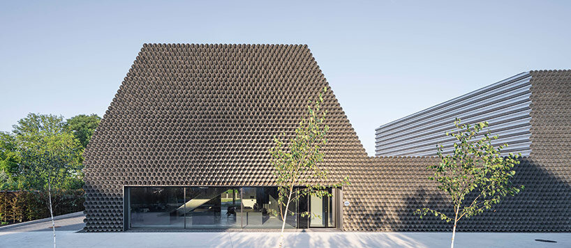
    kwk promes gambit office
    KWK Promes designs the Gambit Office in Polish to resemble a stack of industrial pipes

    Design and Durability

    Though KWK Promes’ Gambit Office is undeniably industrial, it’s surprisingly sensitive to its surroundings. From the street, it shows a confident urban front. From the residential district behind it, the fragmented roofline breaks up its mass, helping it blend into the scattershot neighborhood fabric. This duality, at once assertive and modest, is typical of the studio’s work.

    At first, the facade was intended to be clad in Gambit’s pipes, which are designed for underground use. But when tests showed they oxidized under UV light, KWK Promes pivoted to raw aluminum sheeting — a low-cost, high-durability material the team had used in past projects like Unikato and Konieczny’s Ark. The aluminum will weather naturally into a soft, concrete-like patina, requiring minimal maintenance — an important consideration given the environmental cost of building operations.
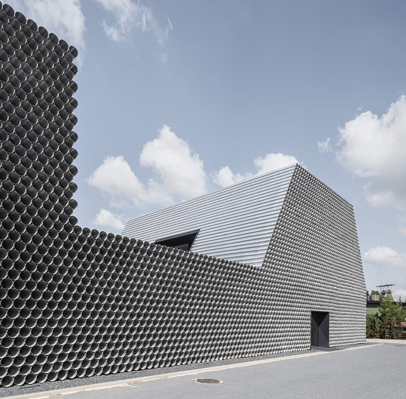
    kwk promes gambit office
    the building blends into its residential surroundings while presenting a bold, street-facing front

    Sustainability and Coexistence

    Birds and pipes don’t always mix, but at the Gambit Office, coexistence won out over control. While the architects initially considered installing bird netting to prevent nesting in the pipe-like elements, they ultimately decided to welcome avian residents. The pipes at the building’s edges were capped to prevent whistling in the wind, but otherwise, nature was invited in.

    Though the KWK Promes Gambit Office is surrounded by asphalt and truck bays, the architects carved out a bit of sky for the people inside. A rooftop terrace, tucked above the lowest section, offers employees a space for relaxing outdoors. It’s a small gesture, but one that speaks volumes about the studio’s commitment to designing even utilitarian spaces with a welcoming atmosphere.
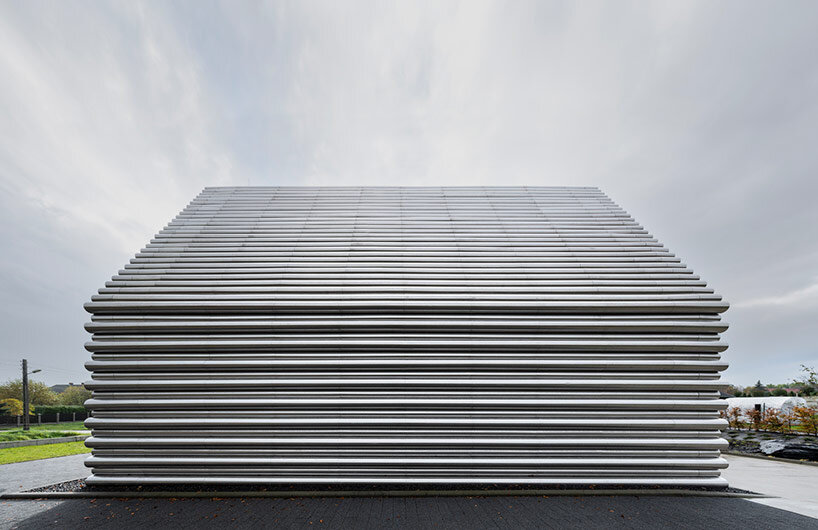
    kwk promes gambit office
    the building’s form reflects local residential architecture with pitched roofs and simple volumes
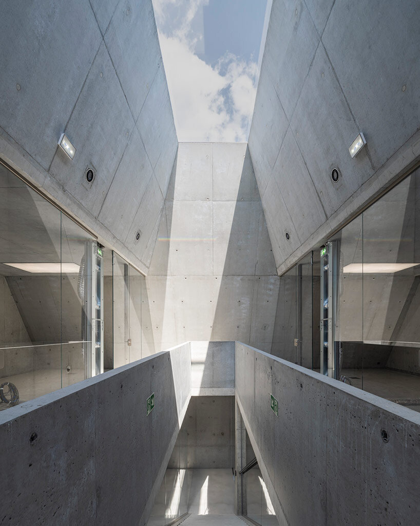
    kwk promes gambit office
    natural light enters through windows and skylights, while a rooftop terrace offers employee respite

    Conclusion

    The KWK Promes Gambit Office stands as a testament to the power of innovative design in transforming challenges into opportunities. By repurposing industrial pipes and incorporating them into the building’s design, the architects not only created a unique and functional space but also showcased the client’s product in a creative


  • Ridge Barn in Upstate NY

    Ridge Barn in Upstate NY

    Worrell Yeung Expands its Vision in Upstate NY with Ridge Barn

    Worrell Yeung completes the steel-wrapped Ridge Barn as part of a remote residential compound that includes the Ridge House in Upstate New York. The two structures occupy the same elevated site with sweeping views of the Taconic and Catskill Mountains, and together they exemplify the studio’s precise and poetic approach to building in dialogue with the land. While Ridge House established a sculptural anchor, Ridge Barn introduces a more utilitarian structure — part guesthouse, part storage facility, part pool pavilion — that extends and deepens the architectural narrative.

    Introduction to Ridge Barn

    Worrell Yeung rethinks the connection between buildings through a landscape intervention co-designed with Understory Landscape Architecture‘s Jeffrey Longhenry. Leaving Ridge House, visitors descend to the barn via a ‘trench walk,’ a carefully composed path carved into the hillside and inspired by land art pioneers like Andy Goldsworthy and Michael Heizer. Rather than a traditional walkway, this trench is a sculpted gesture in stone, one that brings movement and topography into active conversation.

    images © Rafael Gamo

    An Embedded Structure References Local Typologies

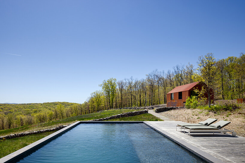
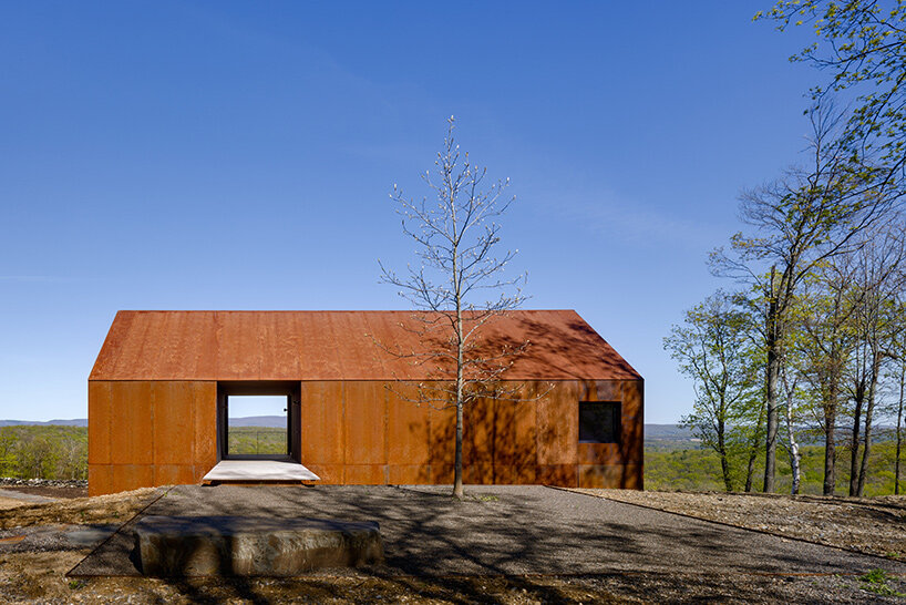
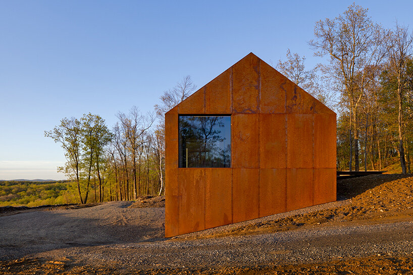
    The architects at Worrell Yeung conceived Ridge Barn as a contemporary take on the ‘bank barn,’ a typology common in the region, traditionally embedded in the landscape for multi-level access. Tucked into a slope and clad in weathering Corten steel, Ridge Barn appears both purposeful and ancient, like a rusted monolith emerging from the hillside. Its lower level serves pragmatic needs — parking, a wine cellar, a bike workshop — while its position and materiality allow it to nestle almost invisibly into the terrain.

    The barn’s upper level generously frames the landscape. An open-air breezeway bisects the plan, offering a dramatic 8-by-8-foot aperture that looks directly toward the Taconic Mountains. To one side lies a minimalist fitness space; to the other, a guest bunkhouse with an open living plan. Designed for comfort and retreat, the bunkhouse includes a compact kitchen, living, and sleeping area, topped by a loft accessible by a custom ladder. Two sculptural Lambert & Fils light fixtures, designed by Worrell Yeung, add a tactile counterpoint to the raw, industrial envelope.

    worrell yeung ridge barn
    Ridge Barn joins the neighboring Ridge House on-site in Upstate New York

    Material Honesty and Weathering is Celebrated

    Worrell Yeung ensured that its Ridge Barn didn’t just function as a guest quarters or workshop. It also acts as a discreet pool house. The lower level includes a shower, water closet, and changing area for swimmers. The pool itself sits just downslope, reached via stone pavers that continue the landscape’s stepped geometry. Two sides of the pool meet the ground plane, while the other two, clad in Corten steel, emerge as the land drops away, echoing the material and language of the barn and appearing as if set within a sculpted cut of the hillside.

    A consistent ethos of elemental materiality is applied across the site. While Ridge House is clad in corrugated metal with board-formed concrete ends, Ridge Barn’s Corten shell continues the theme of structures designed to age and mark the passage of time. The choice of untreated, industrial materials isn’t austere — it’s intentional, allowing the architecture to record weather, light, and seasonal shifts. Each component becomes an evolving part of the landscape’s palette, a physical memory of environment over time.

    worrell yeung ridge barn
    a landscape pathway is inspired by land artists like Andy Goldsworthy and Michael Heizer

    Collaboration and Design Philosophy

    Worrell Yeung worked closely with the client from the earliest stages to establish a shared language rooted in art and ecology. ‘Landscape as art, architecture elevating the experience of nature, making visible the mark of human intervention,’ is how Max Worrell describes the studio’s goal. Ridge Barn, like Ridge House before it, draws on references that range from modern land artists to vernacular farm buildings, to the quiet poetry of forest floor compositions. It’s a place where material meets metaphor, and structure becomes site.

    worrell yeung ridge barn
    mountain views are framed through an upper-level breezeway

    worrell yeung ridge barn
    Corten steel cladding visually and materially links the barn to the surrounding landscape

    Conclusion

    Ridge Barn is a testament to Worrell Yeung’s ability to create structures that not only coexist with their surroundings but also elevate the experience of nature. By combining a deep understanding of the landscape

  • Southern Spanish Villa

    Southern Spanish Villa

    Introduction to Villa 95

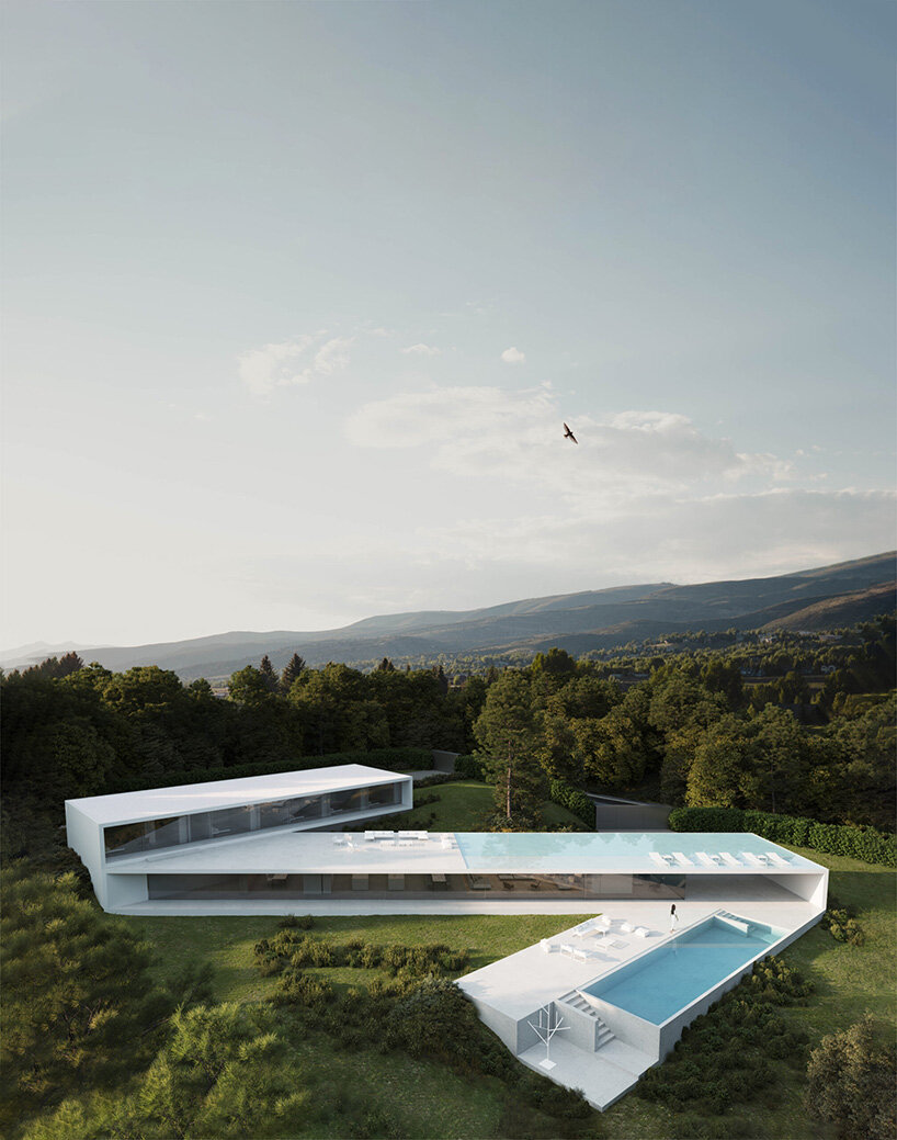
    Fran Silvestre Arquitectos designs Villa 95 as part of the real estate developer Cork Oak Mansion project in Sotogrande, crafting a residence that appears to glide across the southern Spanish landscape. Defined by a continuous architectural gesture, the three-story villa unfurls along a sharp diagonal, its elongated form maximizing the buildable area of the 2,317 square meter plot while framing views of Altos de Valderrama area. Developed by DUS Desarrollos Inmobiliarios, the house is part of an exclusive collection of six high-end villas.

    images courtesy of Fran Silvestre Arquitectos

    Architectural Design

    The Valencia-based team at Fran Silvestre Arquitectos shapes the visual identity of Villa 95 with a dynamic plywood configuration that guides the eye along a sequence of spaces. From the main volumes, seemingly connected only at their edges, interior rooms twist and interlock in a fluid choreography of circulation and perspective. This sense of movement is echoed in the spatial hierarchy of the project. The upper floor opens to a broad terrace, cantilevering above the mid-level and pulling the landscape into the domestic realm, with views stretching toward the pool and the surrounding forested terrain.

    Interior and Exterior Spaces

    Villa 95 offers 1,200 square meters of living space, including six bedrooms, a private service apartment, and dual kitchens, one for daily use and one for support. The program caters to both leisure and lifestyle with a full spa, multipurpose room, and a gym integrated into the design. Outdoors, a shimmering pool and a minimalist reflecting pool further enhance the sculptural quality of the house while creating zones for relaxation and contemplation.

    flowing three-story villa by fran silvestre glides across the southern spanish landscape
    the residence appears to glide across the southern Spanish landscape

    Additional Features

    flowing three-story villa by fran silvestre glides across the southern spanish landscape
    Villa 95 is defined by a continuous architectural gesture

    flowing three-story villa by fran silvestre glides across the southern spanish landscape
    the three-story project unfurls along a sharp diagonal

    flowing three-story villa by fran silvestre glides across the southern spanish landscape
    interior rooms twist and interlock in a fluid choreography of circulation and perspective

    Conclusion

    In conclusion, Villa 95, designed by Fran Silvestre Arquitectos, is a remarkable residence that seamlessly integrates into the southern Spanish landscape. The continuous architectural gesture and dynamic plywood configuration create a unique visual identity, while the interior and exterior spaces provide a perfect blend of leisure, lifestyle, and relaxation. The villa’s sculptural quality, enhanced by the shimmering pool and minimalist reflecting pool, makes it a true masterpiece of modern architecture.

  • Timeless Interior Colour Schemes

    Timeless Interior Colour Schemes

    Choosing colours for the home is a seriously daunting decision for most homeowners. Context is everything and colours should always be selected according to a few things – the quality of natural light your particular home receives, the style and location of your home, and the feel you’re striving to achieve. That said, here are five colours that are bound to have longevity in the home. The specific shade you choose is down to a decent dose of trial and error, also known as test pots.

    ## 1. Slate Green
    I can vouch for slate green in the home because we recently installed a slate green kitchen that makes my heart sing. It’s earthy, rich, sophisticated and packs a punch in all the right ways. It’s especially impactful paired with brass, other earthy tones and deep greys. Yes, green might be having a moment in interiors right now, but that doesn’t mean it won’t be relevant in years to come.

    ## 2. Sage Green
    There are so many versions of a sage green. In fact, I’ve used three different versions of a sage green in our own home renovation recently, all adapted to suit the natural light of each space. Be mindful not to opt for a sage that’s too “spearminty” or too bright. Its effect should be cool and calm, so if your sample says otherwise, try again. For example, as seen in Carlene’s bedroom, where sage green walls create a serene atmosphere.

    ## 3. Navy Blue
    Navy blue is such a classic and so resistant to the changing trends that it’s almost a no-fail. Be mindful, however, that your navy doesn’t throw a strong purple unless the light in the space really calls for it. If you opt for a navy shade on the walls, don’t be afraid to go really deep, especially in a media room, bedroom or low light area. It will create mood and atmosphere and will make your art shine bright, as shown in this stylish kids bedroom stylish kids bedroom.
    ## 4. Powder Blue
    Powder blue began having a moment again a couple of years ago, but in relationship with dusty pinks and light greys. Whilst this particular combination of colours feels like it’s been a bit exploited, powder blue paired with rich timbers, tans, creams and even some navy will prove to be a very long-serving combination, as seen in this powder blue kitchen powder blue kitchen.

    ## 5. Earthy Grey
    Note that I’m specifically referring to ‘earthy’ greys and not the broader spectrum of greys when I refer to this colour. I’ve seen some very unappealing use of greys with purple undertones that can make your decorating job particularly difficult and completely change the feel of your space. Regardless of the depth of the colour (light or dark), earthy greys will have some very subtle green or brown undertones and sit perfectly against deep greens and deep timbers, as shown in this dulux wholeself example.

    In conclusion, choosing the right colour for your home can be a daunting task, but by considering the quality of natural light, style, and location of your home, you can make an informed decision. The five colours mentioned above – slate green, sage green, navy blue, powder blue, and earthy grey – are all great options that are likely to stand the test of time. Remember to test the colours with sample pots and consider the undertones to ensure the best result. This article was originally published on 27 May 2020 at 1:37pm, but has been regularly updated to keep the information current.

  • Dayi Design Revives Historic Site

    Dayi Design Revives Historic Site

    Historic Stone Alleyways Reactivated in Nanjing

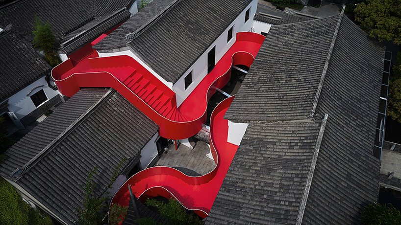
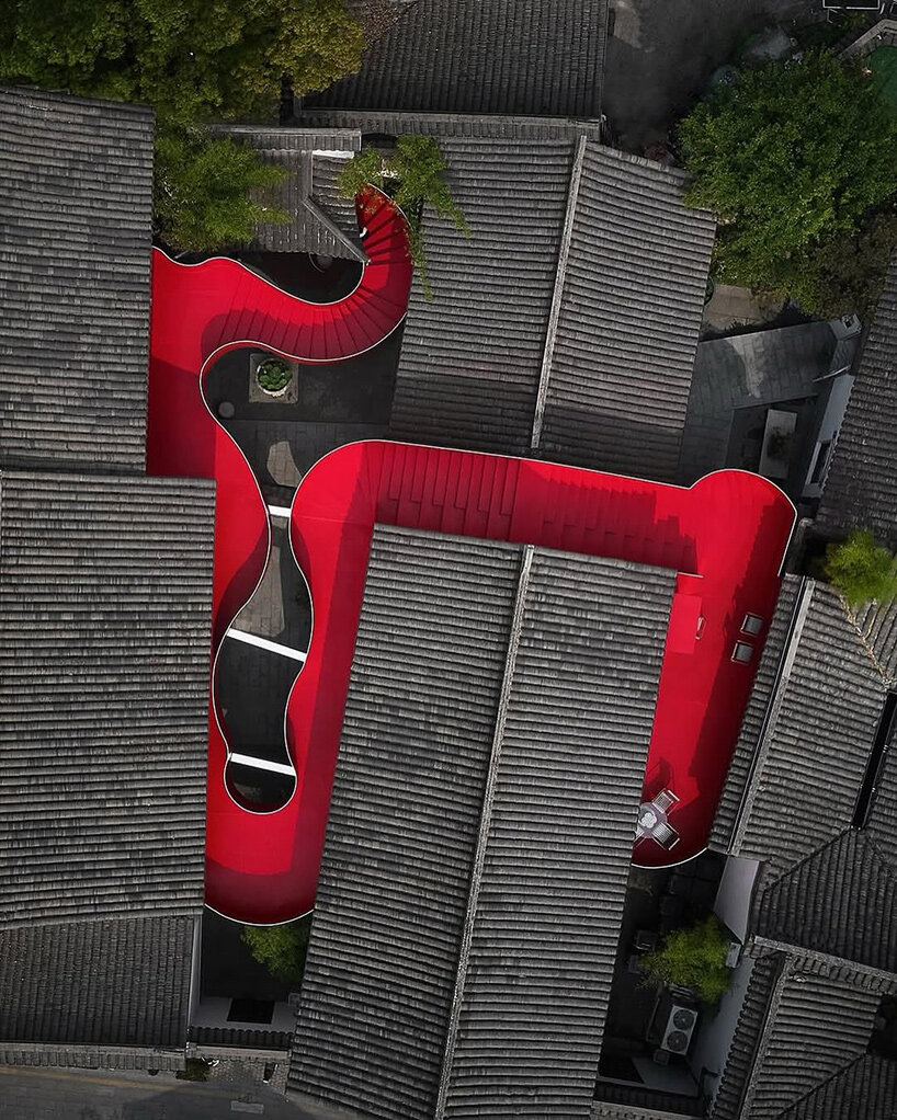
    In Nanjing’s centuries-old Qinhuai River district, where tiled rooftops and stone alleys express the area’s layered history, Dayi Design completes a bold intervention titled Red Lobster. With the renovation project, the architects reimagine heritage without erasing it. The 2,000-square-meter crayfish-themed restaurant and retail space is less a renovation than a recalibration, an architectural weaving of old and new.

    ‘This area exudes an atmosphere rich with cultural depth and the lively essence of everyday life,’ the architects explain. But rather than cordon off history as artifact, Dayi Design roots Red Lobster in continuity. The result is a highly tactile, walkable, and visually dramatic urban experience, all threaded together by a vibrant outdoor stair. The project at once draws from its surroundings and offers something entirely new.

    images © Cong Lin

    Dayi Design Demonstrates Adaptive Reuse

    Preserving historical architecture, according to the architects at Dayi Design, is not about wrapping it in reverence. At Red Lobster, they’ve demonstrated how adaptive reuse can bring new energy to aging spaces: ‘The optimal approach to safeguarding historical monuments isn’t through mere veneration but by making them accessible, tactile, and functional.’ The site was approached with restraint — minimal demolition, maximum reuse — and a clear goal of long-term sustainability.

    Instead of treating heritage like porcelain, Dayi Design handled it like clay. Removed architectural elements were reused, Taihu stones collected and re-integrated, and the new interventions, most notably the dramatic, sculptural red staircase, were installed with a conscious gap between past and present, physically and conceptually.

    dayi design red lobster
    Dayi Design transforms a historic site along Nanjing’s Qinhuai River into a new retail space

    A Staircase to Evolve a Crimson Dragon

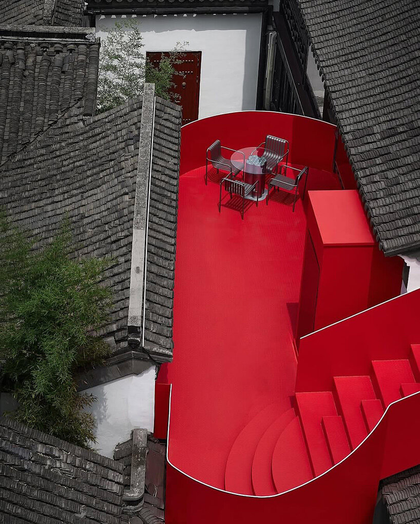
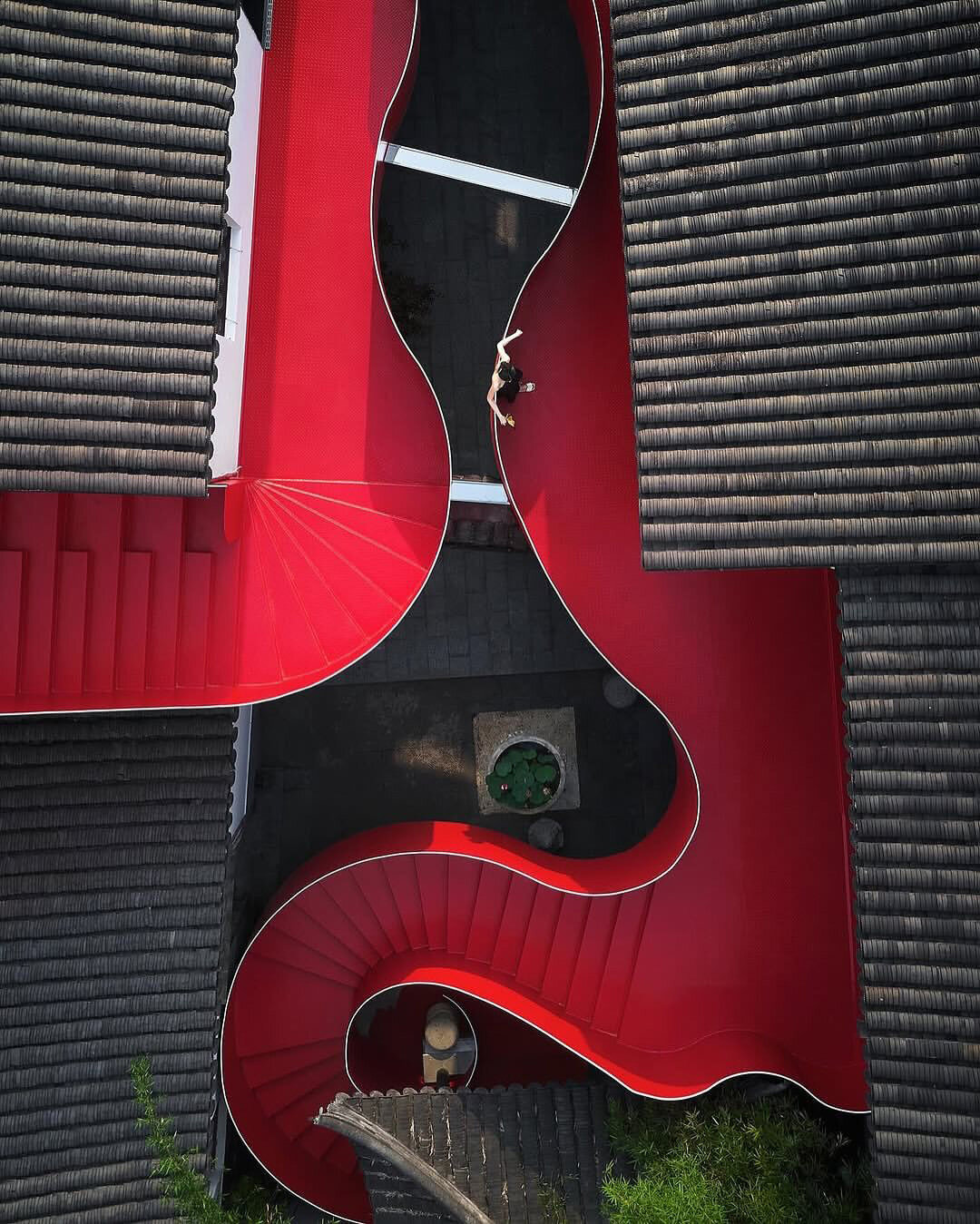
    At the heart of Dayi Design’s Red Lobster is a red steel staircase that snakes from the ground floor to the roof like a dragon coiled around a scroll. ‘The staircases’ sinuous forms, reminiscent of a protective dragon, weave through the dense architectural landscape, creating a striking visual contrast,’ the architects note. Their bright red hue slices through the muted tones of the traditional buildings, an electrifying punctuation mark within the historic fabric.

    The staircase is not only an aesthetic gesture. ‘Form should serve function,’ say the architects, and this structure lives up to that mantra: linking previously disconnected ‘islands’ of the site, doubling as a fire escape, and offering shelter from rain at the ground level. Along its path, visitors are offered new glimpses of Nanjing’s iconic Dabaoen Temple, an architectural promenade that reveals itself in stages.

    dayi design red lobster
    Red Lobster blends old and new through adaptive reuse and sensitive architectural intervention

    Material Palette: A Blend of Old and New

    If the staircase is Red Lobster’s backbone, the material palette is its skin. Dayi Design fused glass, metal, and modern construction with the silhouette of traditional Chinese architecture to create what it describes as a ‘Cyber Chinese Style.’ The result is a complex layering of time periods: past, present, and a speculative future all coexist in harmony.

    This hybridity is the project’s driving logic. ‘We blend modern materials with classical styles,’ the team explains, using simplified forms to allude to tradition without mimicking it. The effect is one of deep-rooted familiarity with a jolt of the unexpected, like walking through a temple and finding a portal.

    dayi design red lobster
    preservation is prioritized as the space is accessible, functional, and rooted in daily life

    dayi design red lobster
    a red staircase connects previously separate buildings while evoking the form of a protective dragon

    Conclusion

    In every detail of Red Lobster, Dayi Design shows how careful interventions can inject new life into historic places without stripping them of their identity. By using local materials,

  • Memorial Park Honors Ethiopian Airlines Victims

    Memorial Park Honors Ethiopian Airlines Victims

    ET-302 Memorial Park: Architecture of Absence

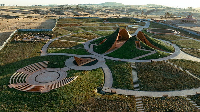
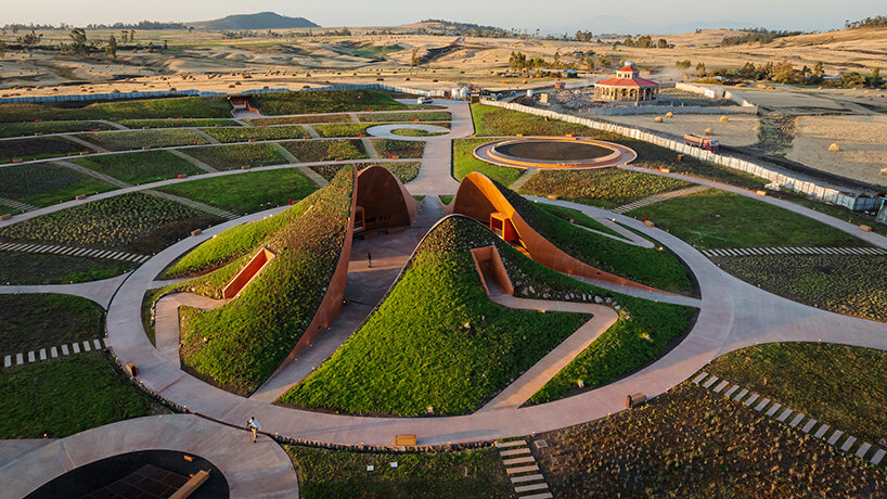
    Along a quiet farmland of Ethiopia, ET-302 Memorial Park is designed as a place to grapple with grief. This solemn and spatially layered landscape commemorates the 157 lives lost in the tragic Ethiopian Airlines Flight 302 crash in March 2019. More than just remembering, it reveals. Through deliberate spatial sequencing, the space draws visitors into an emotional topography of absence, quietly echoing the void left behind while guiding them toward reflection, connection, and eventual healing.

    Foundational Principles

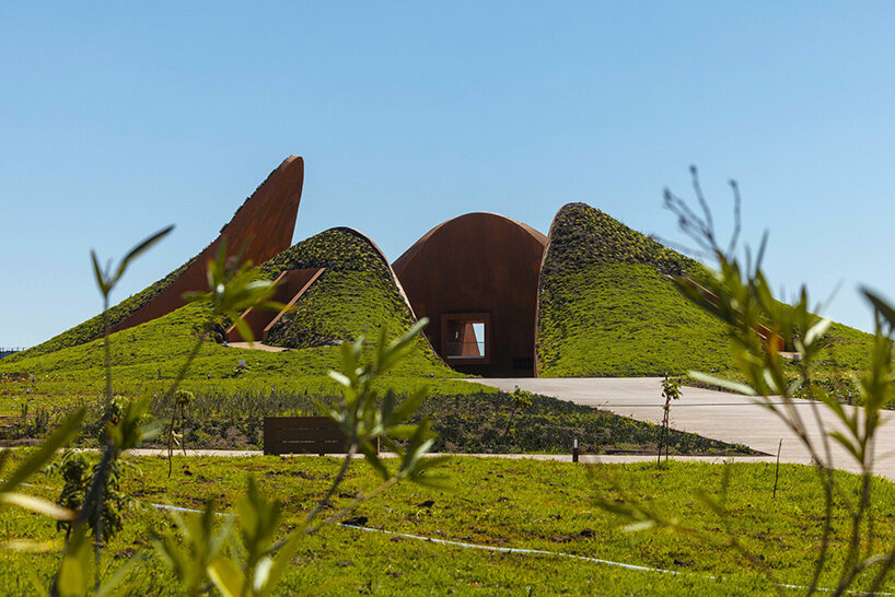
    The memorial is built on the foundational triad of absence, revelation, and healing. These aren’t abstract ideas but architectural principles woven into the geometry and movement of the site. The experience begins at the southwest entrance with a path that charts the final six minutes and forty-four seconds of Flight ET-302’s journey. Step by step, the path draws visitors closer to a commanding cluster of four tilted, earth-red concrete forms — each one a visceral reminder of the victims’ final moments.

    images © Aron Simeneh

    Symbolism Shaped into the Land

    ET-302 Memorial Park centers around its monument, an evocative composition of four sculptural structures that rise from the exact crash location. Each is imbued with geographic significance — Africa, Europe, North America, and Asia — arranged by descending height. This isn’t decorative symbolism. Instead, it’s geography as grief. Echoing the chiseled textures of Ethiopia’s rock-hewn churches and the tectonic drama of the Rift Valley, these forms are deeply rooted in place. Beneath them, plaques mimic Boeing 737 MAX windows, personalizing the abstraction with names and continents. Echoes of visitors’ voices resonate here as a subtle acoustic thread weaving through memory.

    The architectural narrative is extended with the Healing Monument, A Corten steel sculpture poised like a wind-carved wing between the Asian and African structures. The surface, weathered and pierced with light-catching perforations, recalls both the fragility and strength of aircraft skin. Nearby, an amphitheater of six concentric rings provides a stage for collective remembrance, where families and communities can gather, speak, and listen. Designed for accessibility and holding over 360 people, it transforms memory into a shared act of resilience.

    ET-302 memorial park
    ET-302 Memorial Park commemorates the 157 lives lost in the Ethiopian Airlines Flight 302 crash

    A Monument Rising from the Earth

    A rock garden surrounds ET-302 Memorial Park, as a quiet shift in intention that speaks volumes. Initially imagined as a flower-filled tribute, the garden evolved into something more enduring. Upright local stones placed deliberately among two concentric walking paths. There’s a certain humility to these massive rocks — weathered, unmoved, contemplative — inviting visitors to pause, move slowly, and confront memory as something unchanging, yet ever-present.

    A low-profile facility building sits near the main entrance, its solar-panel shade structures and green roofs blending into the terrain. Parking, security, and restrooms are discreetly housed within two Corten steel-wrapped wings, joined by a central lobby that continues the park’s material and visual language. Walls throughout display plaques honoring those who shaped the memorial, creating a quiet acknowledgment of collective effort.

    ET-302 memorial park
    three principles — absence, revelation, and healing — weave into a sequence of architectural moments

    ET-302 memorial park
    a pathway traces the flight’s final six minutes and forty-four seconds toward the central monument

    ET-302 memorial park
    four inclined concrete forms at the crash site symbolize the continents of the victims

    Conclusion

    ET-302 Memorial Park is a poignant tribute to the lives lost in the tragic Ethiopian Airlines Flight 302 crash. The park’s thoughtful design

  • Mykonos Architects’ Wedge-Shaped House

    Mykonos Architects’ Wedge-Shaped House

    Introduction to N’Arrow

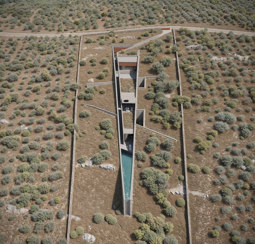
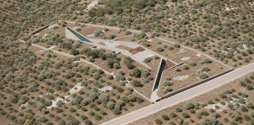
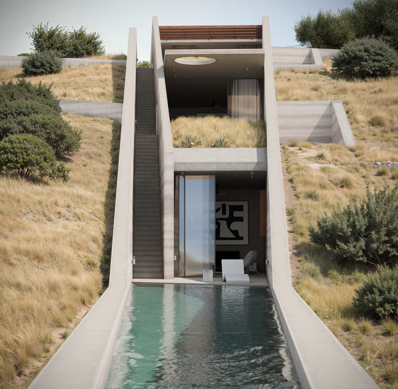
    Set to be carved into the olive-dotted hills of Crete, Mykonos Architects designs a home titled N’Arrow to respond directly to the steep topography and slender dimensions of its site. The underground, rammed-earth project is designed to avoid imposition, and instead works with the natural contours of the land, inviting the surrounding environment to shape its form. Olive groves and rolling terrain are not backdrops but rooftops, and but co-authors in the architectural narrative, pushing the residential space toward harmony rather than dominance.

    A fifteen-meter setback regulation, typically a limiting factor, sparked the defining concept behind N’Arrow. Mykonos Architects saw not a constraint but a creative opportunity, transforming the elongated form of the plot into a narrow, wedge-like structure that nestles into the hillside. This bold, linear geometry sets the tone for the home’s identity, drawing attention to the power of architectural adaptation when guided by site-specific conditions.

    images © Marinkovic Marco

    Design and Layout

    At the heart of N’Arrow lies a spatial system which the team at Mykonos Architects defines by three solid walls. Two serve as corridors of movement, tracing the staircases that flow across levels, while the third outlines the private zones of the home. These boundaries are not rigid but intentional, shaping how inhabitants circulate through and interact with the residence. The descent from entry to living spaces mirrors a gradual immersion into the landscape, with the external staircase choreographing this transition.

    Split across three levels, the home uses vertical layering to offer both intimacy and openness. The first level introduces a shaded outdoor sitting area that acts like a hidden courtyard — part-threshold, part-retreat. Inside, living areas orbit around a central, circular volume that houses auxiliary functions, while a sculptural metal shading device projects outward, framing views of the hills and softening the sunlight. This interplay of exposure and enclosure recurs throughout the home.

    n'arrow mykonos architects
    setback regulations are transformed into a guiding principle for the home’s linear form

    Layers of Light, Shade, and Space

    Mykonos Architects composes layers of light, shade, and space to create a unique living experience. The team defines the spatial system by three solid walls, which serve as corridors of movement and private zones. The boundaries are not rigid but intentional, shaping how inhabitants interact with the residence.

    Quiet Interiors Beneath the Earth

    On the second level of N’Arrow, Mykonos Architects employs glass partitions to separate sleeping areas, maintaining openness while preserving privacy. A sun shaft pierces through the structure, bringing light and ventilation into the more subterranean spaces. Canopies and slanted walls draw the eyes outward while regulating sun and shade. The deliberate framing of views through these angled elements echoes the sculptural quality of the terrain itself.

    The third and uppermost level is conceived as a flexible zone — a space that can shift in function through movable panels. The line between inside and outside blurs here, as the pool and planted sun shaft stretch across the design’s axis, linking the building’s gesture to its context. This continuity reinforces the narrative of a house embedded in the land rather than placed upon it.

    n'arrow mykonos architects
    circulation and privacy are defined through three strict walls that structure movement and living areas

    Sustainable Materials

    Materially, N’Arrow is literally grounded in its surroundings through the use of rammed earth. Mykonos Architects chose the material for its low environmental footprint and its resonance with the local geology. By using compacted natural soils, often sourced directly on site, the home minimizes transportation and processing impacts. More than sustainable, the material choice expresses a deeper ethos of belonging.

    The thermal mass of rammed earth brings passive cooling and warmth, enhancing comfort without mechanical intervention. Its ability to regulate humidity and temperature is both practical and poetic, contributing to an atmosphere that feels connected to seasonal rhythms. Visually, the warm, earthy tones of the walls reinforce the home’s embeddedness in the terrain, making it appear less like a foreign object and more like a geological evolution.

    n'arrow mykonos architects
    an external staircase choreographs the descent through the home’s layered spaces

    Conclusion

    N’Arrow, designed by Mykonos Architects, is a testament to the power of architectural adaptation and the importance of working with the natural environment. By using rammed earth and carefully composing layers of light, shade, and space, the team has created a home that not only minimizes its impact on the land but also enhances the beauty of its surroundings. As a result, N’Arrow becomes a part of the landscape, rather than a imposition upon it, creating a unique and harmonious living experience for its inhabitants.

  • Laura Ellen Bacon weaves willow

    Laura Ellen Bacon weaves willow

    Introduction to Into Being

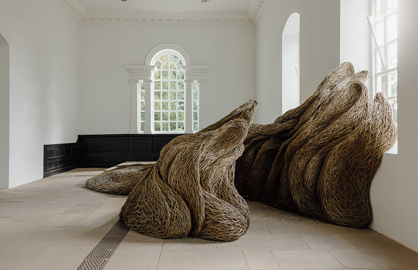
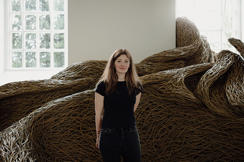
    Laura Ellen Bacon brings her distinctive woven forms to the atmospheric Chapel at Yorkshire Sculpture Park in her latest site-specific exhibition, Into Being, on view from April 5th to September 7th, 2025. The monumental installation — entirely hand-woven from Somerset willow — emerges from the fabric of the historic interior as if it were always meant to be there. It’s a material response to architectural memory, growing in dialogue with the building’s tall stone walls, filtered light, and resonant acoustics.

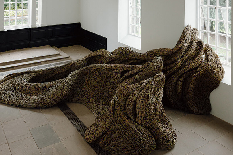
    The new sculpture occupies and envelops the space. Creeping six meters into the nave and climbing three meters up the walls, the work wraps around the chapel’s features like a living organism. Its abstract contours draw from natural archetypes — seed pods, burrows, cocoons—inviting visitors to stand within and experience the work from the inside out. The structure feels both invasive and protective, unsettling and serene.

    images © India Hobson, courtesy YSP

    A Contemporary Take on Traditional Willow Weaving

    Laura Ellen Bacon constructs the entire piece on-site over an eight-week period, using willow like an architect uses line, drawing directly into space at Yorkshire Sculpture Park. In a nod to place-based making, she incorporates branches from fallen beech trees found on YSP’s grounds to create the framework of the self-supporting form. The result is a work that speaks to primal shelter: a space that reconnects human instinct with the natural world through scale, materiality, and rhythm.

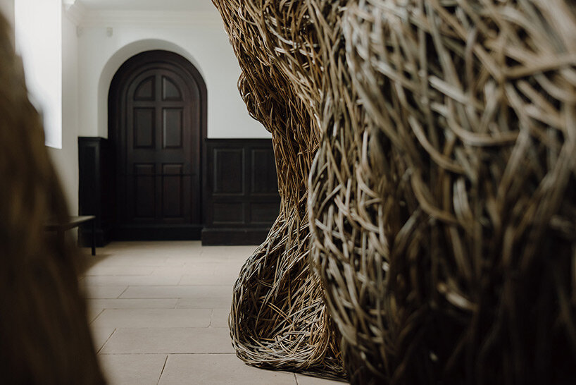
    The artist taps into the 10,000-year-old tradition of willow weaving, but her approach is resolutely contemporary. Over two decades, she has refined her own sculptural language — part drawing, part architecture, all deeply physical. Working primarily alone, she channels her focus into each twist and tension of the rods, embedding memory into every knot. Her technique resists spectacle in favor of intimacy, inviting close inspection of the craftsmanship and its meditative repetition.

    laura ellen bacon yorkshire
    Laura Ellen Bacon transforms the 18th-century Chapel at YSP with a monumental willow installation

    Into Being: Laura Ellen Bacon Explores Process as Presence

    Laura Ellen Bacon’s choice of material — Somerset’s Dicky Meadows willow — reinforces the environmental sensitivity of the work at Yorkshire Sculpture Park. Lightweight, strong, and renewable, the willow allows her to carve sweeping gestures into space without industrial intervention. Once the exhibition concludes, the sculpture will be dismantled and the materials returned to the landscape to support local wildlife. ‘It will be a sensory experience,’ Bacon says. ‘There is so much willow, and it has a beautiful aroma… the light from the Chapel windows will affect and change the work throughout the day.’

    Into Being is imbued with a sense of growth and duration. More than a static sculpture, the work reflects an evolving dialogue between artist, material, and space. Bacon’s process begins with sketches but relies on instinct to guide the final form. As the title suggests, the piece becomes almost animate, its folds and tendrils giving shape to something that feels alive. The experience is both spatial and emotional: visitors encounter a work that is at once strange and familiar, monumental and delicate.

    laura ellen bacon yorkshire
    the sculpture grows organically through the space, evoking natural forms like cocoons and seed pods

    laura ellen bacon yorkshire
    visitors can step inside the structure and experience its folds from within

    laura ellen bacon’s organic willow installation weaves through yorkshire sculpture park
    the artist constructs the work entirely by hand using Somerset willow and local beech branches

    Project Information

    Exhibition: Into Being

    Artist: Laura Ellen Bacon | @lauraellenbacon

    Location: Yorkshire Sculpture Park | @yspsculpture

    On View: April 5th — September 7th, 2025

    Photography: © India Hobson | @indiahobson

    Conclusion

    Laura Ellen Bacon’s Into Being is a thought-provoking and visually stunning exhibition that showcases her unique approach to willow weaving. By combining traditional techniques with contemporary sensibilities, Bacon creates an immersive and emotive

  • Make Your TV the Star of Your Room

    Make Your TV the Star of Your Room

    Most modern living rooms tend to centre around a large TV screen. Yet, how do we style the space in a way that is both aesthetically pleasing and conducive to a great entertainment experience? To find out, we spoke to two interior stylists who shared their expertise on how to style your living room for top-notch viewing time.

    The key to a great viewing experience starts with the right lighting. A living room demands mood lighting, so most designers prefer a dimmer switch. If this can’t be done, lamps are a great alternative. “The best lighting for TV viewing is to have a soft light behind you, not in front of you. I always use lamps for that softer light as opposed to direct light above you,” says designer Mia Lake. “But you don’t want to have a window behind you because it can be hard to see the screen with light coming through.”

    Lamps are great to achieve soft, dim lighting that doesn’t interfere with your screen. Picture: Kirill/Unsplash

    Lighting will be less impactful on your viewing experience depending on the TV you have. For instance, the Hisense Dual Cell TV uses the latest technology to ensure a high-quality picture, including deeper blacks and more explosive colours, giving even more impact.

    Layout

    The layout will largely depend on the size and shape of your living room, but there are a few things to consider. “I try not to have the TV as the focal point as soon as you walk into a room,” says Mia. “The other thing is that you want it central to the main sofa.” Ideally, the entrance will be to the side of your screen and your most spacious seating will be positioned square in front of it.

    The best layout has your largest seat square in front of the TV. Picture: Michael Oxendine/Unsplash

    Mounted vs. Standing

    This comes down to personal preference and space available. However, Mia prefers standing TVs. “Because TVs have become so thin, it’s not necessary to do that recess niche in the wall,” she says. “Some TVs have beautiful stands or legs now, so I like to opt for them to sit on furniture.”

    When your TV looks this good, it can become part of the decor. Picture: Hisense

    Kerena Berry, founder of Designbx, finds that most TVs in the homes she works on are mounted, with inventive ways to incorporate the screen into the decor. “People can collaborate the TV with artworks and turn it into sort of an art gallery wall,” she shares. “Another idea is to keep a family portrait on the TV as a screensaver. It then becomes part of a huge family gallery on the wall.”

    Hide Cables

    Cords and cables can be an eyesore and a hazard – especially if you have small children. The best way to organise them is through stick-on cable clips. “You can organise the cord so it runs across the TV and down the leg,” Mia notes. “I also then do that to the back of the cabinet and hopefully that hides all your cords!”

    If you have a mounted set, you can always disguise the cords by painting plastic cable covers the same colour as your walls. However, Kerena prefers other methods. “You can also sit a beautiful stack of books or a nice plant nearby to disguise them,” she says. “Or get beautiful wood cable boxes or cane baskets – which is a good one because you can thread the cable through it – that look like an ornamental piece.”

    Decor

    You don’t want to overwhelm the viewing space, but the tip is to ensure your TV isn’t the main sculptural object. “It comes down to how the room is laid out, but I generally like to put a tall lamp or plant to the side so there’s some interest and balance to the items that are sitting [on the cabinet or in the area],” Mia says.

    Depending where your TV sits on or above your cabinet, you could cluster some decor together. Picture: Dominika Roseclay/Pexels

    “It can be also nice to have a little tray with a plant and a candle, and cluster some objects.”

    Conclusion

    In conclusion, styling your living room for a great viewing experience requires careful consideration of lighting, layout, and decor. By following these tips and considering your personal preferences and space available, you can create a room that is both aesthetically pleasing and conducive to a great entertainment experience. Remember to keep your TV as a part of the overall decor, rather than the main focal point, and don’t forget to hide those pesky cables. With a little creativity and planning, you can create the perfect space to enjoy your favourite shows and movies.

    This article was originally published on 15 Sep 2020 at 3:39pm but has been regularly updated to keep the information current.

  • Ridge House by Worrell Yeung

    Ridge House by Worrell Yeung

    Introduction to Ridge House

    In a remote corner of Upstate New York, architecture studio Worrell Yeung completes Ridge House, a residential project perched on a wooded knoll in lower Columbia County. Designed for a young family of four, the home carves a subtle presence into an 88-acre ridgeline, engaging deeply with the surrounding terrain and panoramic mountain vistas. Sharing the site is a second structure, the Ridge Barn, a formally aligned yet materially distinct companion project.

    Initial Impression and Design Approach

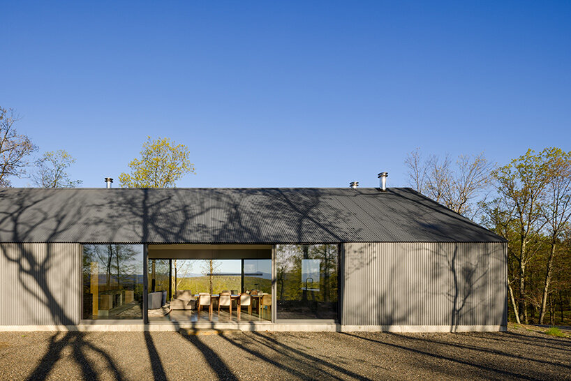
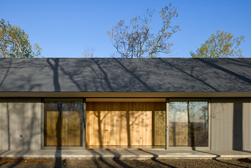
    At first glance, Ridge House appears as a minimalist gabled silhouette stretching 128 feet along the ridgeline. Rather than dominating the site, Worrell Yeung embeds the structure into the natural contours of the forested plateau. The architecture is defined not by ostentation, but by a rigorous balance of geometric clarity and tactile materiality. The approach is intentionally slow — through a winding drive that builds anticipation — culminating in an unexpected entry: not a front door, but a passage carved into the center of the home, flanked by textured board-formed concrete.

    images © Rafael Gamo

    Worrell Yeung Brings the Outside In with Custom Details

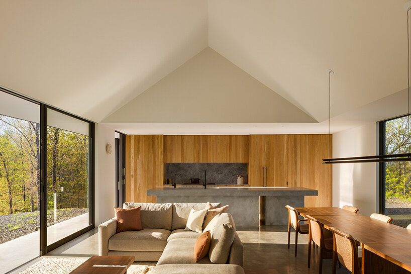
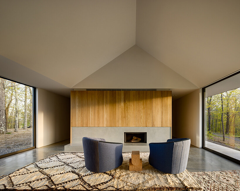
    Within this central threshold, the Ridge House splits into two wings: a communal space open to light and views, and a private wing receding into the woods. In the shared living area, the team at Worrell Yeung unifies kitchen, dining, and lounge into a soaring lofted room beneath a 20-foot gabled ceiling. Concrete elements — a monolithic kitchen island on one end, a fireplace on the other — anchor the room, while 30-foot glass spans offer uninterrupted views of both the Catskill and Taconic mountain ranges.

    Indoor-outdoor flow is extended by a west-facing veranda, which serves as a quiet platform for watching light shift across the Catskills. Here, Worrell Yeung also nods to expressive craftsmanship. Over the dining area, the architects collaborated with Lambert & Fils to design custom lighting inspired by the gabled form itself. The fixtures project light both upward to the ceiling and downward to a bespoke Bien Hecho dining table, mirroring the structural language of the house. Inside, Colony’s interior design balances warm layers and cool tones, especially in the indigo-hued private spaces.

    Worrell Yeung Ridge House
    the home sits humbly within the landscape with a minimalist gabled form

    Private Spaces become Architectural Sanctuaries

    Beyond the living core, the private wing of Ridge House continues Worrell Yeung’s commitment to quiet geometry and detail. A long corridor faces east, drawing the eye toward the Taconic ridgeline, while a continuous white-oak wall conceals entrances to the two guest bedrooms and the primary suite. These rooms are defined not by ornamentation but by their relationship to the land: each features an expansive 7-by-9-foot picture window. Because the windows are too large to open traditionally, the architects inserted a cleverly disguised ‘visionless’ wood panel that allows for natural ventilation.

    At the southern end of the home, the primary suite becomes a meditation on rhythm and repose. Worrell Yeung employs a repetition of square window forms, three of which are paired with operable wood inserts. One window frames a deep concrete soaking tub, offering the owner a contemplative soak with views west to the Catskills. The shower and vanity are placed within the same open volume, reinforcing the architectural purity of the space. Like the rest of the house, the suite operates within a quiet 8-by-8-foot modular logic — a measured cadence that links the Ridge House to the Ridge Barn, and to the larger landscape it inhabits.

    Worrell Yeung Ridge House
    a central, carved-out threshold replaces a traditional front door

    Worrell Yeung Ridge House
    the main living space features a lofted ceiling and 30-foot glass openings

    Worrell Yeung Ridge House
    oversized windows frame views of the mountains beyond

    Conclusion

    Ridge House is a masterclass in understated yet powerful design, blending seamlessly into its surroundings while providing a unique and contemplative living space for its inhabitants. Through its use of natural materials, thoughtful design, and emphasis on connection to the outdoors, Worrell Yeung has created a home that not only complements its environment but becomes an integral part of it. The careful balance of geometric clarity, tactile materiality, and expressive craftsmanship makes Ridge House a standout example of modern residential architecture, one that invites reflection, peace, and a deep appreciation for the natural world.