Author: cozyspaces.haelthyh@gmail.com

  • Printemps NY

    Printemps NY

    Introduction to Printemps New York

    If Printemps Paris is a grand cathedral of retail, its newly unveiled New York concept is a bold, transatlantic reinterpretation — less sacred, more subversive. Forget the grand staircases of Boulevard Haussmann. Here, visitors step through One Wall Street’s Art Deco bronze doors into a fantastical playground informed by experimentation and New York City heritage.

    Designed by architect Laura Gonzalez, the 55,000-square-foot space spans two floors, weaving together retail, hospitality, dining, and curated experiences in an ever-evolving environment. Just in time for spring, Printemps New York is set to open its doors to the public on Friday, March 21st, 2025.

    images © Gieves Anderson for Printemps New York

    Printemps: ‘Not a Department Store’

    Printemps introduces its retail concept to New York’s evolving Financial District. Curated by architect Laura Gonzalez, the 55,000-square-foot space spans two floors and integrates retail, hospitality, dining, and curated experiences in an adaptable layout.

    To unify the landmark Art Deco One Wall Street building with its 1960s modern glass-and-metal extension, Printemps enlists Laura Gonzalez for her ability to blend traditional and contemporary design. ‘We were very inspired by the heritage of Printemps — the mosaics, the stained glass, the patterns, the original art — but this is in New York,’ Gonzalez explains. ‘It’s a new story. It’s a city where everything is possible.’
    printemps new york
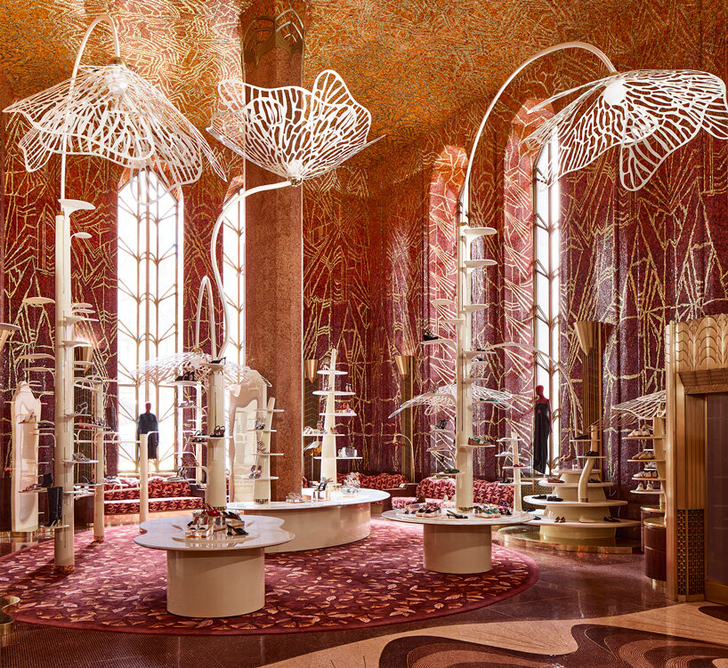
    the Red Room occupies the former Bank of New York entrance with its original 1920s red ombré and gold mosaic

    Parisian Art Nouveau Meets New York Art Deco

    Gonzalez modernizes classic materials and pioneers new ones throughout the interiors of Printemps New York. Classic oak floors are inlaid with natural stone, vintage-style Art Nouveau tiles reinterpret historic motifs, and what appears to be marble tabletops are actually compressed recycled plastic from the fashion industry. The store’s furniture, crafted entirely from upcycled materials, marks a first for large-scale retail design. Antique pieces sourced from French flea markets further enhance sustainability efforts.

    The so-called Red Room occupies the former Bank of New York entrance with its 33-foot ceilings and original 1920s Hildreth Meière red ombré and gold mosaic. To preserve the historic walls, Gonzalez devised an independent ‘forest of flowers’ made from ecological resin, designed specifically for this project. ‘Constraints bring creativity,’ says Gonzalez. ‘In the Red Room, we couldn’t attach anything to the walls, so we created freestanding structures that enhance, rather than disrupt, the space.’
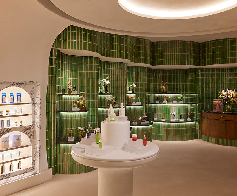
    printemps new york
    Laura Gonzalez merges Art Deco heritage with modern design at One Wall Street

    The Retail Experience

    The retail experience unfolds through ten uniquely designed sections, each offering its own identity while maintaining cohesion. The Broadway entrance leads to the Playroom, a vibrant, multi-colored marble space housing casualwear, gifts, and the all-day Café Jalu. The Sneaker Room, featuring an LED ceiling installation, offers a futuristic shopping experience, while the Salon, with its intricate wood flooring and floral textiles, sets the stage for women’s ready-to-wear and accessories.

    The design incorporates works from international artists and studios. Paris-based Studio Pierre Marie reimagines Printemps’ stained-glass legacy with a modern approach, while Brooklyn sculptor William Coggin creates an organic, coral-inspired bar counter and French artist Charles Kaisin contributes an intricate bird installation to The Salon.
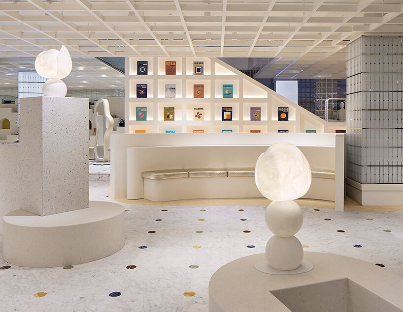
    printemps new york
    sustainable innovation defines the space with recycled plastic and upcycled antique furniture

    Dining and Evening Experiences

    The Boudoir, a focal point for evening wear, vintage clothing, and fine jewelry, features opulent double-height ceilings, warm moon-gold metal cladding, and Atelier Maury’s cracked lacquer screens. An adjacent pink marble staircase leads to the cozy, ground-level Red Room Bar, designed with rich red jasper marble and stained glass to create an intimate ambiance.

    Printemps’ fine dining concept, Maison Passerelle, blends Parisian and New York influences with hand-painted tiles, floral plaster bas-reliefs, and an Art Nouveau mosaic floor. The restaurant features a large stained-glass window by Pierre Marie and a fresco created using AI-generated images of sunsets from former French colonies, which Gonzalez transformed into a mural executed by Atelier Roma.
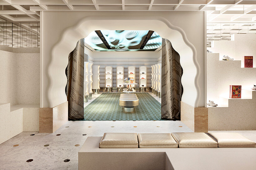
    printemps new york
    the Playroom has a vibrant marble entry while the Sneaker Room

  • Alpina Expands Farmhouse

    Alpina Expands Farmhouse

    Introduction to BS Hof House

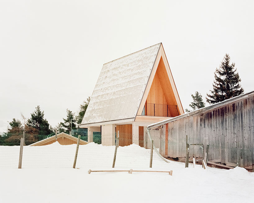
    A nineteenth-century Northern Italian farmstead, known as BS Hof House, receives a modern addition by Alpina Architects. At an altitude of 1,300 meters (4,265 feet), the site is located in Nova Ponente, a town in the province of Bolzano. This farmstead has been a part of the local landscape since 1850. Originally constructed as a family farm, the home has gradually evolved over time with additional structures, forming a small cluster that gives it a distinct village-like character. The latest addition to the property introduces a contemporary volume that respects the historical integrity of the original farmhouse.

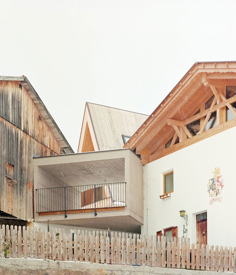
    The farmstead has long maintained a balance between traditional construction and practical farm functions. The main house is built in stone and plastered, while the secondary structures, including barns and stables, feature wooden construction. This material contrast defines the hierarchy among the buildings. The farmhouse itself is spread across three levels, with cellars at the lowest level, living spaces on the first floor, and bedrooms on the upper floor. The new architectural intervention preserves this hierarchy while introducing a distinct yet cohesive design.

    images © Simone Bossi

    Design Approach and Expansion

    The need to further expand the BS Hof House, with design by Alpina Architects, arose as the client’s family continued to grow. Initially, the architects planned to divide the existing house, adding an attic to accommodate the new living quarters. However, this approach risked disrupting the building’s proportions. Instead, a more integrated solution was proposed to expand the living space without altering the farmhouse’s defining characteristics.

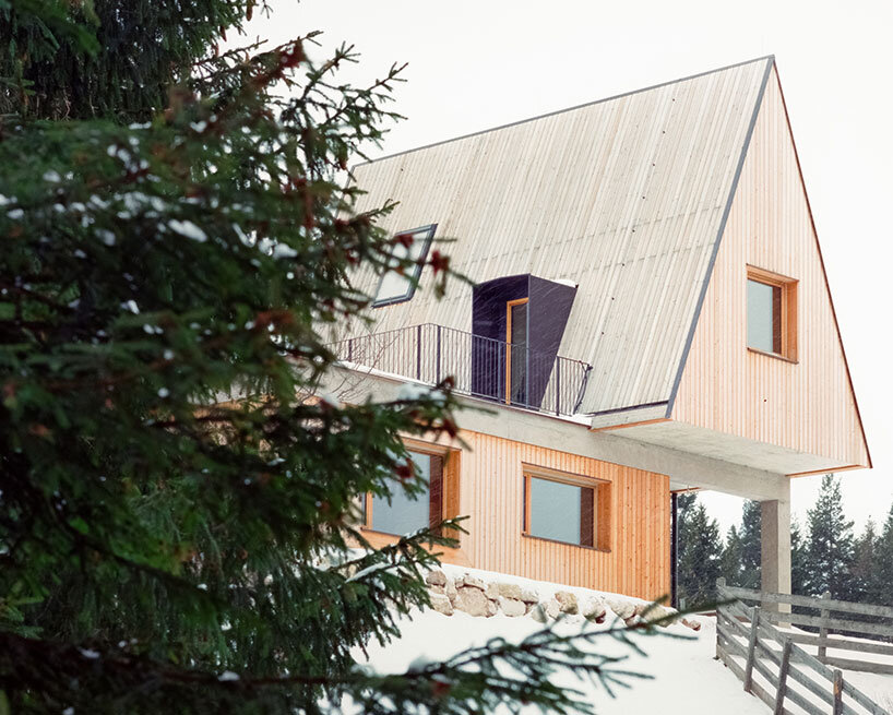
    Alpina Architects approached the project with a deep understanding of BS Hof’s existing structure and its surrounding landscape. Instead of building upwards, the design leveraged the sloping terrain to introduce a new volume at the farmstead’s upper level. The extension connects internally to the farmhouse’s second floor while extending northward, ensuring both integration and independence. A circular patio acts as a transitional space, creating a connection between the old and new structures while serving as a central design element.

    BS hof house: alpina architects presents newly expanded farmhouse in northern italy
    the original BS Hof was built in 1850 and has evolved with additional farm structures over time

    Architectural Features and Materials

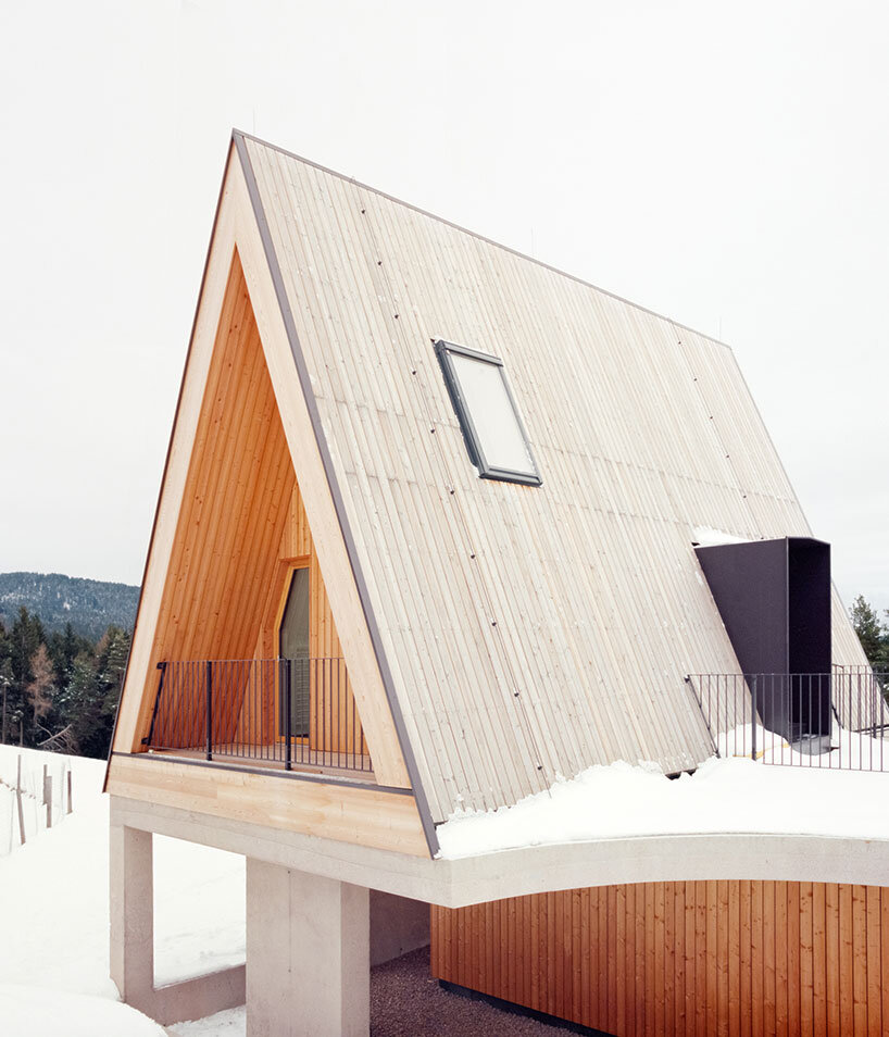
    With the new extension of BS Hof House, Alpina Architects designs a bold, triangular form, evoking the archetypal shape of a cabin. Its design follows traditional farmstead expansion methods by extending horizontally rather than vertically. The connection between the old and new volumes is achieved through a flat-roofed section that houses the entrance. Visitors are guided from the historic entrance through a staircase leading up to the patio, which acts as a hub connecting the different spaces.

    The extension primarily accommodates the home’s private areas. A corridor leads to two children’s bedrooms, while a staircase ascends to the master bedroom and en-suite bathroom, located in the uppermost level of the new volume. This upper space, characterized by warm wooden interiors, offers a cabin-like atmosphere that enhances the sense of retreat and comfort.

    BS hof house: alpina architects presents newly expanded farmhouse in northern italy
    the farmhouse maintains a traditional material palette with a stone and wood

    Integration with the Landscape

    The circular patio serves as a focal point, bridging the transition between the old and new structures. A distinctive concrete viewing frame extends from this space, providing a vantage point over the surrounding mountains. This architectural gesture reinforces the project’s dialogue between past and present, creating a space that fosters contemplation while integrating seamlessly with the Alpine landscape.

    The material palette for the extension remains grounded in tradition. Timber is the dominant material, used both structurally and as external cladding. The pitched roof and facade are clad in untreated larch slats, which will naturally age to a silvery-grey patina. The base of the structure, along with the flat-roofed connection and patio, is constructed from sandblasted exposed concrete. This treatment highlights the porphyry aggregates within the concrete, lending it a textured, stone-like appearance that harmonizes with the existing farmhouse.

    BS hof house: alpina architects presents newly expanded farmhouse in northern italy
    an independent living space is introduced while a connection to the farmstead is maintained

    BS hof house: alpina architects presents newly expanded farmhouse in northern italy

  • Remove Wallpaper

    Remove Wallpaper

    Introduction to Removing Wallpaper

    If you’ve landed here trying to figure out how to remove wallpaper – you may have already been intimidated by the rabbit hole of information on the internet. Or perhaps you’ve almost decided it’s impossible after asking for advice from friends? We came close to feeling hopeless before even starting – but I’m here to tell you it just might be easier than you’d think!

    Getting Started

    Before diving into the process, it’s essential to understand that removing wallpaper can be a challenging task, but with the right approach, it can be done efficiently. In this article, we will guide you through the best methods to remove wallpaper, making it easier for you to achieve your goal.

    Understanding the Challenges

    One of the primary concerns when removing wallpaper is the amount of information available online. With so many different methods and techniques, it can be overwhelming to decide which approach to take. Moreover, seeking advice from friends or family members may not always provide the best solution, as everyone’s experience is unique.

    Read More

    The Solution

    Despite the challenges, removing wallpaper can be a relatively straightforward process. By following the right steps and using the appropriate tools, you can achieve professional-looking results without breaking the bank. In the following sections, we will explore the best methods for removing wallpaper, including the materials needed and the techniques to use.

    Conclusion

    In conclusion, removing wallpaper may seem like a daunting task, but it doesn’t have to be. By understanding the challenges and using the right approach, you can achieve your goal of removing unwanted wallpaper. Remember to stay patient, and don’t be afraid to seek help if needed. With the right mindset and techniques, you’ll be able to remove your wallpaper with ease.

    The post How to Remove Wallpaper: The Best Methods  appeared first on The Budget Decorator.

  • Vezzoli Revives Lagerfeld’s Memphis Apartment

    Vezzoli Revives Lagerfeld’s Memphis Apartment

    Introduction to KARL GOES TO MEMPHIS

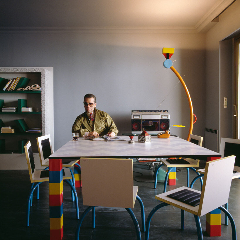
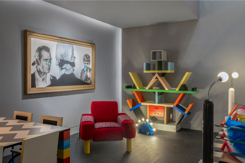
    Under the title ‘Francesco Vezzoli presents: KARL GOES TO MEMPHIS. Tribute to an Historic Encounter in Monte Carlo’, Almine Rech Monaco hosts the artist’s third solo exhibition with the gallery, on view from March 20 to May 24, 2025. As faithfully as possible, Vezzoli recreates Karl Lagerfeld’s iconic Monte Carlo apartment, originally furnished entirely with pieces from Memphis – a design collective, born from a cultural movement initiated by Ettore Sottsass. Besides celebrating the collective’s lasting legacy, the exhibition transports visitors into a world where vivid colors, geometric shapes, and playful forms honor Lagerfeld’s eclectic taste and fearless approach to aesthetics.

    all images courtesy of the Francesco Vezzoli, Memphis and Almine Rech, unless stated otherwise | image © Jacques Schumacher

    LAGERFELD’S INTERIOR LOVE AFFAIR WITH THE MEMPHIS MOVEMENT

    Lagerfeld was captivated by the humor and rebellious spirit of Memphis. For him, ‘it was love at first sight,’ when he saw the first Memphis show in September ‘81 in Milan. Founded by Ettore Sottsass in 1980, the movement, named after the capital of Ancient Egypt and Elvis Presley’s hometown, was a revolutionary force in design, characterized by its vibrant palette, angular forms, and playful disregard for traditional conventions. Acquired in 2022 by the Italian Radical Design group, Memphis continues to influence the public’s taste in the fashion industry, as well as in cinema and television.

    As Paloma Picasso reflects in her statement to Francesco Vezzoli’s ‘KARL GOES TO MEMPHIS’ exhibition, Karl Lagerfeld’s embrace of Memphis design was part of a larger creative evolution. In the early 1980s, as the fashion designer settled into his new residence in Monte Carlo, he made a radical shift from his opulent interior style, adopting a disruptive aesthetic between kitsch and elegance. To him, Memphis represented a modern-day Art Deco, perfectly fitting the Mediterranean environment with its vivid hues and jolly forms. This led him to furnish his entire apartment with Memphis pieces, turning his home into a living reflection of the cutting-edge style that defined the early 80s.

    francesco vezzoli revives karl lagerfeld's bold memphis apartment in monaco
    Karl Lagerfeld in his full-on Memphis-furnished apartment | image © Jacques Schumacher

    FRANCESCO VEZZOLI’S HOMAGE AT ALMINE RECH MONACO

    All of the pieces that originally furnished Lagerfeld’s Monte Carlo residence are included in Francesco Vezzoli’s ‘KARL GOES TO MEMPHIS’ exhibition at Almine Rech Monaco, providing a window into the private world of one of fashion’s most iconic figures. Vezzoli has carefully curated the space to create an immersive experience that captures both the essence of Memphis and Lagerfeld’s creative persona.

    ‘It is nearly impossible to find, in the history of 20th-century art and architecture, a creative collision as all-encompassing and intoxicating as the one that exploded in 1981, when Karl Lagerfeld entrusted Memphis with the aesthetic vision for his living space in Monte Carlo,’ reflects Francesco Vezzoli. Elaborating on his intention, the artist continues, ‘this exhibition seeks to celebrate that utopian and surreal union—an exhilarating, unrepeatable marriage of avant-garde creativity and uncompromising vision. By revisiting this extraordinary moment, we aim to honor the boldness and imagination that reshaped not only a space but also the very boundaries of art, fashion and interior design.’

    francesco vezzoli revives karl lagerfeld's bold memphis apartment in monaco
    installation view of ‘Francesco Vezzoli presents KARL GOES TO MEMPHIS Tribute to a historic encounter in Monte Carlo’ | image © Nicolas Brasseur

    Additional Artworks and Exhibition Catalog

    In addition to the original Memphis pieces, Vezzoli has created eight artworks for the occasion. These include embroidered portraits of Lagerfeld in baroque frames, which stand in stark contrast to the modernity of the interior, creating a dynamic tension between opulence and modernity. The artist, known for his provocative blend of classical references and contemporary culture, evokes a sense of nostalgia with his pieces while simultaneously introducing a fresh narrative to the exhibition, mirroring Lagerfeld’s own ability to merge contrasting styles in fashion and design.

    To further enrich the exhibition experience, a catalog designed by the renowned graphic duo Mathias Augustyniak and Michael Amzalag of M/M (Paris) accompanies the show. Their involvement adds another layer of artistry to the showcase, making it an essential element of the exhibition’s storytelling by offering deeper insight into the significance of the furniture and home decor pieces.

    francesco vezzoli revives karl lagerfeld's bold memphis apartment in monaco
    KARL GOES TO MEMPHIS (I FEEL JUST LIKE A CHILD), 2025 by Francesco Vezzoli | courtesy of the artist and Almine Rech

    Conclusion

    Francesco Vezzoli’s ‘KARL GOES TO MEMPHIS’ exhibition at Almine Rech Monaco is a testament to the enduring legacy of Karl Lagerfeld and the Memphis movement. By recreating Lagerfeld’s iconic apartment and showcasing the original Memphis pieces, Vezzoli pays homage to the creative genius of both Lagerfeld and the Memphis collective. The exhibition is a must-see for anyone interested in fashion, design, and art, offering a unique glimpse into the private world of one of fashion’s most iconic figures and the revolutionary design movement that inspired him.

  • Essentials for a Fun Home

    Essentials for a Fun Home

    If you love to entertain at home, you’ll want to have a few essential supplies in stock. Think of the best dinner party you’ve been to: what made it so special? Chances are it was the company – maybe the food, as a close second. So, when you’re prepping your home for the next dinner party, think in terms of what will foster connection, fun and ease. For keen entertainers, there are some home items that help keep the good times flowing.

    Here’s our ultimate home entertainer’s list:
    1. An extendable dining table. Whether indoor or out – perhaps both, for those more fortunate – entertainers need an excellent table around which guests can gather. While once upon a time the size and style of your table was defined by your space, there’s now a bevy of stylish and flexible options available.
    Investing in a dining table will ensure memories are made for years to come. Picture: King
    Extendable tables are vital for those who can’t, or may not want, an eight-seat table all year round. The King Quay Table is flexible in both length and style. While the sleek but classic shape fits most aesthetics, you can also choose between marble, ceramic and timber table tops to complete your look. If you’re looking for an indoor and outdoor table, consider the ceramic table top. Not only does it look a treat, it’s an ideal investment piece at a reasonable price.

    2. Table protection. Keep your mind at ease and protect that lovely dining table with a stunning table cloth to match your decor or theme.
    A tablecloth can enhance your aesthetic and protect your dining table for longevity. Picture: Pexels
    Take your pick of fabrics, colours and patterns, but remember this piece of fabric is likely to be stained at some point. Keep stain removal at the back of your mind when purchasing a new table cloth and get something you’re not going to worry about. Napkins, placemats, trivets (mats for hot pots and pans) and coasters are other protective devices one can employ on top of the table cloth for that extra layer of protection.

    3. Beverage accessories. Whether you’re drinking water, wine or whisky sours, you need the right jugs, decanters, cups, coupes, glasses, shakers and tumblers. Let’s think about your beverage possibilities:
    Water: Whether a dinner party, cocktail party or backyard BBQ, you should have some water at the ready. Save everyone – yourself included – a trip to the tap by having a jug or dispenser nearby for ease. Depending on your style, you could make a real statement with the right vessel.
    Regardless of your drink of choice, you’ll need an easy, accessible and tasty way to share it around. Picture: Pexels
    Wine: The shape and depth of your wine glass is said to bring out the flavour, so you’ll need a couple of varieties of glass depending on what you’re drinking. A few fundamentals: bigger for red, a bit smaller for white and flutes or coupes for sparkling. Keen on wine served properly? Get yourself a decanter to aerate your drop.
    Cocktails: If you’re a household that likes to treat their guests – or themselves! – you’ll want a cocktail cart, complete with your liquors of choices and accessories, like a cocktail shaker, stirrer, muddler, strainer and so on. You may also want to add a few martini glasses or tumblers to that glassware collection. Finally, don’t forget to have a supply of those staples that make cocktails great, such as lemons, simple syrup, sugar cubes, bitters and – of course – ice.

    4. Serving essentials. Cutlery and crockery are likely to already be in your cabinets, but certain serving items make the dining experience much easier for dinner parties. Consider these few essentials:
    Platters and serving bowls always come in handy when entertaining. Picture: Pexels
    A cheese board, serving platter, salad bowl, ramekins (for olives, nuts etc.), and salt and pepper grinders are must-haves for any dinner party.

    5. Warm lighting. Lighting sounds like a silly thing to fuss over – unless you have the wrong lighting. Having a dinner party under bright fluorescent lights can be practical but it’s not as fun. In dining areas, you need good but warm lighting. An ideal set-up might have flexible choices, such as a dimmer switch or a few lamps and candles. Have something a bit brighter while you’re eating, as well as something slightly moodier for drinks and chats.

    In conclusion, entertaining at home can be a breeze with the right supplies. By investing in an extendable dining table, table protection, beverage accessories, serving essentials, and warm lighting, you can create a warm and inviting atmosphere that will make your dinner parties truly unforgettable. With these essentials, you’ll be well on your way to hosting memorable gatherings that your guests will cherish for years to come. This article was originally published on 7 Aug 2021 at 7:00am but has been regularly updated to keep the information current.

  • Gothic Foyer Design

    Gothic Foyer Design

    Introduction to Foyer Design

    Your foyer design determines how your entire home feels when visitors enter. Your foyer stands as the first point of entry for visitors; hence, it needs to balance personal touches with practical usability. The contemporary foyer design emphasizes linear simplicity with modern design elements, including unified color schemes and diverse material transitions.

    The aesthetic appeal of Hazil Cambric and Gothic Grey finishes reign supreme in current design trends because they present a sophisticated and ageless appearance.

    We will demonstrate the proper implementation of these finishes to achieve functional and elegant Foyer Design Ideas throughout this discussion.

    Understanding Hazil Cambric and Gothic Grey Finishes

    An understanding of finish capabilities and their interior space enhancement methods is crucial before pursuing design concepts.

    1. Hazil Cambric Finish

    • This finish bestows a gentle warmth through its light tones, which generates open and airy spaces.
    • Works well with both modern and traditional interiors.
    • These finishes contribute sophisticated styles and bright expansiveness to all types of spaces.

    2. Gothic Grey Finish

    • A strong, intense gray tone creates added depth and contrast in interior designs.
    • This surface heightens contemporary design through its sharply defined style.
    • The light-colored Hazil Cambric pairs well with this shade to create a balanced effect.

    Combining these two finish options allows you to create an entrance that blends welcoming feelings with modern style elements without overtaking the room.

    Key Elements of a Contemporary Foyer with Hazil Cambric and Gothic Grey

    Key Elements of a Contemporary Foyer

    1. Flooring Choices

    For foyer flooring, owners should select materials that combine durability with attractive design and simple care requirements. Some excellent options include:

    • Gothic Grey marble flooring combined with subtle white veining provides a luxurious touch.
    • Hazil Cambric wood-finish tiles create a dynamic connection of warmth and texture, which enhances the space through wooden flooring.
    • Matte Ceramic Tiles made by combining Hazil Cambric tiles with Gothic Grey tiles through geometric patterns result in a distinct aesthetic.

    Combining Hazil Cambric tiles with Gothic Grey tiles through checkered or Modern Foyer Design with Wooden Panels and Buddha Statue will enhance the foyer entrance’s elegance.

    2. Wall Treatments

    The entrance foyer depends heavily on walls to establish its overall atmosphere. The following methods offer effective ways to achieve upgraded results:

    • Gothic Grey textured wall panels create visual impact through their pairing with Hazil Cambric decorative accents.
    • The combination of Gothic Grey walls alongside Hazil Cambric trim or wall art creates an accent point that acts as a distinctive focal element in the space.
    • Wallpaper or paint should feature Hazil Cambric throughout most surfaces then integrate one panel of Gothic Grey to establish depth.

    The deep tones of Gothic Grey can be balanced through reflective surfaces like mirrors and metallic accents, which simultaneously open up the space.

    3. Statement Entrance Door

    The main entrance door from the foyer demands attention as a key design element. Some stylish choices include:

    • The gothic grey matte-finish wooden door provides a contemporary and minimalistic feel.
    • The hazil cambric paneled door provides gentle visual contrast, which works best in rooms with ample natural light.
    • Glass and metal doors with gothic grey frames are perfect for industrial or modern homes.
    • To elevate sophistication in your entrance handle Installation, choose black, gold or brushed nickel designer handles from premium designers.

    Sleek smart lock finishes help achieve a contemporary look in entrances.

    4. Lighting Fixtures

    A well-lit foyer looks aesthetically superior. Some ideal lighting choices include:

    • Pendant lights made of gold or matte black act as stylish accents that stand out against Hazil Cambric wall surfaces.
  • Kengo Kuma’s ghostly café

    Kengo Kuma’s ghostly café

    Introduction to Cs Somme Café

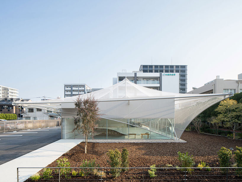
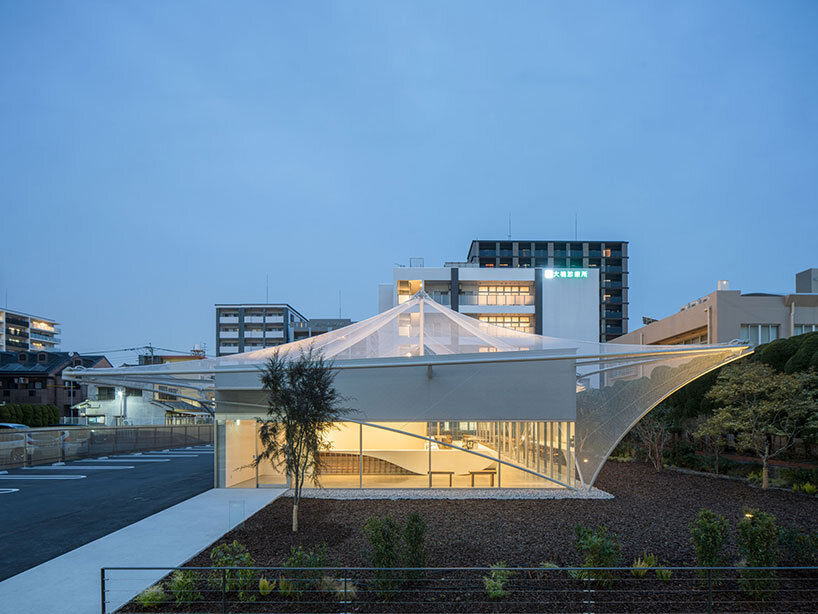
    Kengo Kuma and Associates has conjured an architectural apparition in the heart of Fukuoka, Japan with the newly opened Cs Somme Café. The coastal city, famous for its food culture, is located along the northern shore of the country’s Kyushu Island. The new structure is wrapped in a facade of delicate metal mesh and appears to hover above a small green oasis in the city. Overall, the project evokes an ethereal retreat floating amidst the urban density. Like a shimmering mirage, the soft facade transforms the café from a white glass box into an occupiable sculpture.

    images © Katsumasa Tanaka

    Design and Structure

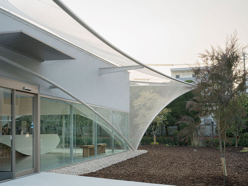
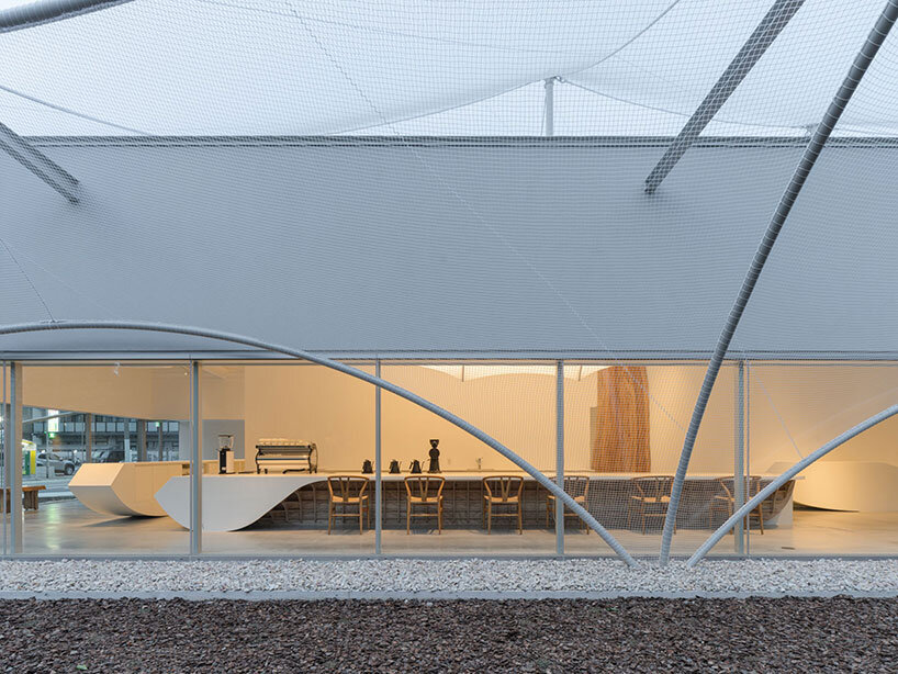
    Conceiving the structure of its Cs Somme Café, the design team, led by Japanese architect Kengo Kuma, takes an innovative approach. A mesh-clad, arch-supported steel frame is integrated to interlock with an internal grid framework. This interplay of structural elements ensures seismic resilience despite the café’s seemingly lightweight and airy design. The system functions as a contemporary reimagining of the flying buttress, reinforcing stability while maintaining a visual lightness. Beyond its spectral appearance, the mesh provides passive energy savings by filtering sunlight, reducing the need for artificial cooling.

    Interior Design

    Beneath this shroud, the Cs Somme Café occupies a luminous white cube. A polished plaster counter floats at the center, its refined finish contrasting with the soft translucency of stretch-fabric lighting fixtures. The careful balance of light and texture gives the interior an almost weightless quality, reinforcing the café’s ethereal concept. Here, craftsmanship and innovation result in an atmosphere that is at once intimate and otherworldly, demonstrating the studio’s ability to transform everyday spaces into poetic experiences.

    kengo kuma somme café
    Kengo Kuma designs Cs Somme Café as a ‘floating’ oasis in Fukuoka, Japan

    Exterior and Structural System

    The café is wrapped in a delicate metal mesh, creating a mirage-like appearance. A steel arch frame and an internal grid framework ensure seismic stability. The structural system functions as a modern reinterpretation of the flying buttress, reinforcing stability while maintaining a visual lightness.

    kengo kuma somme café
    the café is wrapped in a delicate metal mesh, creating a mirage-like appearance

    kengo kuma somme café
    a steel arch frame and an internal grid framework ensure seismic stability

    kengo kuma somme café
    the structural system functions as a modern reinterpretation of the flying buttress

    Conclusion

    The Cs Somme Café, designed by Kengo Kuma and Associates, is a masterpiece of modern architecture that seamlessly blends innovation, craftsmanship, and poetic experience. The delicate metal mesh facade, the luminous white cube interior, and the structural system all work together to create an ethereal retreat that floats amidst the urban density of Fukuoka, Japan. This project demonstrates the studio’s ability to transform everyday spaces into extraordinary experiences, making it a must-visit destination for anyone interested in architecture, design, and innovation.

  • Herzog & De Meuron’s Am Tacheles

    Herzog & De Meuron’s Am Tacheles

    Garth Roberts Presents Rooms of Am Tacheles

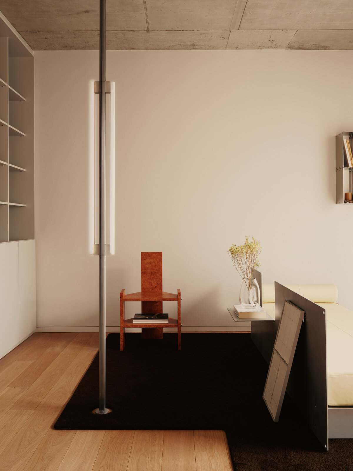
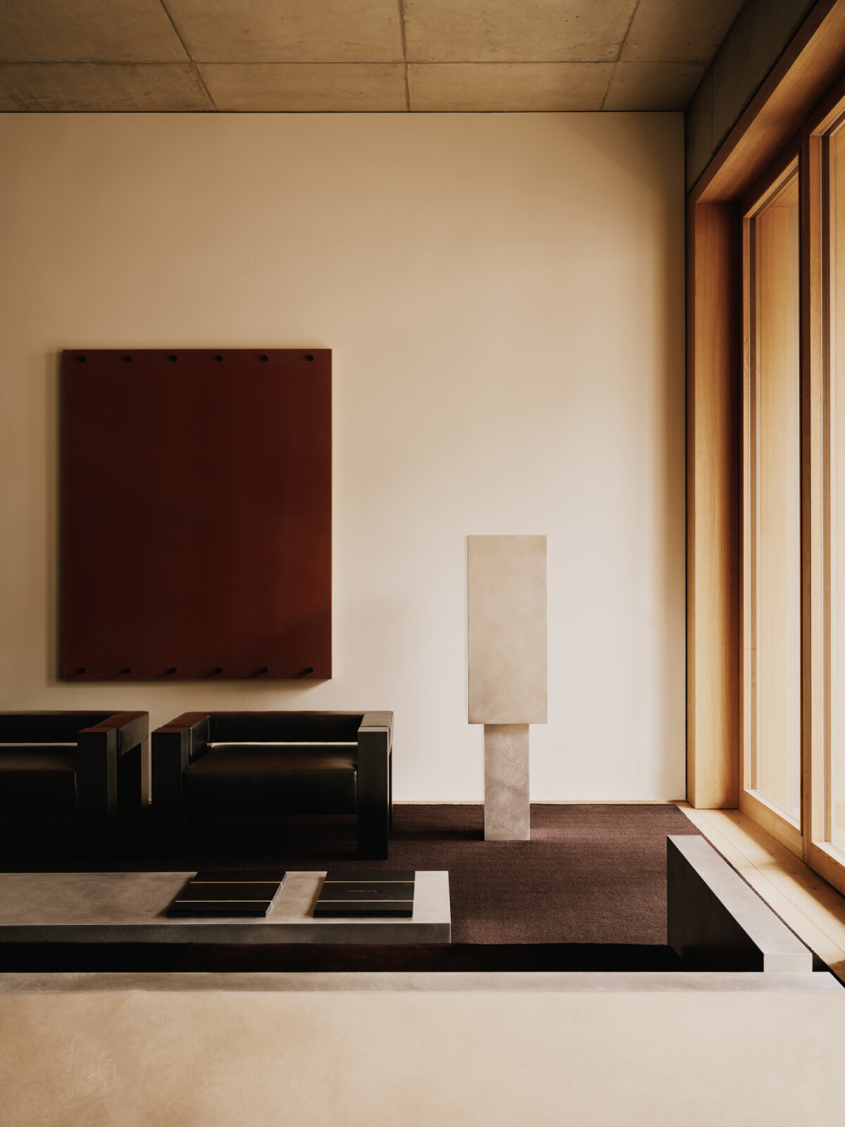
    In Berlin’s Mitte district, Herzog & de Meuron’s Am Tacheles development is hosting three interior vignettes inspired by various architectural languages, staged by Garth Roberts. The interventions at ROOMS of AM TACHELES are shaped by three architectural studios — Fernando Laposse, Lotto Studio, and studioutte — who challenge conventional notions of domesticity by reimagining high-end living as a space of material exploration and conceptual storytelling rather than predetermined luxury. Under the guidance of Roberts, the approach deviates from conventional paradigms of domesticity and standard design vocabularies, instead embracing the unfinished and the exaggerated.

    all images by by Robert Rieger

    Introduction to ROOMS of AM TACHELES

    ‘ROOMS of AM TACHELES seeks to explore the diverse aesthetic and emotional potential of domestic life, shaped by the iconic architecture of these living spaces,’ explains creative director and multidisciplinary designer Garth Roberts. The interiors, each responding to a different room within the Mitte district, are thus not fully furnished and are posed as ‘gestures’ — fragments of possibility that encourage open-ended interpretations and engagement with space.

    Interventions by Fernando Laposse, Lotto Studio, and Studioutte

    Fernando Laposse’s vignette is playful and pink, transforming the interior into a sensory domestic landscape shaped by organic textures. Known for his innovative use of natural fibers, the architect here works with sisal, corn husk veneers, and other overlooked materials to craft tactical surfaces and unexpected encounters. His vignette bridges sustainability with cultural heritage, turning these raw materials into a powerful medium for storytelling.

    tactile, sleek & organic vignettes dialogue with herzog & de meuron's am tacheles, berlin 
    Garth Roberts stages ROOMS of AM TACHELES

    Dualities Inspired by Herzog & de Meuron’s Brutalism

    Lotto Studio adopts a sculptural approach drawing on negative space, and balancing function with the expressive potential of materiality. Aluminum, burled maple, and Emperador marble touches dialogue with the architecture of Gruentuch Ernst. By treating interior design as an interplay of form, void, and inhabitation, the designers‘ composition feels both curated and open-ended. Studioutte’s interpretation of domestic space, meanwhile plays with contrasts — juxtaposing raw aluminum against supple leather, translucent drapery against monolithic volumes. While also inspired by Herzog & de Meuron’s brutalist forms at Am Tacheles, the Milan-based studio infuses contrasting warmth and tactility, challenging assumptions about scale and softness in interior environments.

    tactile, sleek & organic vignettes dialogue with herzog & de meuron's am tacheles, berlin 
    the exhibition includes three interior vignettes

    Design Approach and Inspiration

    The approach deviates from conventional paradigms of domesticity and standard design vocabularies, instead embracing the unfinished and the exaggerated. Fernando Laposse, Lotto Studio, and Studioutte design a room each, with all interiors inspired by Herzog & de Meuron’s architecture.

    tactile, sleek & organic vignettes dialogue with herzog & de meuron's am tacheles, berlin 
    all interiors are inspired by Herzog & de Meuron’s architecture

    tactile, sleek & organic vignettes dialogue with herzog & de meuron's am tacheles, berlin 

  • Buerger Katsota’s Greek Villas

    Buerger Katsota’s Greek Villas

    Introduction to Rolling Greens Villas

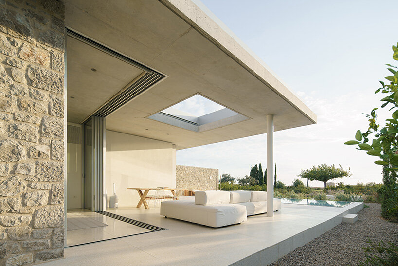
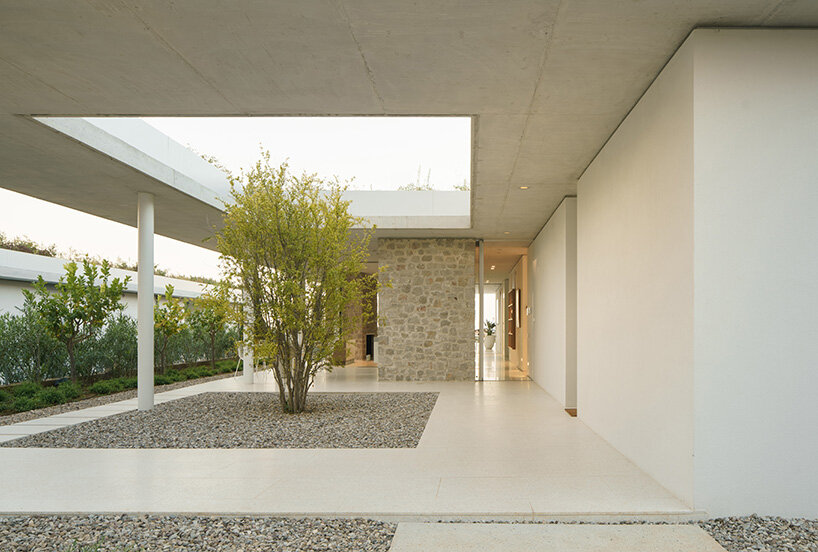
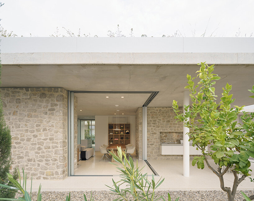
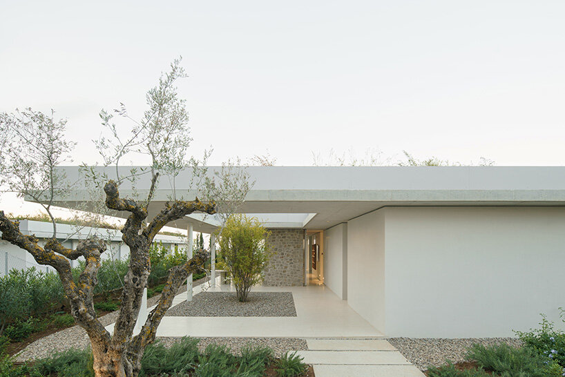
    Rolling Greens Villas is a collection of 19 holiday residences by buerger katsota architects, located in the Navarino Dunes at Costa Navarino, Messinia, Greece. The design team uses a horizontal architectural style to blend the single-story homes into the Mediterranean landscape, offering semi-detached three-bedroom and detached four-bedroom options.

    Design and Architecture

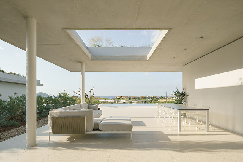
    Each villa is conceived as a composition of solid and open volumes, set between the grounding presence of a habitable platform and a cantilevering roof. The flat, planted roof—conceived as a fifth facade—further embeds the villas within the coastal terrain, mirroring the lush Mediterranean vegetation while enhancing thermal comfort. Equipped with solar collectors and skylights, it regulates the indoor climate, reducing energy consumption and providing shaded areas for all-day outdoor relaxation.

    all images by Alex Shoots Buildings, courtesy of buerger katsota architect

    Spatial Arrangement and Outdoor Living

    The Athens-based buerger katsota architects follows a fluid configuration for the spatial arrangement, with private quarters—bedrooms and en-suite bathrooms—offset within solid blocks, while communal areas, including the living room, kitchen, and courtyards, flow through floor-to-ceiling glazed openings.

    Extending beyond the built envelope, the villas’ platforms form expansive sunbathing terraces that lead to private swimming pools, visually integrating with the golf course and aligning with the horizon of the Ionian Sea. An open-air dining, cooking, and lounge space enhances the experience of outdoor living, while a sunken fire pit provides an intimate setting.

    composition of solid and open volumes shapes buerger katsota's coastal villas in greece
    Rolling Greens Villas is a collection of 19 holiday residences by buerger katsota architects

    Additional Features and Design Elements

    composition of solid and open volumes shapes buerger katsota's coastal villas in greece
    the design team uses a horizontal architectural language in this project

    composition of solid and open volumes shapes buerger katsota's coastal villas in greece
    single-story structures are available as semi-detached three-bedroom and detached four-bedroom homes

    composition of solid and open volumes shapes buerger katsota's coastal villas in greece
    each villa is conceived as a composition of solid and open volumes

    composition of solid and open volumes shapes buerger katsota's coastal villas in greece
    the flat, planted roof is conceived as a fifth facade

    Conclusion

    In conclusion, Rolling Greens Villas by buerger katsota architects is a remarkable collection of