Author: cozyspaces.haelthyh@gmail.com

  • Louvre Through Bohbot’s Lens

    Louvre Through Bohbot’s Lens

    Introduction to Franck Bohbot’s Le Louvre Photo Series

    A series of photographs by Franck Bohbot presents an unusually quiet and architecturally focused portrait of Paris‘s Musée du Louvre. Granted rare carte blanche access by the museum, the French-born, New York–based photographer turns his lens on the interiors of the world’s most visited museum, revealing its structural cadence and enduring material presence with a stillness rarely seen by visitors.

    Through this work, part of his broader ‘Parisian Interiors’ project, Bohbot moves away from the museum’s iconic role as a destination and instead frames it as what he calls ‘a living architectural organism.’ His images distill the museum to a sequence of calm spatial encounters, captured entirely in natural or available light. Through his images, daylight is shown to gradate while vanishing lines and historical textures dominate the composition.

    the Cour Marly is filled with diffused daylight under its soaring glass canopy | images © Franck Bohbot

    A Study in Scale and Symmetry

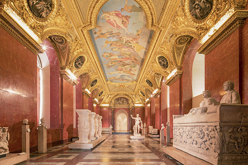
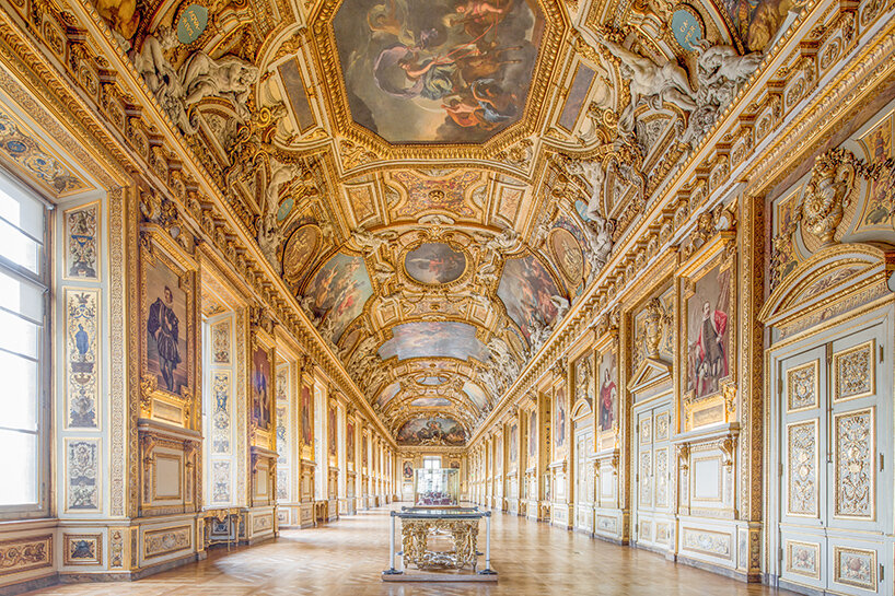
    From the Cour Marly’s glass-roofed sculpture garden to the saturated reds and gilded vaults of the Galerie d’Apollon, Franck Bohbot’s photographs emphasize the extravagance of Le Louvre’s interiors. In one frame, natural light pours through the vast barrel vaults of the Denon Wing, illuminating a receding array of stone statues. In another, the austere framing of the Mona Lisa’s gallery creates a visual standoff between viewer and object.

    The photographer writes: ‘It’s a study in scale and silence, where every corridor, color palette, and composition pays homage to those who designed and preserved these spaces.’ His focus on symmetry heightens the architectural rhythm. Arches mirror arches, columns recede in dramatic perspective, and light bounces from the polished floors to the intricate ceilings overhead.
    louvre franck bohbot
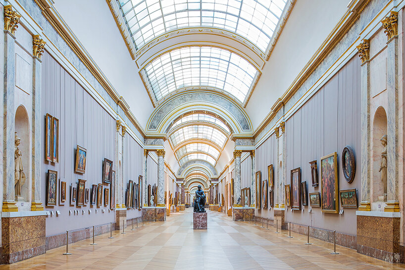
    Franck Bohbot emphasizes the strict symmetry of the Louvre’s main corridors

    The Vast Museum’s Layered History

    Along with its visual order, Franck Bohbot’s photographs record the layered temporality of Le Louvre. The museum was originally a medieval fortress, then a royal palace, and finally a public museum. This architectural evolution is evident throughout the vast museum, from the 12th century vestiges of the lower ground to the opulent 19th-century galleries.

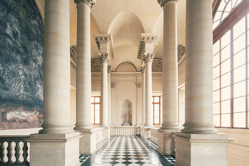
    In the rooms of antiquities, worn stone artifacts appear framed by neoclassical arches and softly reflective limestone walls. Meanwhile, the checkered flooring and classical columns of an upper-level hall lead toward a sculptural niche with exaggerated symmetry. ‘This series is less about documentation and more about reverence,’ Bohbot says, ‘for the stories embedded in stone, for the invisible presence of human hands, and for the timelessness of space when it’s given the chance to simply exist.’
    louvre franck bohbot
    the grand painting hall is rhythmically punctuated by arched skylights
    louvre franck bohbot
    a series of stone columns lead to a tranquil gallery alcove
    louvre franck bohbot
    the Galerie d’Apollon glows with gilded ornament and painted ceiling panels

    Conclusion

    Franck Bohbot’s photographs of Le Louvre offer a unique perspective on the iconic museum, revealing its intricate architecture, layered history, and serene beauty. By capturing the museum’s interiors in a state of stillness, Bohbot invites viewers to appreciate the space as a ‘living architectural organism’ rather than just a destination. His images not only showcase the museum’s grandeur but also pay homage to the designers, preservers, and stories embedded in its stone walls, creating a sense of reverence and timelessness.

  • Moss-Covered Lakehouse

    Moss-Covered Lakehouse

    Introduction to Wendelstrand Lakehouse

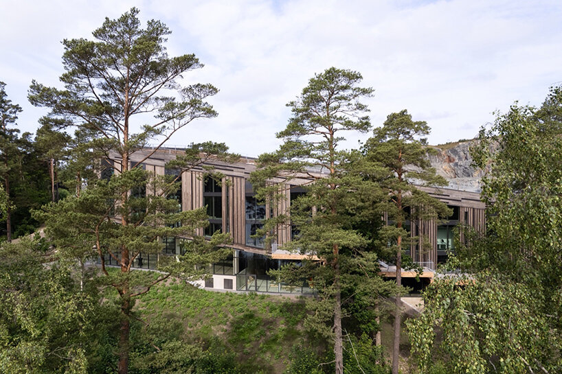
    In the Swedish town of Mölnlycke, outside Gothenburg, Snøhetta‘s Wendelstrand Lakehouse stands as the central gathering space within a visionary development. Wendelstrand is at once a residential development and a community designed for interaction and leisure. The Lakehouse is the heart of this vision, offering spaces for work, dining, fitness, and events. It is both a functional hub and an architectural symbol of the area’s sustainable future.

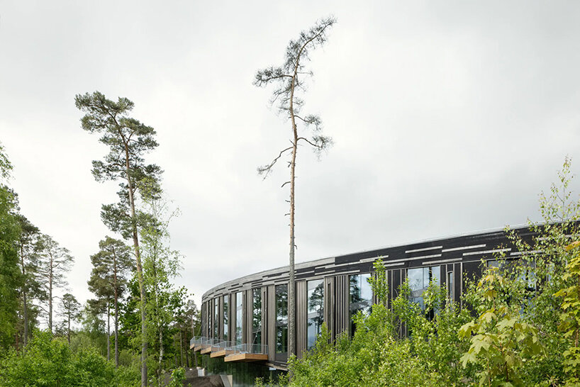
    The Lakehouse, which broke ground in early 2022, is an elongated structure designed to camouflage with its natural surroundings. Its form evokes the shape of a spine, extending across the landscape and bridging the gap between the past and the present. This connection between old and new is further emphasized by the building’s materials, which draw directly from the site’s history as a former quarry.

    images © Kalle Sanner

    Design and Architecture

    Snøhetta’s design of the Wendelstrand Lakehouse is informed by the surrounding landscape. The lower floors of concrete and stone are embedded in the bedrock, offering a solid and grounded connection to the earth. With these materials to reflect the rugged terrain and the site’s quarrying past, the architects reinforce the relationship between the built environment and the natural landscape.

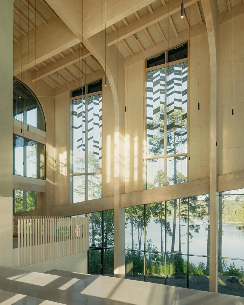
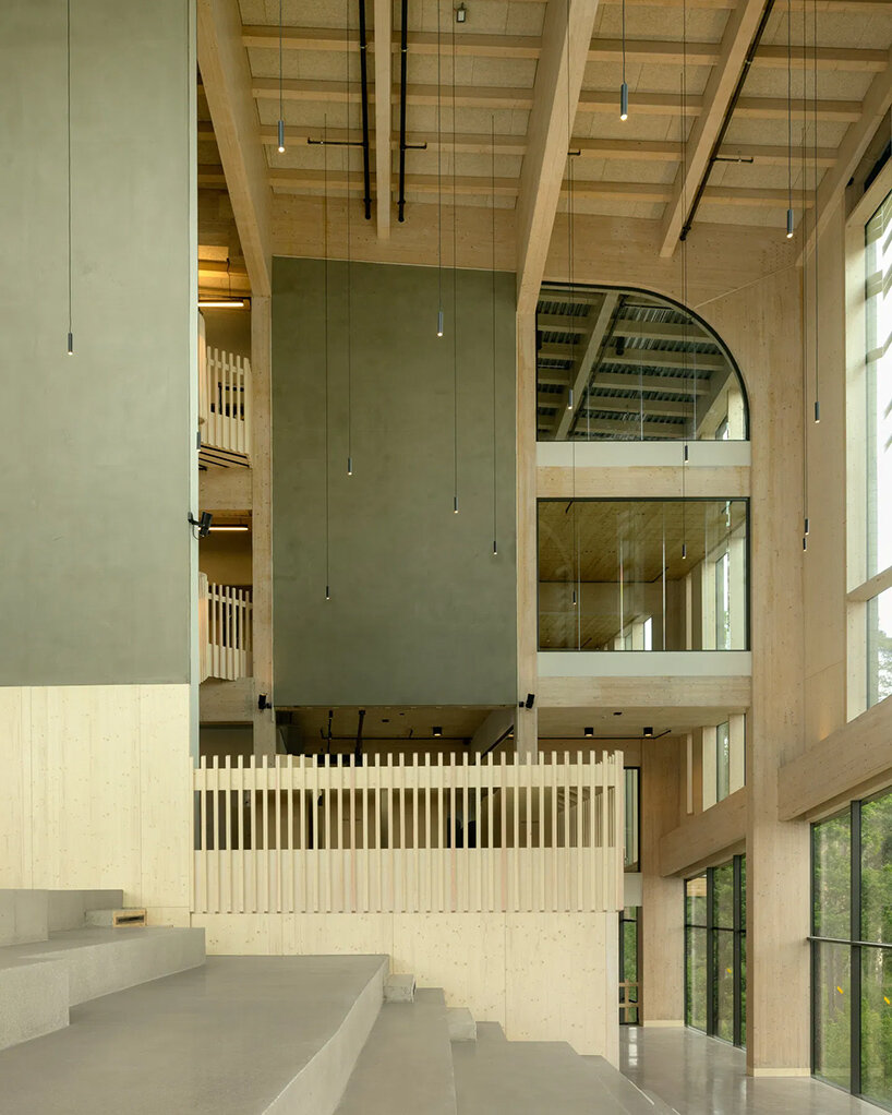
    At the core of the Lakehouse is an open atrium that rises through all the building’s levels. This vertical space serves as a gathering point, allowing natural light to flood the interior and enhancing the building’s sense of openness. The atrium is flexible, able to accommodate concerts, performances, or quieter moments of relaxation. It spills out into an open-air amphitheater, which overlooks Lake Landvetter, blurring the line between the built and natural world.

    snøhetta wendelstrand lakehouse
    Wendelstrand Lakehouse is the heart of a new residential development in Mölnlycke, Sweden

    Sustainable Features

    Snøhetta’s commitment to sustainability is clear throughout the Wendelstrand development, and the Lakehouse is no exception. The building incorporates energy-efficient solutions and a careful selection of materials that minimize its environmental footprint. A key aspect of the design is its connection to nature. The functional green roof, resembling a treetop canopy, is covered with native plants such as moss, grass, and wildflowers, which help manage water runoff, mitigate heat, and promote biodiversity.

    The top floors of the lake house continue the theme of nature-inspired design. Constructed from glulam and laminated timber, these levels reflect the forested surroundings with their warm, organic textures. Large glass panels, adorned with strategically placed patterns, mimic the interplay of light through treetops, while also improving the building’s energy efficiency by reducing solar heat gain.

    snøhetta wendelstrand lakehouse
    the building’s form reflects the natural landscape, drawing inspiration from the site’s quarry heritage

    Integration with the Surroundings

    snøhetta wendelstrand lakehouse
    concrete and stone dominate the lower floors, grounding the building in its natural surroundings

    snøhetta wendelstrand lakehouse
    a central open atrium connects all levels and serves as a flexible gathering space

    Conclusion

    In conclusion, the Wendelstrand Lakehouse, designed by Snøhetta, is a prime example of sustainable architecture that seamlessly integrates into its natural surroundings. The building’s unique design, inspired by the site’s quarry heritage and the surrounding landscape, creates a sense of community and connection to nature. With its energy-efficient solutions, careful material selection, and functional green roof, the Lakehouse sets a new standard for sustainable development in Sweden. As the heart of the Wendelstrand residential development, the Lakehouse is a hub for community building, offering a range of spaces for work, leisure, and relaxation, and serving as a symbol of the area’s commitment to sustainability.

  • Patio House in Sicily

    Patio House in Sicily

    Introduction to Patio House

    Located on a coastal stretch in Sicily, the Patio House by SOLUM Studio is set within a narrow, elongated plot that extends toward the sea and ends on a rocky cliff. The house fully occupies the buildable area of the site, responding with a compact yet layered architecture that privileges privacy and orientation over outward display.

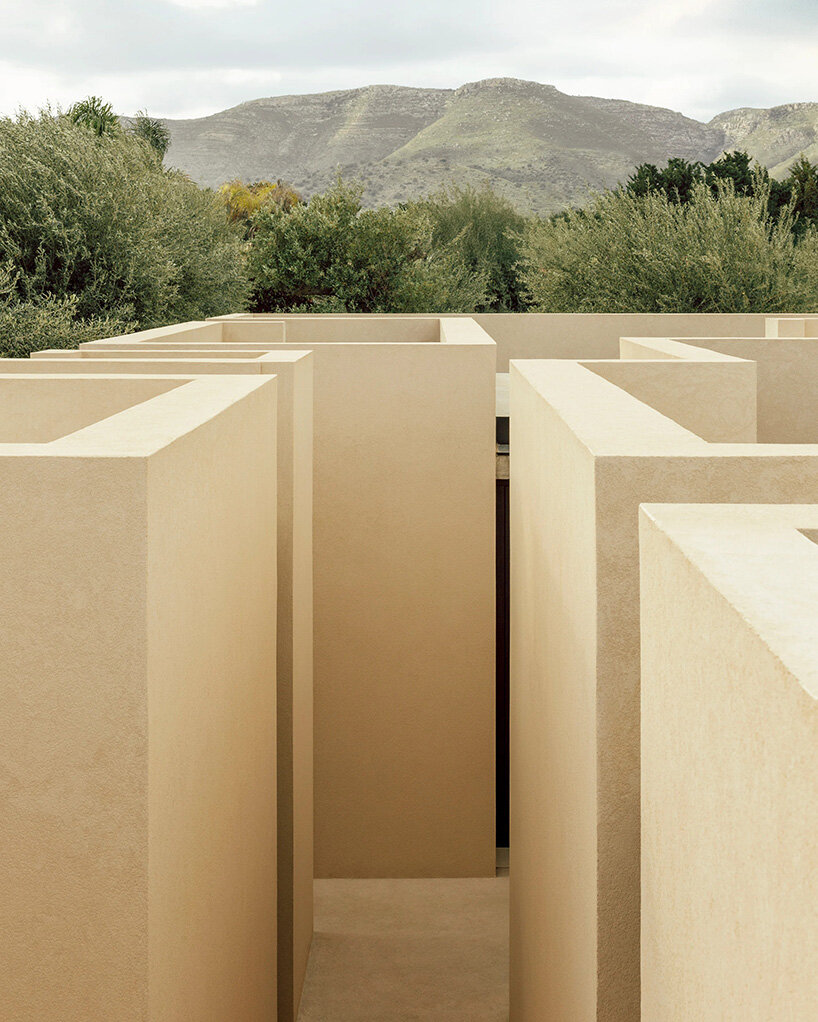
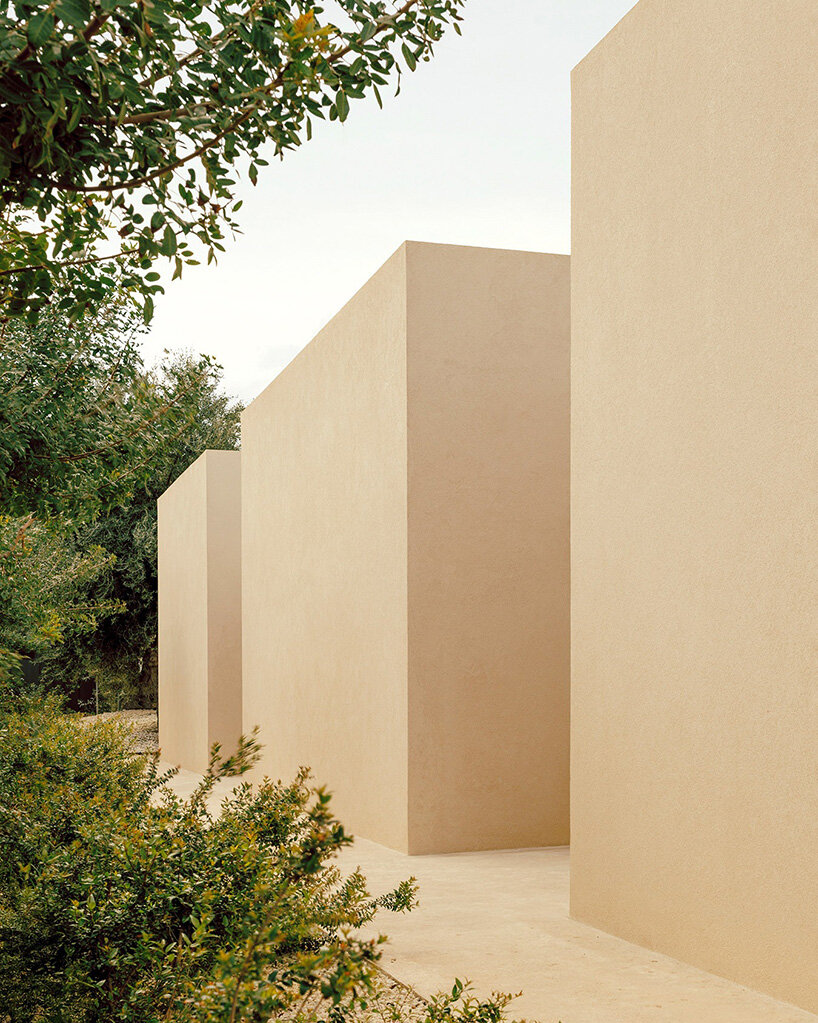
    At the heart of the project is a series of thick, continuous walls that define both interior and exterior spaces. These structural elements serve to organize movement and visual rhythm along the building’s length. Five independent bedrooms and a sea-facing living area are spaced along the perimeter, each arranged to maximize autonomy and visual quiet.

    Walls as Spatial Framework

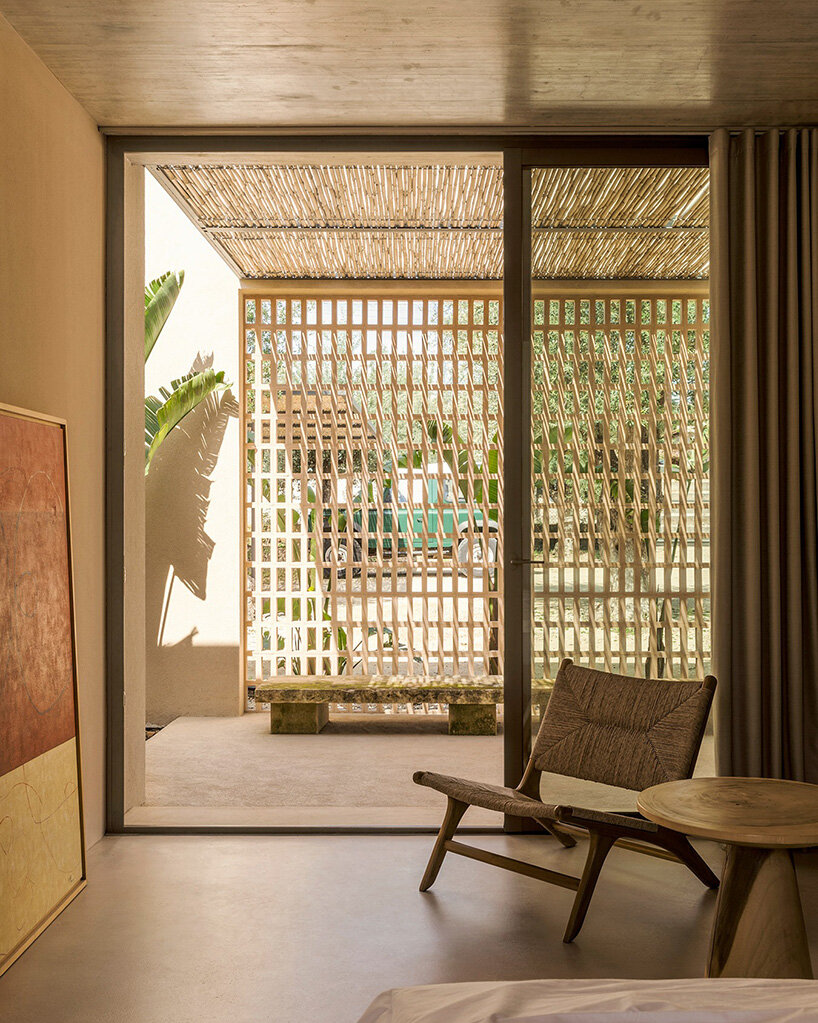
    Full-height walls form intimate patios adjacent to each bedroom, introducing natural light while shielding the interiors from direct views. The living spaces, in contrast, are defined by openness. At the end of an internal open-air corridor, large sliding windows retract fully into the masonry, giving the living room a direct and unobstructed relationship with the horizon.

    images © Nicolò Panzeri

    SOLUM Studio Curates A Sequence of Outdoor Rooms

    Circulation throughout the Patio House unfolds through a narrow, uncovered corridor conceived by the architects at SOLUM Studio as a private alley. This outdoor path connects the bedrooms to the shared living spaces in a progression of tight passages and wider moments of pause. The route ends at the sea, turning movement into a spatial narrative that is at once choreographed and visually understated.

    Adjoining the kitchen, another patio and flooded with daylight and houses a staircase that leads to the roof terrace. From above, the plan reveals itself as a maze of solids and voids, a geometric interplay that modulates openness and enclosure across the floor-plate. The roof terrace offers panoramic views of the Sicilian landscape and draws attention to the relationship between the house and its cliffside context.

    solum studio patio house
    the Patio House is located in the province of Syracuse on the coast of Sicily

    An Intricate Floorplan Realized with Simple Materials

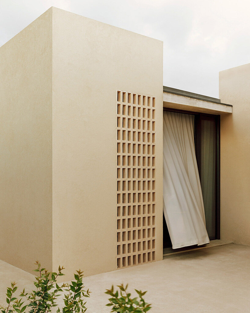
    The material palette by SOLUM Studio reinforces the sense of groundedness throughout the Patio House. Walls are rendered in textured earth-toned plaster, while warm-toned concrete floors extend the chromatic language indoors. The outdoor terraces are constructed from dry-stacked Noto stone, a traditional local material, and the pool is finished in lava stone, visually anchoring it in the region’s volcanic geology.

    The landscape design reinforces this continuity, allowing native vegetation to grow in a restrained but intentional way. The green areas act as buffers between built elements, strengthening the sense of a secluded compound while avoiding the appearance of manicured artifice.

    Patio House reads as an abstract interpretation of vernacular forms. Its façade, largely closed and windowless, reveals little of the spatial richness inside. This reticence is deliberate, a way of engaging with the landscape through orientation, materiality, and inner openness rather than panoramic gesture.

    solum studio patio house
    it occupies a narrow plot that stretches from the access road to a seaside cliff

    solum studio patio house
    the design is structured by a sequence of thick walls that shape both rooms and patios

    solum studio patio house
    each bedroom opens onto a private patio enclosed by full-height walls

    Conclusion

    The Patio House by SOLUM Studio is a masterful example of how architecture can engage with its surroundings while maintaining a sense of privacy and intimacy. Through its use of thick walls, narrow corridors, and strategically placed openings, the house creates a sense of progression and discovery, revealing its secrets to those who inhabit it. The result is a unique and captivating living space that not only responds to its environment but also redefines the relationship between indoors and outdoors.

  • Monumental Swimming Pool

    Monumental Swimming Pool

    Introduction to Casa da Baro

    Casa da Baro is a residential project designed by Brazilian studio Passarelli Arquitetos in the interior of São Paulo, located within a community known for weekend retreats. Built along the natural contours of the site, the house spreads horizontally across the plot, its plan gently fanning out like a set of wings. This gesture was first sketched by Marcelo Passarelli during a flight shortly after his initial meeting with the clients, setting the tone for a design based on intuitive clarity and structural confidence.

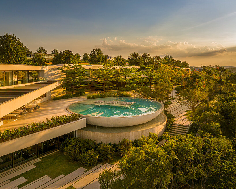
    The home unfolds in a series of deliberate contrasts with straight lines and softened curves, exposed openness and protected retreat. Horizontal forms dominate the composition, punctuated by two moments: a sculptural internal staircase that floats downward in a loose, extended spiral, and a circular swimming pool that overlooks the sloping terrain below. The pool’s shape emerges in part as a response to site conditions, with a subtle overflow that creates a shallow wet edge, lined with travertine that matches the surrounding flooring.

    images © Fernando Guerra

    Design and Layout

    Throughout the project, the team at Passarelli Arquitetos uses material and form to frame a balance between openness to nature and a sense of seclusion. Wide eaves and pergolas shade the interior from direct sun while preserving sightlines to the landscape. The house is organized around a gallery at the upper level, which opens onto a generous social space before stepping down to more private quarters.

    Circulation through the home encourages a gradual descent, guided by the wide central staircase that reveals varying perspectives of the structure and its garden. The spatial sequence feels composed yet informal, offering moments of pause and discovery rather than abrupt transitions.

    passarelli arquitetos casa baro
    Casa da Baro is located in a residential community in the interior of São Paulo

    Material Palette and Furniture Selection

    A restrained material palette strengthens the project’s architectural coherence. Travertine stone unifies both interior and exterior surfaces, creating a subtle continuity between living areas, terraces, and the pool. The living room is defined by its double-height ceiling lined in warm wood, and by the soft daylight that filters through openings calibrated to the sun’s path.

    Furniture selections reflect a curated sensibility, with pieces by Lina Bo Bardi and the Campana Brothers anchoring the space alongside a private art collection that includes works by Osgemeos and Daniel Senise. These choices add texture and context without overwhelming the architecture’s clean gestures.

    Architect’s Vision and Outcome

    Marcelo Passarelli describes Casa da Baro as a project that arrived at the right moment in his professional trajectory. Its calm resolution, careful massing, and attention to site conditions reflect a maturity in practice that allows expressive features to emerge naturally from structural and environmental considerations. The home feels grounded without being rigid, and feels expressive without exaggeration.

    passarelli arquitetos casa baro
    the house follows the natural topography with a horizontal, winged layout

    passarelli arquitetos casa baro
    Passarelli Arquitetos emphasizes linear forms punctuated by sculptural curves

    passarelli arquitetos casa baro
    large eaves and pergolas offer shade while maintaining visual openness

    Conclusion

    Casa da Baro, designed by Passarelli Arquitetos, stands as a testament to the power of thoughtful design in creating a sense of harmony between nature and architecture. By embracing the natural contours of the site and incorporating a balanced blend of openness and seclusion, the project achieves a unique sense of calm and expressive elegance. The use of a restrained material palette, coupled with carefully selected furniture and art pieces, further enhances the architectural coherence of the home. As a result, Casa da Baro not only serves as a beautiful residential space but also as a reflection of the maturity and consideration that comes with thoughtful architectural practice.

  • Hee House by Studio Ellsinger

    Hee House by Studio Ellsinger

    Introduction to Hee House

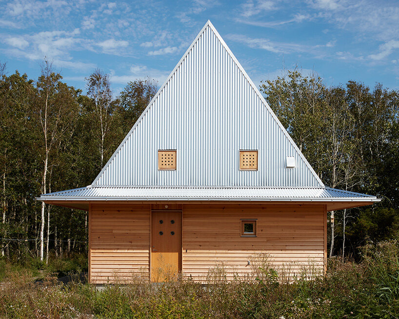
    Hee House, designed by Studio Ellsinger, stands on a flat plot just south of Hamburgsund on Sweden’s West Coast. Framed by pines, weathered rocks, and meadow grass, the vacation home balances a modest footprint with a sense of generous interior scale. The design responds directly to the site’s prevailing coastal climate, using durable materials and careful orientation to protect against wind and rain.

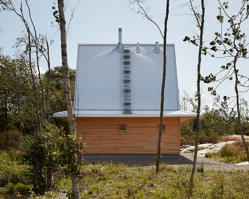
    From the north, the façade remains closed to shield views from the road and neighboring properties. Toward the south and east, large openings draw in daylight and connect the interiors to the forest edge and open fields. This dual character — introverted on approach, expansive within — establishes a clear distinction between shelter and landscape.

    images © Christopher Hunt

    Vertical Space and Structural Ingenuity

    At only 7 by 7 meters in plan and reaching 7 meters in height, Studio Ellsinger’s Hee House achieves surprising volume. To preserve clear sightlines and avoid structural elements interrupting the main space, the design moves roof loads into a horizontal laminated timber frame. This strategy eliminates the need for bracing or exposed beams that would segment the experience of the tall room.

    The architects clad the roof and all gable surfaces in untreated aluminum sinus sheeting, chosen for its resistance to the harsh coastal conditions and its ability to weather naturally over time. A cantilevered canopy extends from the main volume, reinforcing the house’s protective posture while marking the entry.

    hee house studio ellsinger
    Hee House by Studio Ellsinger is located just south of Hamburgsund on Sweden’s West Coast

    Custom Detailing for a Design-Minded Client

    The clients — a photographer and a writer, both working within design — worked together with Studio Ellsinger and brought an informed perspective to the Hee House. Their openness to unconventional solutions led to a fully bespoke approach. Nearly every element was designed specifically for the house, from the window profiles to the kitchen and fitted furnishings.

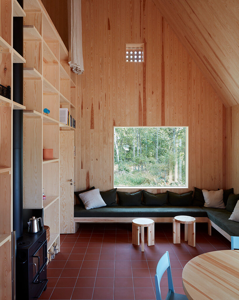
    Inside, the layout organizes a large central volume around a lofted platform. Beneath the loft, a compact sequence of rooms includes a hallway, bathroom, and private bedroom. The loft itself is held aloft by a bookshelf that stretches the full width of the space. This single piece serves as structural support, storage, and the main room divider, integrating a fireplace and extensive shelving in one continuous element.

    hee house studio ellsinger
    the house sits on a flat plot surrounded by pines rocks and meadow grass

    hee house studio ellsinger
    the exterior is clad in untreated aluminium sinus sheeting for durability in harsh weather

    hee house studio ellsinger
    a laminated timber frame carries roof loads to keep the main volume visually clear

    Conclusion

    Hee House by Studio Ellsinger is a testament to the power of thoughtful design in creating a sense of space and connection to nature. The house’s unique blend of introverted and expansive spaces, combined with its bespoke detailing and structural ingenuity, make it a truly special place. As a vacation home on Sweden’s West Coast, Hee House is a haven for those seeking to escape the hustle and bustle of daily life and connect with the natural world. With its durable materials and careful orientation, the house is well-equipped to withstand the harsh coastal conditions, ensuring that it will remain a beloved retreat for years to come.

  • Titi’s House in Vietnam

    Titi’s House in Vietnam

    Compact Living in Ho Chi Minh City

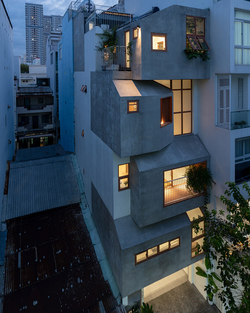
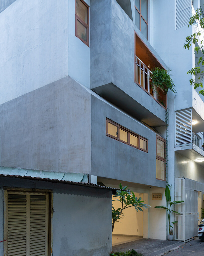
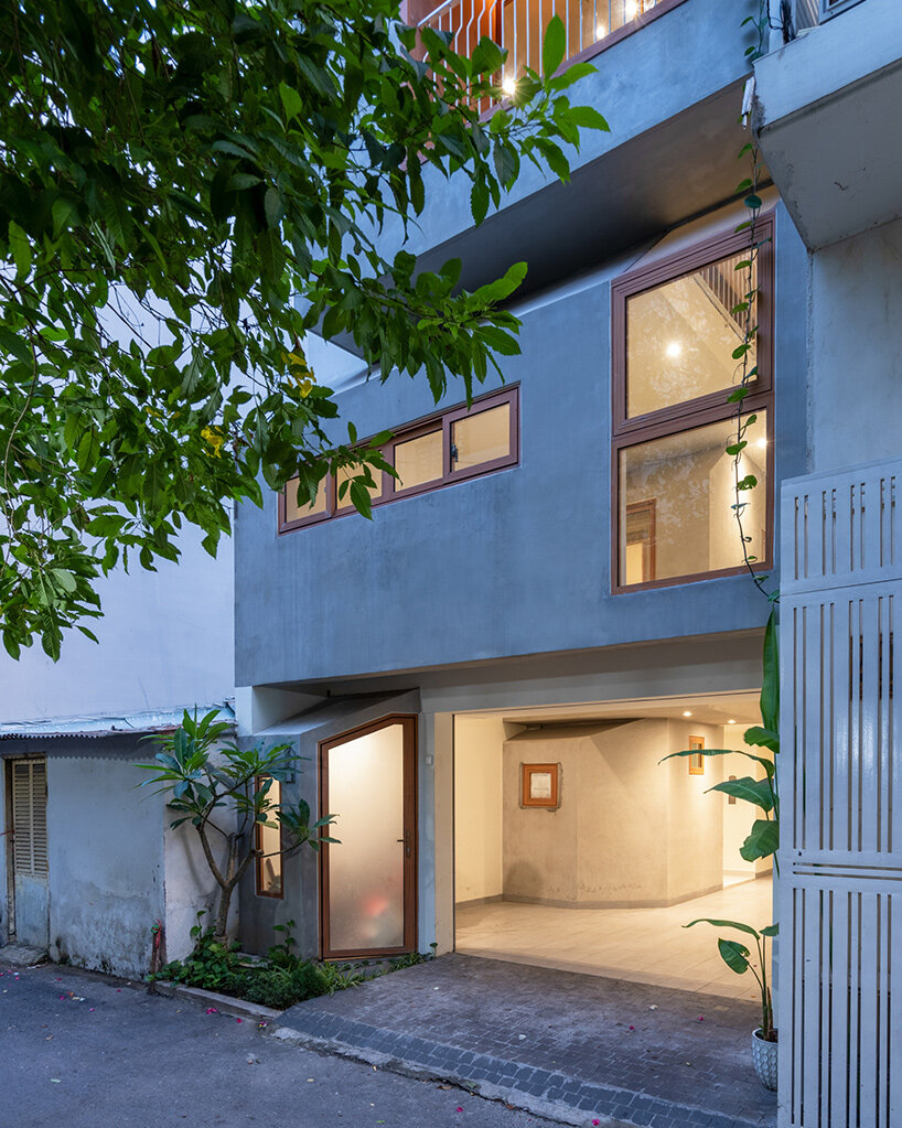
    TiTi’s House is a newly completed residence by NAQI & Partners in Vietnam’s Ho Chi Minh City, situated in the dense fabric of District 10. Designed for a young couple and their three children, the project transforms a narrow fifty-square-meter site into a calm, cohesive living space that balances privacy and shared connection.

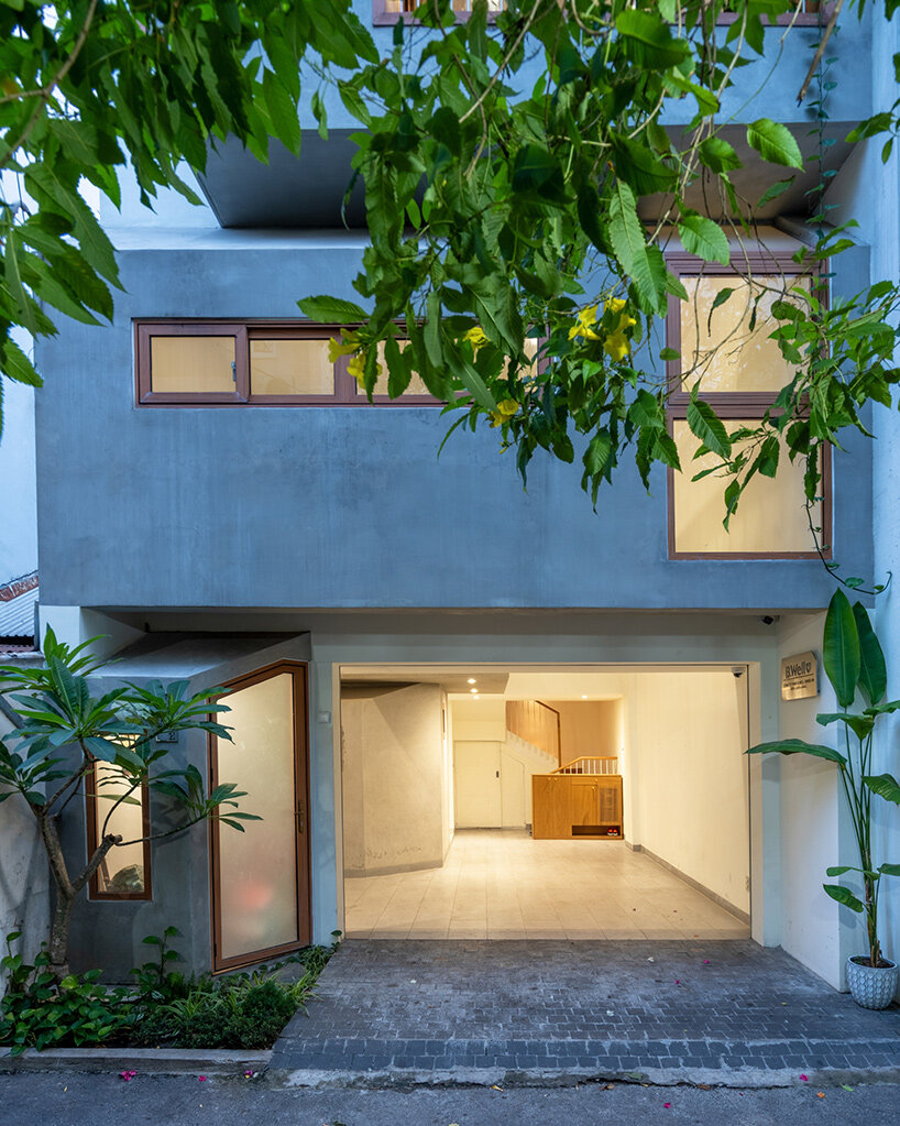
    From the street, the facade appears modest — white walls set behind a simple metal gate. Early in the day, when the sun is still low, the slanted rooftops cast thin diagonal shadows across the entry steps. A small garden sits to one side of the threshold, softening the line where concrete meets tile. These understated gestures hint at the project’s underlying ambition to provide each family member a sense of individual retreat while maintaining the closeness that comes with living in close quarters.

    images © Nguyễn Nhật Anh Chương

    Spatial Strategies and Daily Life

    The Vietnam-based architects organize the layout of TiTi’s House to unfold vertically across four levels. A central atrium rises through the middle of the plan, drawing daylight deep into the home and allowing air to circulate freely. This void functions as both light well and acoustic bridge. The open-plan layout helps mitigate the constraints of the site. Shared spaces flow into one another without abrupt divisions, while sliding panels and built-in storage provide options for delineating zones when needed. In the evenings, the family gathers on the first floor around a low dining table, the atrium above lending a quiet sense of expansion.

    titi's house vietnam
    the compact, four-story home is designed by NAQI & Partners in Ho Chi Minh City

    Material Palette and Architectural Character

    Curating the interiors of TiTi’s House, the team adopts a restrained material and color palette to amplify the perception of space within the dense neighborhood in Vietnam. White walls reflect daylight, complemented by pale grey ceilings and warm timber floors. Where the atrium walls meet the floors, slim steel railings preserve sightlines, making each level feel visually connected to the next.

    NAQI & Partners’ custom cabinetry features pitched tops that echo the roofline, a detail inspired by childhood drawings of houses — simple forms with peaked silhouettes. Beds integrate into these built-ins and incorporate storage drawers beneath the mattresses. Throughout the house, there is no unnecessary ornament. Instead, each detail reflects the studio’s commitment to clarity and purpose.

    titi's house vietnam
    the house occupies a narrow site surrounded by dense urban development

    Urban Context and Design Response

    The architects note that in Ho Chi Minh City, rapid urbanization has made narrow tube houses a common typology. TiTi’s House acknowledges this context without surrendering to it. By introducing an internal void and prioritizing adaptable spaces, the design resists the sense of enclosure often associated with constrained footprints. On humid afternoons, the stack effect draws cooler air through operable openings. Even when all five residents occupy different floors, voices and movement remain perceptible as a reminder of shared presence.

    The project is described as a study in proportion and perception. Small shifts in ceiling height, combined with carefully placed windows, create moments of openness and enclosure that adjust to the family’s rhythms across the day.

    titi's house vietnam
    white walls and pale grey ceilings reflect light and enhance the perception of openness

    titi's house vietnam
    the design prioritizes flexible spaces that support privacy and connection for the family of five

    Conclusion

    TiTi’s House stands as a thoughtful response to the challenges of compact living in Ho Chi Minh City. By combining a restrained material palette with

  • Casa Símera Café

    Casa Símera Café

    Casa Símera: A Garden Retreat in Mexico City

    Casa Símera is a multifunctional project by architecture studio WORC, located in Mexico City. Combining a café, wellness studio, and communal gathering spaces, the architecture guides visitors through a gradual sequence of thresholds and atmospheres, each tuned to different rhythms of activity and rest.

    Set back from the street and partially veiled by foliage, the entrance to Casa Símera feels more like the beginning of a garden path than a commercial storefront. A stone walkway leads to a shaded terrace where low seating and planter beds establish a sense of calm before entry. This open threshold softens the transition between public and interior life, allowing for a pause.

    Introduction to the Café

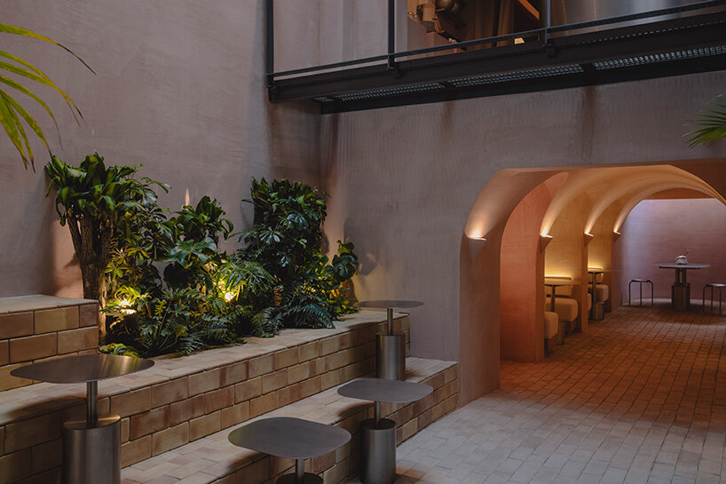
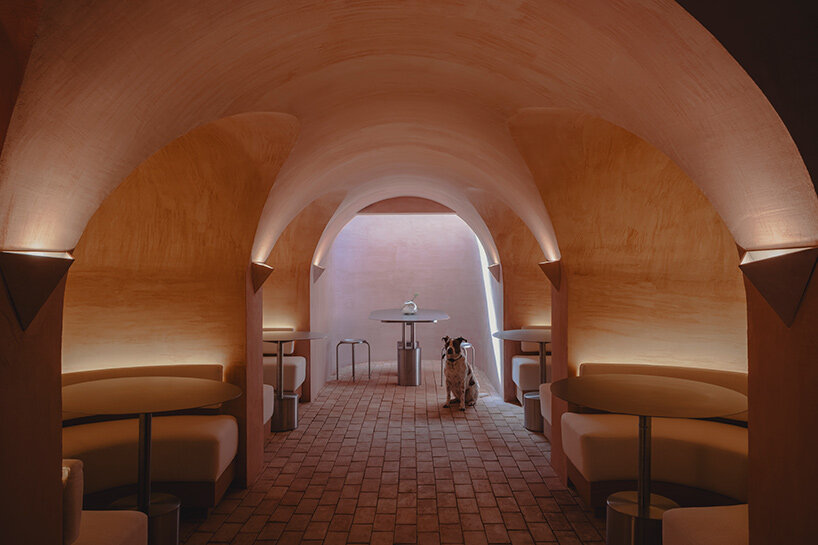
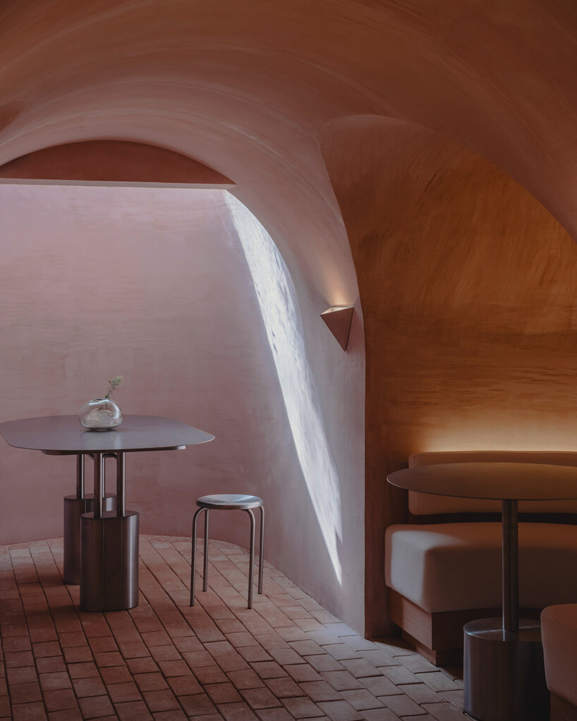
    Inside, the café is carved into a series of sculptural alcoves. Curved benches nest individual tables along the walls, while a marble service bar runs through the center. Materials are tactile and warm, with clay tiles underfoot, earthy pink-toned plaster walls, and soft ambient lighting. Acoustic treatments are integrated, preserving a sense of quiet even during the most active hours of the day.

    images © Zaickz Moz

    Material Palette and Spatial Core

    The spatial core of Mexico City’s Casa Símera is an open vertical atrium, topped by a four-story skylight that draws light deep into the plan. Tiered concrete platforms offer informal gathering points, while a vertical garden climbs the surrounding walls, gradually enclosing the space in greenery. This courtyard anchors the project spatially and conceptually, acting as both a social hub and a visual conduit that links the café below to the wellness studio above.

    Throughout Casa Símera, the material palette by the design team at WORC remains consistent and deliberate. Clay flooring, stainless steel accents, smooth natural fabrics, and live plants work together to create balance. Marble and steel offer moments of contrast, but nothing feels excessive. The result is an architecture that recedes just enough to let activity shape the space without disruption.

    casa símera mexico city
    the entrance is framed by greenery and a stone path leading to a shaded terrace

    The Wellness Studio Above

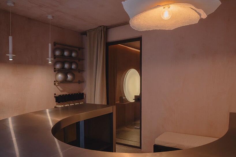
    On Casa Símera’s upper level, WORC situates a wellness studio for a quiet counterpoint to the garden below. This windowless room is free of visual distractions, with a controlled environment engineered for hot pilates and slow movement practices. Lighting is diffuse and warm, with a focus on directional control to guide attention inward. Integrated climate and acoustic systems maintain comfort across a range of temperatures and intensities.

    The studio’s architecture supports inward focus. Enclosed, softly lit, and thermally regulated, it invites users to disconnect and realign. While the lower levels are designed for interaction and social rhythm, this upper sanctuary encourages solitude and presence. WORC designs Casa Símera as a continuous spatial experience rather than a set of discrete zones. Circulation unfolds naturally from one space to the next, and each room is defined less by enclosure and more by atmosphere.

    casa símera mexico city
    the café features curved benches, clay tile flooring, and sculpted alcoves for quiet gatherings

    casa símera mexico city
    a marble bar and stainless steel details add subtle contrast to the earthy material palette

    casa símera mexico city
    the upper floor wellness studio brings a quiet counterpoint to the garden below

    Conclusion

    Casa Símera, designed by WORC, is a thoughtful and multifaceted space that combines the tranquility of a garden with the vibrancy of a café and the serenity of a wellness studio. Through its deliberate material palette, spatial design, and attention to atmosphere, Casa Símera creates a unique and continuous spatial experience. It invites visitors to transition smoothly between different states of activity and rest, making it a haven in the midst of Mexico City. The project stands as a testament to the power of architecture in crafting environments that nurture both community and individual well-being.

  • Skewed Meeting Room Marks Shanghai Office Revamp

    Skewed Meeting Room Marks Shanghai Office Revamp

    Introduction to Kaixuanfang Studio Renovation

    In Shanghai’s Changning District, Atelier Siyu breathes new life into a former industrial shell with the renovation of Kaixuanfang Studio, a 760-square-meter workspace that has served as the client’s headquarters for nearly a decade. Without altering the basic layout, the design team undertakes a strategic reprogramming of the two-level interior.

    The architects revamp this hybrid creative workspace, part photography studio and part office, introducing new volumes, angular geometries, and adaptive design gestures to improve circulation and help things run more smoothly. The project explores contrasts by combining logical planning with expressive design gestures, where rectilinear forms transition into dynamic alignments that frame views, connect spaces, and introduce moments of surprise.

    Key Interventions and Design Elements

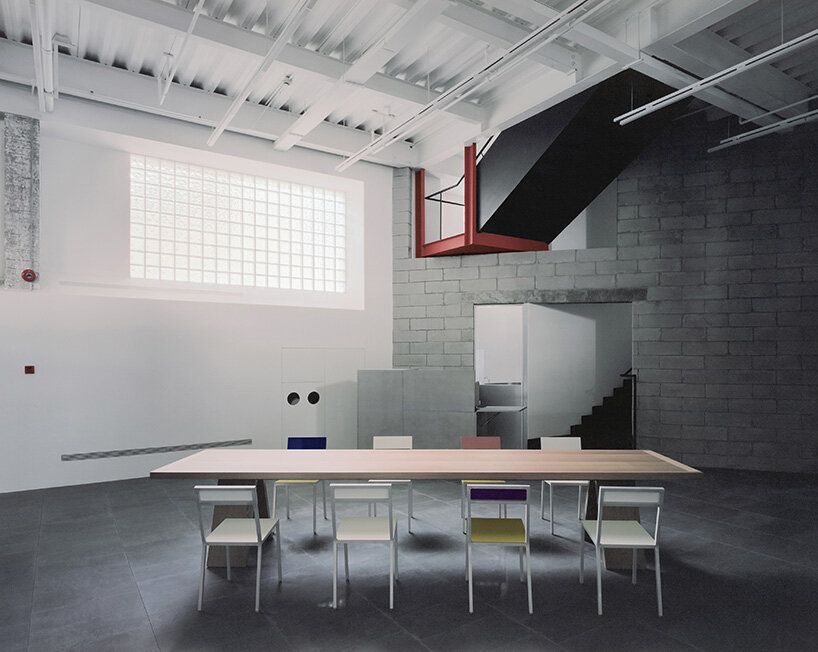
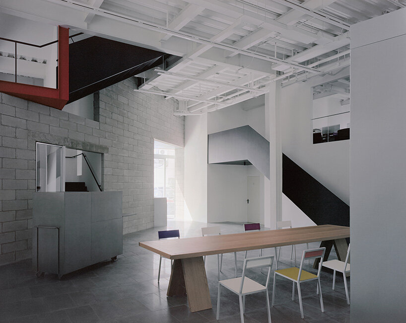
    A key intervention on the ground floor is a skewed meeting room, what Atelier Siyu calls a ‘box’, placed at a 15-degree angle within the orthogonal shell. This move sets off a ripple of indirect circulation routes and spatial overlaps that break up the previously straightforward floor plan. With dimensions of 4.2 by 7.2 meters, the box holds a 12-person conference space and acts as a spatial hinge, connecting the public-facing reception and photo studio with a series of more private functions, including a theater, sample room, and equipment storage.

    images by Chenhao, unless stated otherwise

    Angular Staircase and Brick Cladding Redefine the Entrance

    By intentionally misaligning new and existing planes, the designers at Atelier Siyu introduce a sense of motion and spatial depth. Subtle lighting interventions further amplify this layered geometry, playing off the angled surfaces to create an atmosphere that shifts throughout the day.

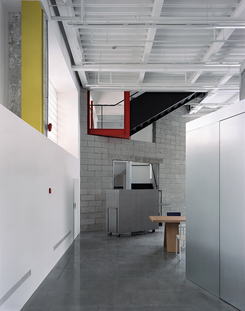
    One of the most striking design features appears right at the entrance, where Atelier Siyu reworks the existing staircase to directly connect the entryway with the reception area. By removing and repositioning part of the stair, they improve how people move through the space and turn the stair into a standout vertical element. The area beneath it now hosts a small pantry, visually tied to the front desk and kitchen with light brick cladding laid out in angular patterns. The stair itself, painted black, framed in red steel, and set on a grey concrete base, brings a bold, industrial feel to the space. Openings between the stair and reception are carefully placed to maintain visual connections while still offering a sense of privacy.

    skewed meeting room bends the grid in shanghai office revamp by atelier siyu
    a key intervention on the ground floor is a skewed meeting room

    Walls that Think: Integrating Utilities into Structure

    Along the window-facing wall on the first floor, the studio found a thick, 600-millimeter wall made of concrete and added steel. Instead of tearing it down or covering it up, Atelier Siyu decided to work with it in a practical way. They neatly fitted things like air conditioners, fire extinguishers, and trash bins into the wall at just the right heights, creating a smart, multi-use area that frees up floor space and helps organize the studio better. To balance light and privacy, parts of the wall are covered with glass bricks, which not only fit the building’s industrial look but also gently soften the light inside.

    skewed meeting room bends the grid in shanghai office revamp by atelier siyu
    Atelier Siyu breathes new life into a former industrial shell with the renovation of Kaixuanfang Studio

    Navigating Low Ceilings with Geometry and Light

    Upstairs, the ceiling drops to just 2.3 meters under the original beams, a challenge that the architects embraced with bold, geometric shapes. They added irregular metal structures between work areas to create clear boundaries, change how the space feels, and open up certain spots. Private offices for administration, finance, and management are enclosed with slanted glass walls that line up with these metal shapes, creating overlapping crystal-like effects that make the space feel bigger than it is.

    To handle electrical wiring on the second floor, where running cables under the floor wasn’t an option, Atelier Siyu used vertical columns that quietly carry wires from the ceiling down to the desks, turning necessary infrastructure into part of the design.

    skewed meeting room bends the grid in shanghai office revamp by atelier siyu
    the area beneath the staircase now hosts a small pantry

  • Kellogg’s Silos Turned Into Hotel

    Kellogg’s Silos Turned Into Hotel

    Urban Transformation in Bremen’s Harbor District

    In Bremen, Germany, a cluster of 1970s grain silos once used by Kellogg’s has been transformed into the John & Will Silo Hotel by Delugan Meissl Associated Architects (DMAA). The site, located on the Überseeinsel peninsula within the larger redevelopment of Überseestadt, forms part of one of Europe’s most ambitious urban renewal projects. With the River Weser on one side and Bremen’s city center nearby, the intervention repositions industrial heritage as a civic and cultural landmark.

    The former Kellogg’s site, now a mixed-use complex, maintains the prominence of the original silos while introducing new programs across its perimeter. DMAA’s response preserves the visual identity of the site while subtly threading it into the changing rhythm of the waterfront.

    images © Piet Niemann

    Silos Reimagined as Hotel Architecture

    The concrete silos in Bremen, once capable of storing up to 5,000 tons of Kellogg’s grain, are now occupied by 117 uniquely configured guest rooms for the John & Will Silo Hotel. The architects at DMAA plan each room with a circular or semi-circular floorplan, following the geometry of the original silo forms. Vertical window slits have been carved through sixteen-centimeter-thick concrete walls to frame narrow, cinematic views of the Weser. These minimal apertures maintain the visual weight of the structures while admitting natural light deep into the cylindrical spaces.

    The original red Kellogg’s logo remains emblazoned atop the tallest silos, asserting continuity with the past even as the interior is radically repurposed. Below, a low-rise annex formerly used as a vitamin store has been adapted into five levels of office and conference spaces, with a new rooftop pavilion serving as an event venue.

    kellogg's hotel bremen
    the Kellogg’s silos in Bremen have been transformed into a hotel by DMAA

    Cutting through Concrete, Connecting New Volumes

    To adapt the Kellogg’s silos for hospitality use in Bremen, DMAA introduced new interior corridors and openings that connect the cylinders. Access routes were carefully threaded through the concrete mass, and 3,500 cubic meters of concrete were excavated and removed by hand. The hotel lobby incorporates the silos’ original funnel-shaped bases, allowing the building’s industrial function to remain legible within the new program.

    The architectural intervention extends beyond the hotel. The adjacent rice store has been adapted into a market hall and restaurant cluster, while new terraces and an in-house brewery activate the waterfront with public life. These spaces contribute to a broader strategy for integrating communal amenities within the former industrial fabric of Bremen.

    kellogg's hotel bremen
    the project is located on the Überseeinsel within Bremen’s larger harbor redevelopment

    kellogg's hotel bremen
    DMAA preserved the industrial character of the original 1970s concrete structures

    kellogg's hotel bremen
    the complex includes restaurants, a brewery, and a market hall within the adjacent rice store

    Conclusion

    In conclusion, the transformation of the Kellogg’s silos into the John & Will Silo Hotel by DMAA is a remarkable example of urban transformation and adaptive reuse. By preserving the industrial character of the original structures while introducing new programs and amenities, the project has created a unique and vibrant destination that celebrates Bremen’s industrial heritage while contributing to the city’s ongoing revitalization. The hotel’s innovative design and thoughtful integration into the surrounding context make it a compelling addition to the city’s landscape, and a testament to the power of creative and sustainable urban development.

  • Valldal Holiday Home

    Valldal Holiday Home

    Introduction to the Holiday Home

    A Holiday Home Embedded in the Slope

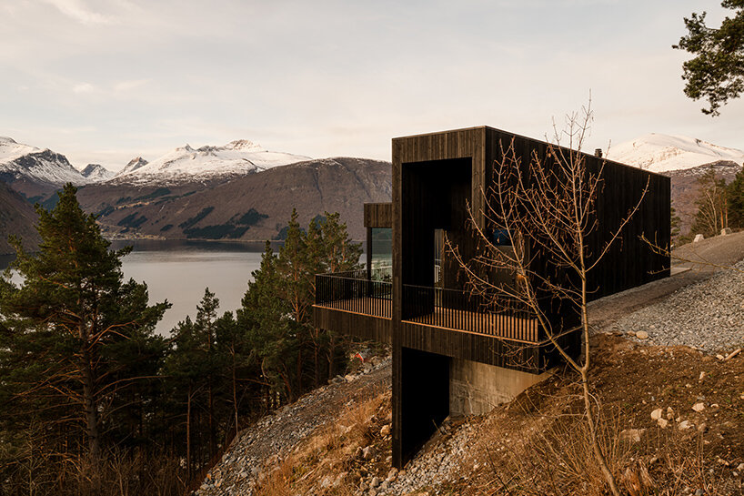
    A new holiday home designed by Office Inainn occupies a steep fjord landscape of Valldal, Norway. The 127-square-meter house is situated high above the waterline and built without leveling the terrain, allowing its form to emerge through close observation of the site.

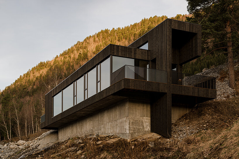
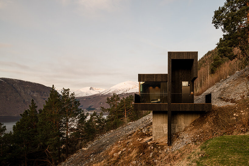
    The project’s approach is defined by its refusal to flatten or clear the land. Instead, a pair of subtly offset volumes follows the natural incline, stepping down with the hillside and creating spatial variation through section rather than partition. A concrete plinth raises the structure above the rocky ground, providing both stability and separation while leaving the landscape intact.

    Each timber-clad volume plays a specific role. A taller, narrow structure contains the entry sequence and a corridor lit from above, while the adjoining lower volume houses the living spaces and bedrooms, cantilevered outward to frame the fjord below.

    images © ONI studio

    Office Inainn’s Procession of Light and Views

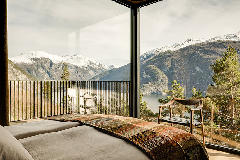
    Arrival at the house by Office Inainn begins along a narrow footpath hemmed by the rocky site and the holiday home’s timber facade. This experience extends inside, where the corridor becomes an interior continuation of the architects‘ compression of the vast site. Clerestory glazing and polished concrete floors lead visitors through a series of intimate spaces before the full fjord panorama is revealed at the living room.

    Framed views are a central element. Each room engages the terrain differently — some take in the steep forested slopes, others the open water. Glazing is expansive yet recessed, preserving privacy and minimizing visual noise while capturing the scale and movement of the landscape.

    office inainn holiday home
    a holiday home by Office Inainn is set high above a fjord in Valldal, Norway

    Norwegian Materials and Furnishings

    Office Inainn defines the holiday home’s material palette by restraint and locality. Dark timber cladding wraps both volumes, allowing the house to recede into its context, particularly under changing light. Inside, wood floors, muted olive walls, and cabinetry by Limstrand create a warm, quiet atmosphere. Furnishings by Fjordfiesta echo the same principles of minimalism and regionally sources.

    Window frames are painted dark and matched with top-hung curtains that extend the verticality of the openings. Across the interior, detailing remains tight and precise. Where contrast exists, it is gentle, used to draw out depth rather than distinction.

    The project was developed in close collaboration with a client who maintains longstanding ties to Valldal. Their brief, to let nature lead, was not treated as metaphor but as instruction. In practice, this meant holding back where possible, patiently calibrating the architecture through subtraction and alignment.

    office inainn holiday home
    the house is designed with minimal alterations of the rocky slope below

    office inainn holiday home
    two offset volumes follow the natural incline of the hillside

    office inainn holiday home
    the client requested that nature lead every design decision

    Conclusion

    In conclusion, the holiday home designed by Office Inainn in Valldal, Norway, is a testament to the power of restraint and locality in architecture. By allowing nature to lead the design process, the architects have created a home that not only blends seamlessly into its surroundings but also provides a unique and immersive experience for its occupants. The use of Norwegian materials and furnishings adds to the home’s sense of place, while the careful attention to detail and minimalistic approach ensures that the focus remains on the stunning natural landscape. As a result, this holiday home is a true gem, one that showcases the beauty of Norway and the importance of living in harmony with nature.