Author: cozyspaces.haelthyh@gmail.com

  • NEMESTUDIO’s Colorado Dwelling

    NEMESTUDIO’s Colorado Dwelling

    Geometric Duality Defines Residence by NEMESTUDIO in Colorado

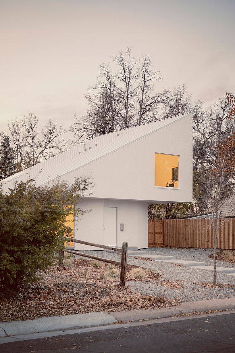
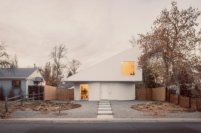
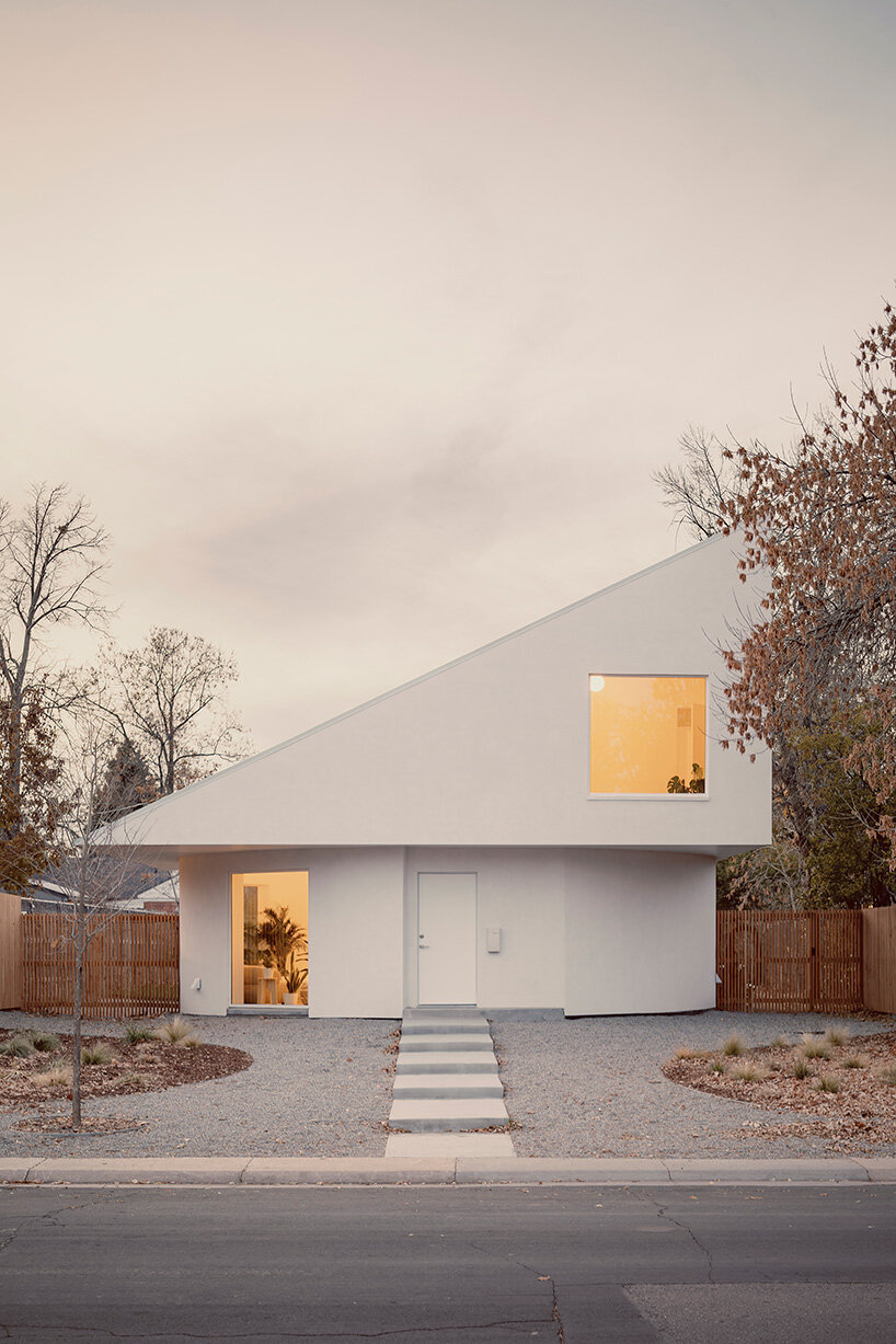
    CS2 House by NEMESTUDIO in Denver, Colorado, offers a study in how architectural form can shape everyday use without relying on high-end materials or complex systems. Located on a modest plot and built within a limited budget, the single-family home consists of two geometrically distinct parts. A circular base houses the main living areas, and a shed-roofed upper volume accommodates the bedrooms. Instead of blending into a unified form, the two parts remain clearly differentiated, introducing a purposeful disconnect that defines the facade and interior spaces of the building.

    all images by César Béjar

    Design and Layout

    San Francisco-based NEMESTUDIO conceives the ground floor of CS2 House as a single open space organized around a central column and enclosing wall. It contains a kitchen, a bathroom, and a double-height living area but avoids fixed zoning. Over time, this space has served a variety of roles, including home office, child-friendly playroom, art studio, gathering place, and temporary bedroom. Its circular geometry allows this flexibility, with no corners to anchor furniture or prescribe specific arrangements.

    The upper floor, more conventional in layout, holds two enclosed rooms and a shared bathroom, while the basement adds storage and a small guest room.

    Outdoor Spaces

    The deliberate misalignment between the base and upper volume of the residence creates overhangs, shaded edges, and a small terrace above, resulting in a variety of outdoor spaces that shift around the house. These in-between zones are not formally landscaped or programmed, but they emerge from the geometry itself and are used as spaces for sitting, walking, or observing, depending on use and season.
    circular ground floor supports shed-roofed volume in NEMESTUDIO's colorado dwelling
    NEMESTUDIO completes CS2 House in Denver, Colorado

    Adaptability and Affordability

    While CS2 House operates within the constraints of affordability, its design does not treat those constraints as purely restrictive. Instead, the project explores how low-cost construction can accommodate evolving patterns of living.
    circular ground floor supports shed-roofed volume in NEMESTUDIO's colorado dwelling
    offers a study in how architectural form can shape everyday use
    circular ground floor supports shed-roofed volume in NEMESTUDIO's colorado dwelling
    the single-family home consists of two geometrically distinct parts
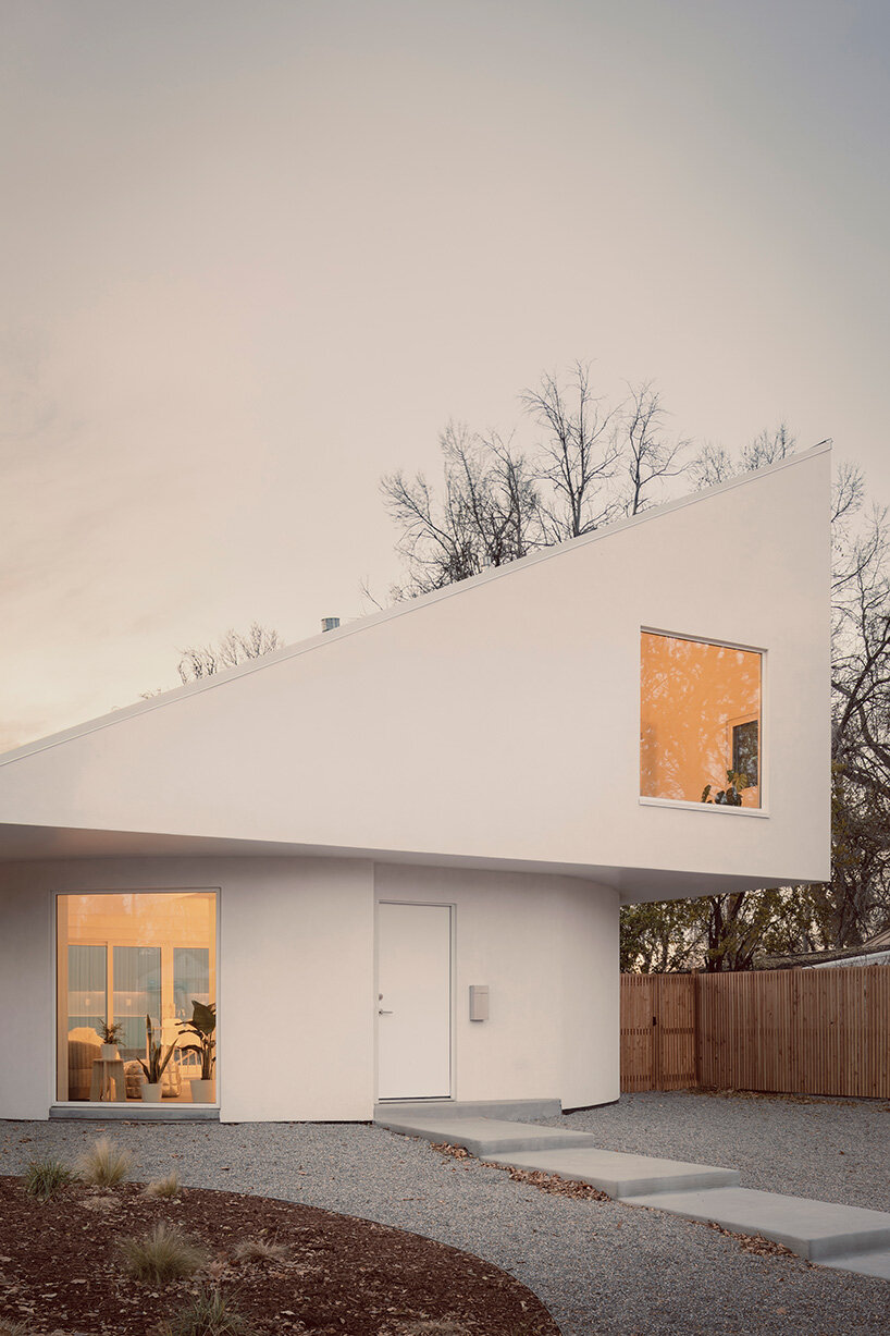
    circular ground floor supports shed-roofed volume in NEMESTUDIO's colorado dwelling
    the circular base houses the main living areas
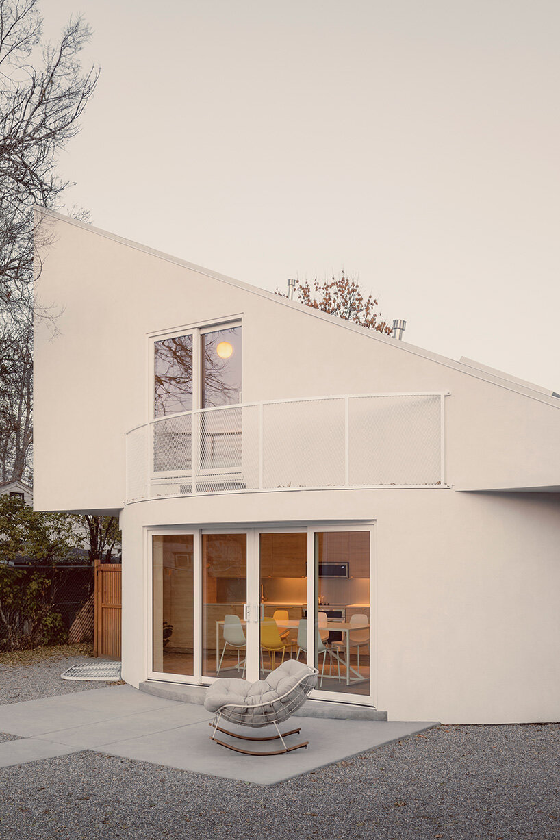
    circular ground floor supports shed-roofed volume in NEMESTUDIO's colorado dwelling

  • Atelier Wen’Arch Bookstore Floats Over Xixi Wetlands

    Atelier Wen’Arch Bookstore Floats Over Xixi Wetlands

    Introduction to the Xixi Goldmye Bookstore

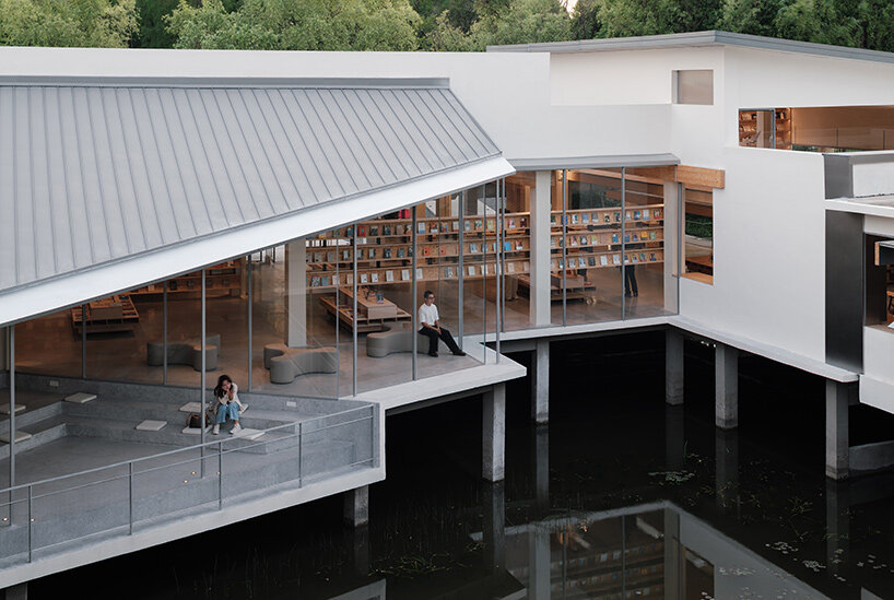
    The Xixi Goldmye Bookstore by Atelier Wen’Arch is located in the Xixi Wetlands of Hangzhou, China. The project transforms a 20-year-old U-shaped office building, originally closed-off and elevated above a water courtyard, into a layered and open space for reading and gathering.

    Originally marked by a disordered structure and a disconnected relationship with its wetland surroundings, the building’s framework has been pared down to its bare concrete columns. Through a series of deliberate architectural interventions — introducing new structural systems, timber frameworks, and water-facing spaces — the project recasts the site into a sequence of spatial experiences celebrates the landscape.

    images © Chen Hao

    Reframing a Closed-Off Structure

    Led by architect Shen Wen, the team at Atelier Wen’Arch begins the project with a disintegration of the bookstore’s existing roof and wall system. A suspended ceiling accommodates mechanical equipment, while a colonnade inserted along the west facade reorients the symmetrical composition into a more horizontal, flowing volume. A new pedestrian path of staggered concrete strips reclaims the vehicular driveway, creating a more nuanced and variable entrance sequence.

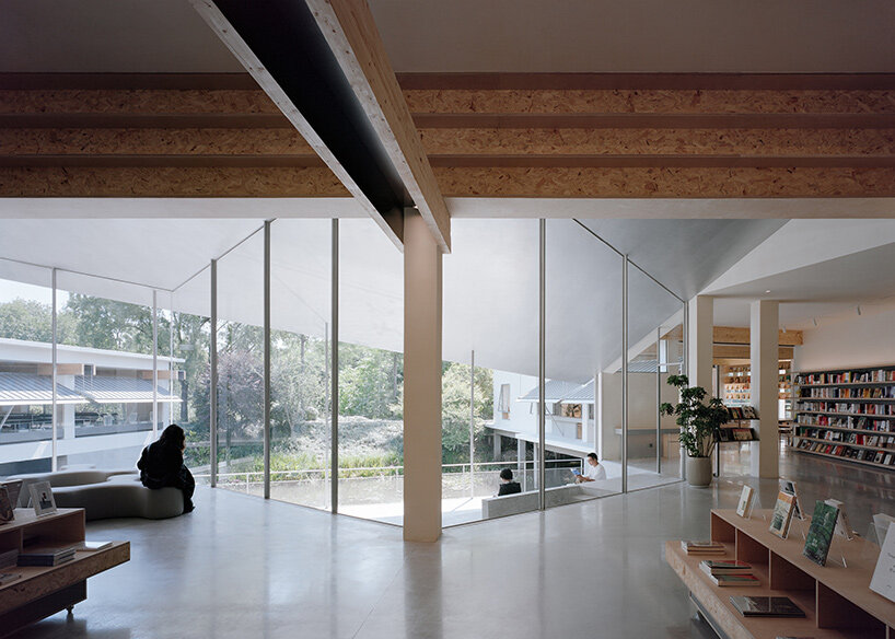
    In alignment with the original structural grid, the architects introduced a double-beam timber system. These laminated pine beams intersect the concrete columns and extend outward in measured cantilevers, defining a rhythm of horizontal spaces. Between each timber pair runs lighting and air-conditioning return channels, integrating infrastructure into the structure’s material logic.

    atenlier wen'arch bookstore
    the bookstore is elevated to float gently over Hangzhou’s Xixi Wetland

    Book Tower and Waterside Pavilion

    Two spatial interventions by Atelier Wen’Arch create vertical connections between bookstore’s architecture and the surrounding nature. A Book Tower anchors the southwest corner, rising with stacked mezzanines that wrap in nested rings. The structure uses a concealed grid of steel I-beams flush with the timber floor to maintain visual and tactile coherence. At its top, the tower draws in light and views, while the interplay of human silhouettes and horizontal lines animates the space.

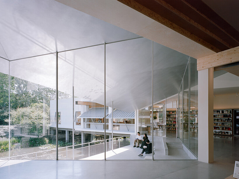
    The southern pavilion, once a faceted glass volume, has been reshaped into a sunken waterside room with a sloped roof. A portion of the original floor was removed, allowing the pavilion to settle closer to the water’s edge. Zinc panels clad the roof, and a silver-painted ceiling reflects ambient light. Recessed seating opens the space toward the wetland, drawing nature into the interior through quiet shifts in material and level.

    atenlier wen'arch bookstore
    Atelier Wen’Arch reframes a U-shaped office into a light-filled cultural space

    Filtering Light with Secondary Eaves

    Drawing from Song Dynasty precedents, Atelier Wen’Arch designed suspended secondary eaves that reinterpret historical sun-shading elements. These eaves are hung from the timber beams by upward tension rods, with downward braces at the center. They serve dual functions: reflecting soft light into the reading rooms and narrowing visual perspectives to maintain intimacy and focus on the wetland.

    The eaves, folding windows, and benches between columns build a field of architectural in-betweens, which is neither fully indoors nor entirely outside, mediating between the constructed and natural environments.

    atenlier wen'arch bookstore
    the original framework is pared down to columns and reorganized with timber beams

    Floating ‘Book Beams’

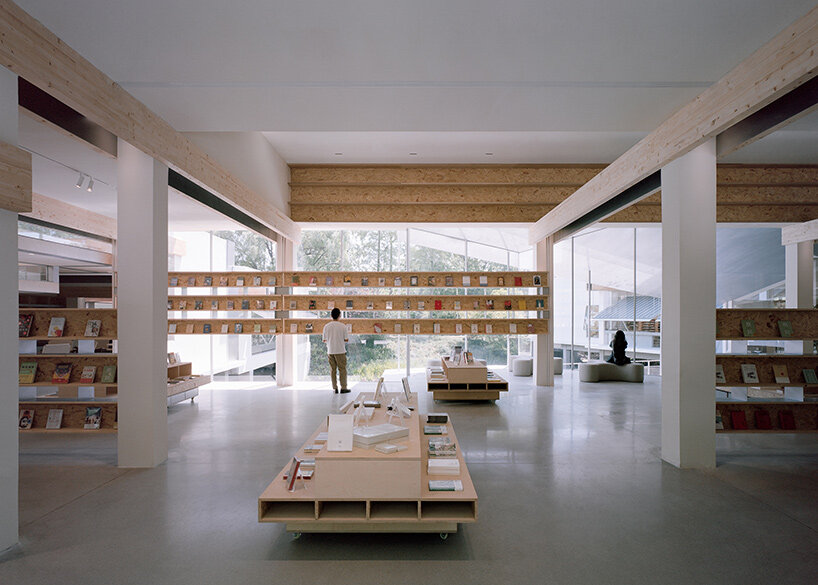
    Six sets of structural bookshelves, or ‘book-beams,’ stretch up to six meters between columns. Developed with structural engineer Zhang Zhun, the shelves consist of horizontal glued-laminated timber interlaced with vertical stainless steel plates, forming torsion-resistant I-beams. Suspended by rods and anchored to the columns, they serve both as shelving and as lightweight spatial dividers.

    These floating book-beams interweave with the primary timber system, building a subtle framework that merges structural clarity with spatial openness. Views extend through the shelves, framing books against a backdrop of water, vegetation, and light.

    atenlier wen'arch bookstore
    ‘book beams’ span between columns and are backdropped by the scenic landscape

    Conclusion

    The Xixi Gold

  • House by MIDE

    House by MIDE

    Introduction to MIDE Architetti’s Courtyard House in Italy

    Located on the transitional edge between a small urban center and the open countryside outside Padua, 200_ House with Interior View by MIDE architetti is infused with pocket gardens. Designed as a single-story residence for a family, the home settles into its setting with a low, horizontal profile that emphasizes the flat terrain and natural surroundings.

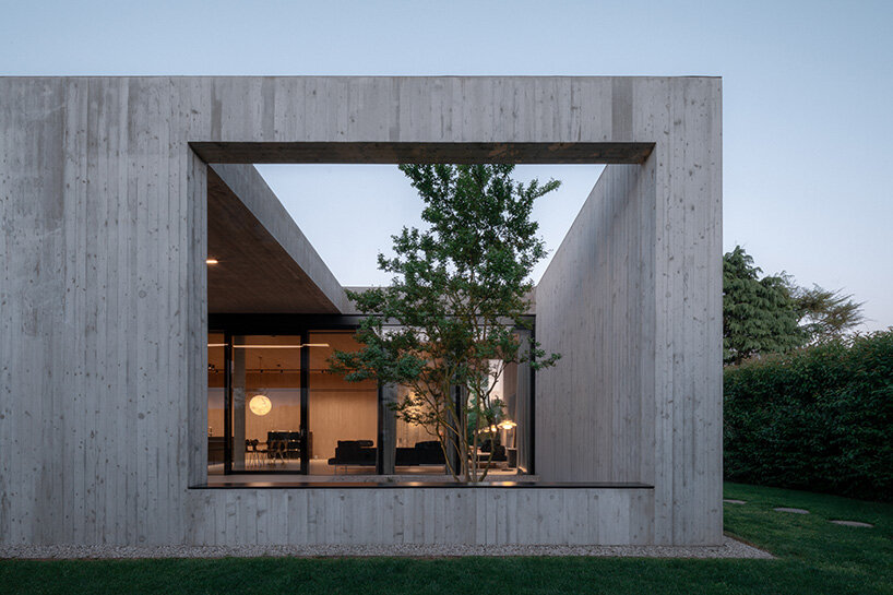
    The structure is composed of two concrete volumes of differing heights, oriented to form a series of connected yet distinct living zones. A taller block contains the entrance, an open-plan living room, and a sheltered outdoor patio, while the lower wing accommodates the bedrooms and private areas. The division in height subtly guides the internal organization of the house, while maintaining a unified language of materiality and geometry.

    images © Tobias Kaser

    Framing Space through Void and Volume

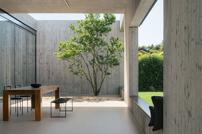
    The house’s spatial layout follows a sequence of three parallel bands, which MIDE architetti intersperses with interior courtyards and planted voids. These interruptions bring natural light into the home and introduce framed views of the surrounding greenery. The approach to the house is marked by a defined entry portal that opens onto a deep courtyard, establishing a threshold between the public and private realms.

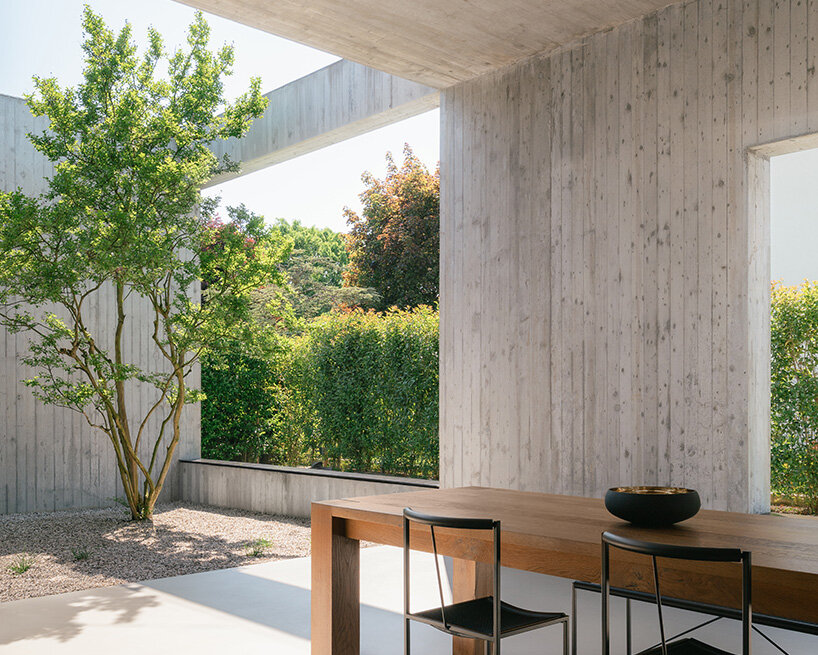
    This transitional space, partially enclosed and visually shielded, acts as a place for pause before entering the home. The design team carefully regulates visual permeability through targeted apertures, allowing the landscape to be present without overwhelming the sense of privacy.

    mide architetti house interior
    MIDE architetti designs ‘200_ House with Interior View’ at the edge of the countryside

    Material Continuity and Interior Warmth

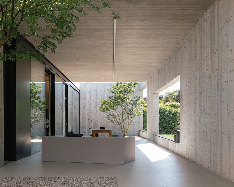
    MIDE architetti’s austere material palette continues along the interior, with light grey resin flooring creating an uninterrupted surface throughout the house. Smooth concrete walls and timber ceiling panels articulate a balance between coolness and warmth, with the latter concentrated in communal areas such as the living room. A wood-paneled feature wall and high ceilings soften the space and amplify natural light, establishing a tranquil, open atmosphere. The team’s attention to interior detail extends to furnishings and lighting. Pieces such as Davide Groppi’s ‘Moon’ lamp and the Sottsass-designed Tahiti table lamp punctuate the minimalist setting, adding measured notes of color and form that enrich the visual rhythm of each room.

    At the heart of the house lies an internal patio, where a perforated concrete canopy allows filtered sunlight to reach crepe myrtle trees and low grasses planted within. This moment of vertical openness acts as a compositional hinge for the project, tying together interior and exterior experiences while offering views of the sky and a shifting pattern of shadows throughout the day.

    mide architetti house interior
    the home is composed of two horizontal volumes that divide public and private space

    mide architetti house interior
    interiors are arranged around courtyards that draw in light and vegetation

    mide architetti house interior
    a sheltered patio establishes a gentle threshold between home and landscape

    Conclusion

    In conclusion, MIDE architetti’s 200_ House with Interior View is a masterful blend of modern architecture and natural surroundings. The house’s unique design, which incorporates pocket gardens, interior courtyards, and a perforated concrete canopy, creates a sense of continuity between the interior and exterior spaces. The use of natural materials, such as concrete, timber, and vegetation, adds warmth and texture to the minimalist setting. The result is a tranquil and open atmosphere that is perfect for a family residence. The house’s design is a testament to the power of architecture to create a sense of harmony between built and natural environments.

  • Atienza Maure Converts Warehouse

    Atienza Maure Converts Warehouse

    Introduction to La Nave

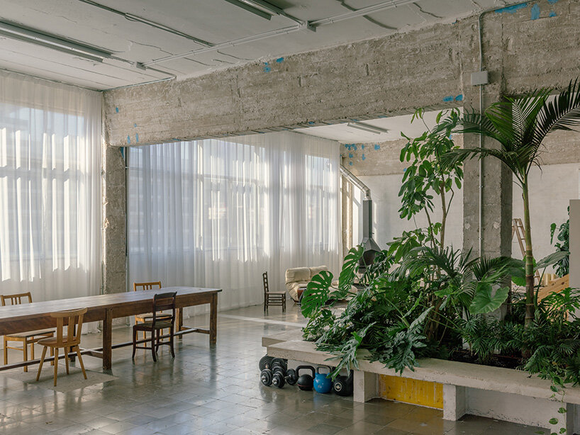
    Atienza Maure transforms a 450-square-meter printing warehouse into La Nave, a hybrid environment that combines work and home in the post-industrial fringe of Sant Adrià de Besòs, Spain, just outside Barcelona. The project houses both the headquarters of a tech company and the personal residence of one of its founders. Developed on a shoestring budget, the architects achieve spatial richness through the inventive reuse of low-cost industrial systems, reminiscent more of server racks and shelving than conventional construction, resulting in a labyrinthine landscape of metal and plywood.

    all images by Simone Marcolin

    La Nave’s Flexible Industrial Shell

    The warehouse, tucked inside a mixed-use block still bearing traces of its industrial past, sits among carpentry workshops, storage depots, independent churches, and even a spa. With no access to new openings or skylights, the Barcelona-based team at Atienza Maure opted for a radically open floor plan, introducing a series of mobile and double-access volumes that act as programmatic buffers between work and life. These units, accessible from two separate points, are designed to be claimed by either zone as needed.

    Circulating through La Nave feels more like drifting through a game level than walking through a building. A network of raised platforms, switchback staircases, and intersecting routes offers multiple ways to move through the space. This non-hierarchical layout, with no central corridor or dominant axis, encourages movement guided by use, habit, or convenience. This open and layered approach allows the residential and work areas to overlap without needing clear separations.

    atienza maure converts barcelona warehouse into live-work space using industrial systems
    Atienza Maure transforms a 450-square-meter printing warehouse

    Construction Approach and Materials

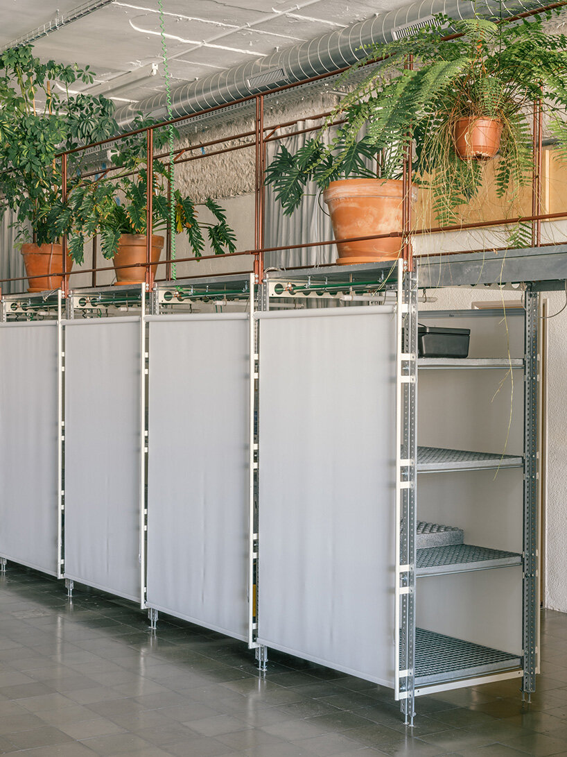
    To meet a strict budget of under €380 per square meter, the architects relied on low-cost, prefabricated components typically used in industrial settings. The main structure is made from galvanized steel L-profile shelving, a system more often associated with storage than construction. These elements support metal trays and threaded rods, which function both as walkable surfaces and as areas for storage. Plywood is used for floors and wall enclosures, while translucent polycarbonate panels provide internal openings that let in daylight without compromising privacy between zones.

    This systematized construction approach is balanced by a few more fixed elements, most notably, built-in pieces made from white concrete. These points introduce a sense of weight and stability within an otherwise flexible framework.

    atienza maure converts barcelona warehouse into live-work space using industrial systems
    a hybrid environment that combines work and home

    Conclusion

    La Nave, the transformed printing warehouse, stands as a testament to innovative and budget-friendly design. By repurposing industrial materials and embracing a flexible, open layout, Atienza Maure has created a unique live-work space that challenges traditional notions of work and home separation. As a model for adaptive reuse and creative problem-solving, La Nave offers valuable insights for architects, designers, and anyone looking to redefine the boundaries between living and working spaces.

  • Crosby Studios’ Chromatic Café

    Crosby Studios’ Chromatic Café

    Introduction to Café Nuances

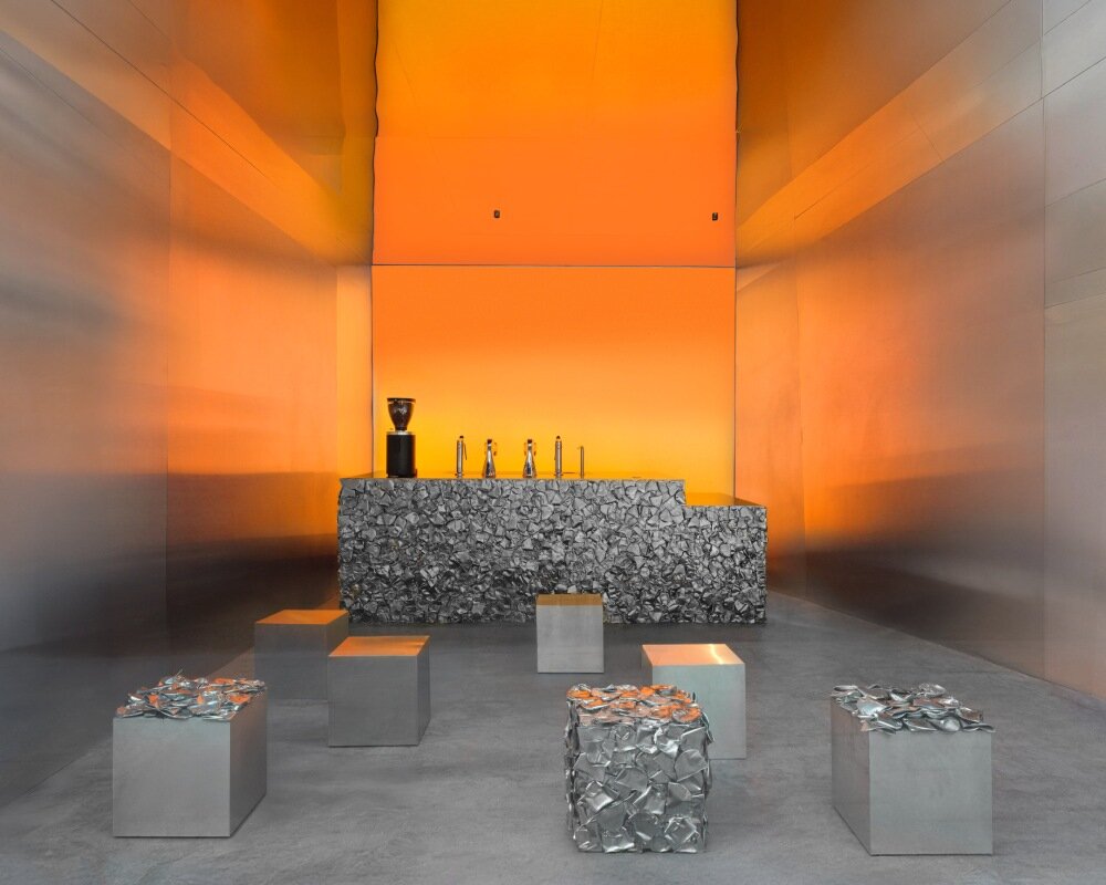
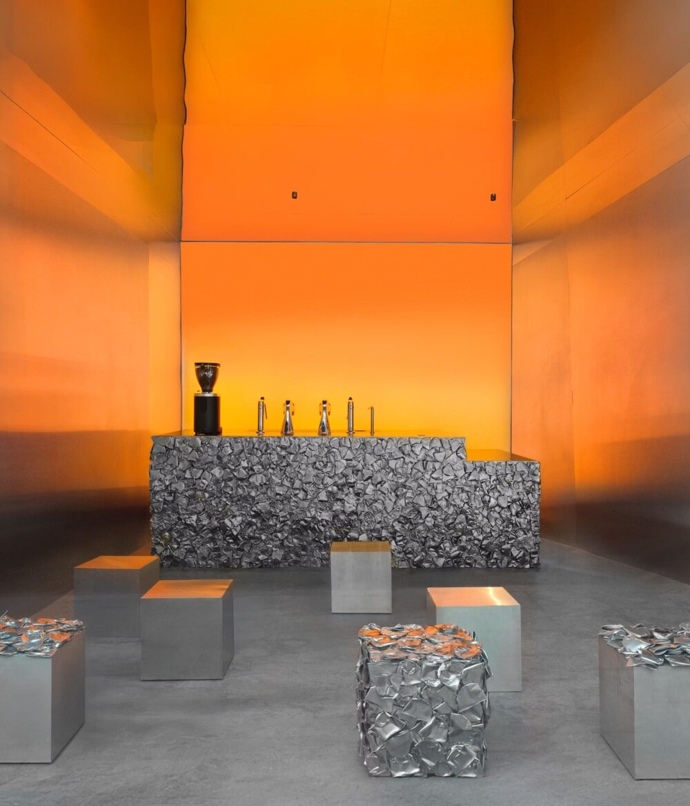
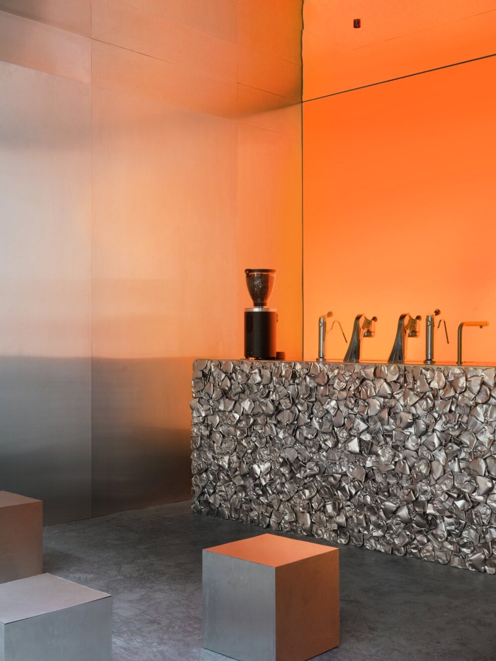
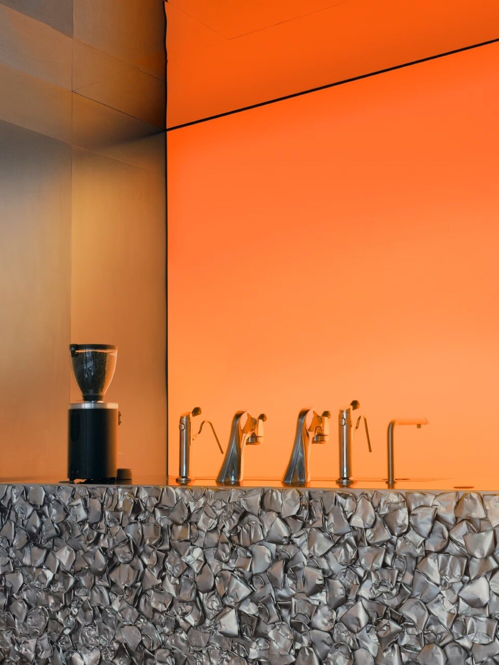
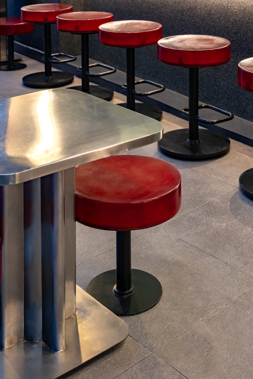
    Bathed in a warm orange glow and anchored by a counter clad in crushed silver metal, Café Nuances’ new outpost in Paris brings a raw, futuristic edge to the historic streets of Le Marais. Designed by Crosby Studios, the compact space plays with reflection, texture, and light to turn a simple coffee stop into an immersive, hyper-designed encounter.

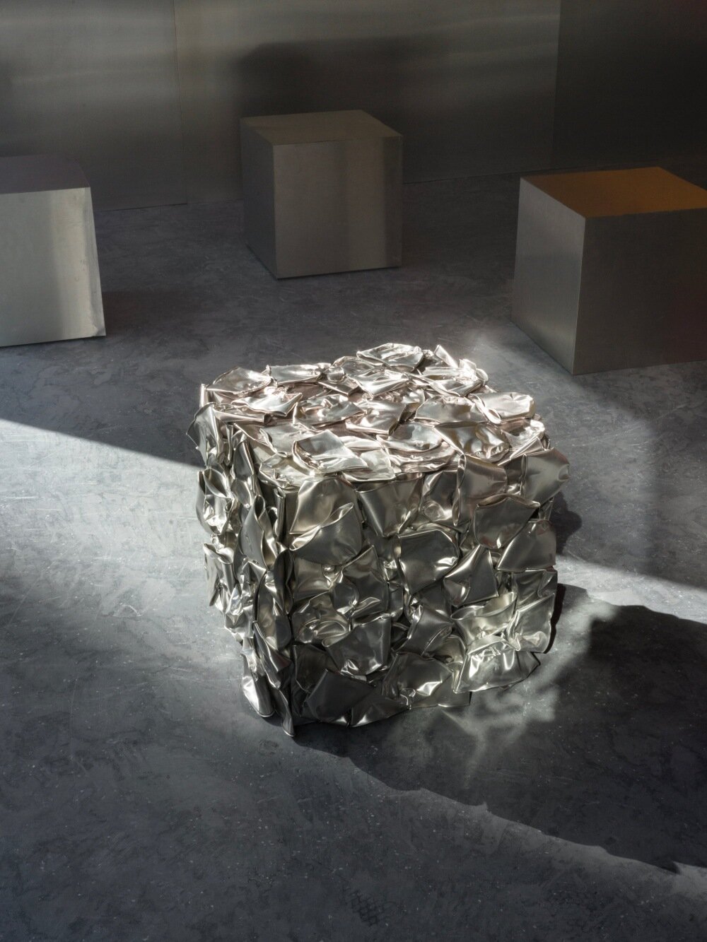
    At street level, a full-glass facade reveals an inviting glowing interior in which the only decor is a volume wrapped in small metal panels that evoke broken shards, and small metal volumes for visitors to take a seat. The walls are finished in Café Nuances’ signature gradient orange, creating a luminous backdrop that intensifies with the changing light. Mirrored surfaces on the ceiling and the monolithic seats reflect and multiply the room, giving the compact space a heightened spatial ambiance.

    all images by Jenia Filatova

    Design and Materials

    The choice of materials emphasizes texture and tactility. Stainless steel surfaces dominate — from the polished cube stools to the coffee equipment and fixtures — forming a palette that feels both raw and hyper-designed. Matching the counter, some seats are topped with the same crushed metal fragments, reinforcing the material language throughout. The floor, finished in smooth grey concrete, adds an understated contrast to the more reflective elements above.

    warm orange glow bathes crosby studios' chromatic café in paris 
    Café Nuances opens new outpost in Paris

    Crosby Studios’ Practice

    This location marks a stylistic evolution for Café Nuances. Conceived by Harry Nuriev, whose Crosby Studios’ practice often blends minimal forms with bold chromatic and material experimentation, the café becomes a curated interior experience, as well as a spot to enjoy coffee in the French capital. The artist and architect’s past work has included interiors and installations across Paris, New York, and Moscow, often pushing the boundary between furniture and sculpture.

    warm orange glow bathes crosby studios' chromatic café in paris 
    bringing a raw, futuristic edge to the historic streets of Le Marais

    Reflection, Texture, and Light

    Crosby Studios plays with reflection, texture, and light to create an immersive atmosphere. Mirrored surfaces on the ceiling and the monolithic seats reflect and multiply the room, giving the compact space a heightened spatial ambiance.

    warm orange glow bathes crosby studios' chromatic café in paris 
    Crosby Studios plays with reflection, texture, and light

    warm orange glow bathes crosby studios' chromatic café in paris 
    bathed in a warm orange glow and anchored by a counter clad in crushed silver metal

    warm orange glow bathes crosby studios' chromatic café nuances in paris 

  • SAAG designs PAB house

    SAAG designs PAB house

    Introduction to PAB House

    PAB House by SAAG Arquitetura is a residential project designed with careful attention to site, scale, and spatial clarity. The home is located in the Brazilian countryside, within a natural setting that gently slopes and unfolds with native vegetation. It is organized around two L-shaped volumes that distinguish private and social uses while maintaining a cohesive relationship with the landscape.

    The first block, reserved for private spaces, is designed with an austere material palette. Opposite it, the second volume opens generously to the surroundings, housing the living and gathering spaces. Here, floor-to-ceiling glass panels and large openings allow for uninterrupted visual continuity with the outdoor areas, supporting the architects’ intent to dissolve the boundary between interior and exterior.

    images © Fran Parente

    Design Approach

    SAAG Arquitetura organizes the volumes of its PAB House to follow the subtle slope of its site. This is most clearly expressed in the pool’s organic outline, which traces the contours of the land instead of cutting through it. The result is a water feature that appears embedded in the terrain. Views are calibrated to balance openness with privacy. The visual relationship between the two blocks encourages a dialogue while maintaining separation.

    Throughout the design, the architects emphasize a balance between structure and lightness. The more solid block is defined by rhythmic apertures that modulate sunlight and natural breezes. These openings introduce variety and texture to the facade and maintain the overall unity of the building. A subtle horizontal line delineates the transition between floors, reinforcing the layered reading of the architecture and articulating the relationship between the vertical and horizontal planes.

    saag arquitetura pab house
    the house is organized around two L-shaped volumes that separate private and social areas

    Modern Rural Silhouette

    The roofscape of the upper volume takes cues from vernacular house forms, particularly the gable, but reinterprets them with a contemporary approach. A lightweight metal roof replaces traditional tile, resting atop a rectilinear base to create a sense of tension and equilibrium. This choice of materials, along with the crisp detailing, lends a modern expression while subtly referencing familiar rural silhouettes.

    Materiality across the house continues the architectural themes of restraint and warmth. The palette includes cacao stone flooring, textured wood, and native plantings that weave through built and open spaces alike. The result is a residence that draws from its setting both visually and tactically. The home’s interiors suggest a layering of experience, where furnishings and collected objects bring texture to an otherwise composed architectural framework. The house becomes a container for stories.

    saag arquitetura pab house
    the private block is dense and enclosed, while the social block opens fully to the landscape

    Integration with Nature

    saag arquitetura pab house
    the layout preserves existing vegetation and follows the natural contours of the land

    saag arquitetura pab house
    an organically shaped swimming pool is embedded into the terrain rather than imposed on it

    Conclusion

    In conclusion, PAB House by SAAG Arquitetura is a masterful blend of modern architecture and natural integration, creating a unique and breathtaking residential project in the Brazilian countryside. The careful attention to site, scale, and spatial clarity, along with the emphasis on balance between structure and lightness, results in a residence that is both visually stunning and tactically engaging. The house becomes a container for stories, where the layering of experience is palpable, and the connection to nature is undeniable.

  • Meadow House Retrofit

    Meadow House Retrofit

    Introduction to Meadow House

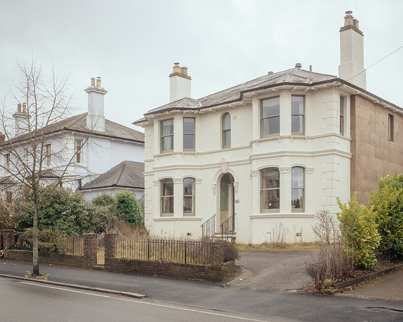
    Studio Bark has completed Meadow House, a deep retrofit and extension of a Victorian villa located on Meadow Road in Tunbridge Wells, England. The residential project delivers a 75% reduction in energy bills while expanding the home’s footprint by 27%, pairing environmental performance with a tactile and deeply personal design.

    Background and Challenges

    Before the renovation, which introduced an extension of timber and cork, the house had remained largely unchanged for half a century. Poor thermal performance, damp, and an outdated layout made daily life uncomfortable for the homeowners, a young family of four. Studio Bark was tasked with reimagining the building while preserving the essential character of the original structure.

    Design Approach

    The team’s approach focuses on reconfiguring the internal spaces to better serve contemporary family life. A new, fifty square-meter rear extension houses a kitchen-diner, utility room, pantry, and side entrance. This extension was built by the clients using Studio Bark’s modular U-Build system, enabling a hands-on, incremental process of construction with minimal waste.

    images © Jim Stephenson, courtesy Studio Bark

    Studio Bark’s Sunlit Victorian Retrofit

    At the core of Studio Bark’s Meadow House, a triple-height atrium brings light and volume to the center of the plan. Positioned at the transition point between the Victorian structure and the new addition, the atrium is framed by the original staircase and capped by a series of rooflights. It offers a vertical axis of connection, drawing in daylight and easing the flow between old and new without requiring visual or spatial uniformity. This way, the architects balance openness with privacy. Circulation spaces are widened and reoriented, while storage and utility spaces are tucked into the edges.

    Interior Design and Materials

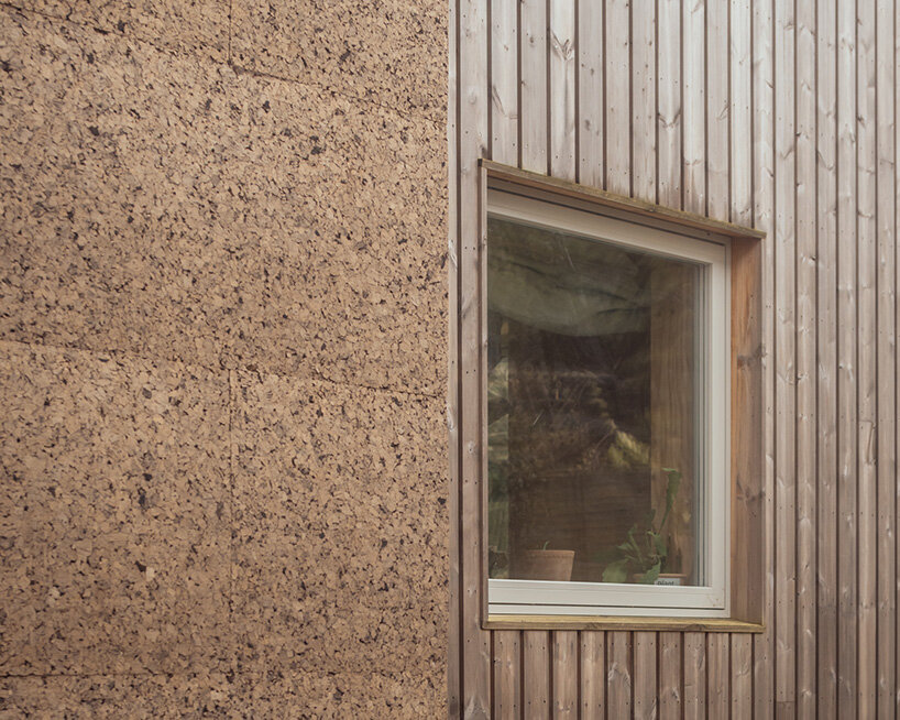
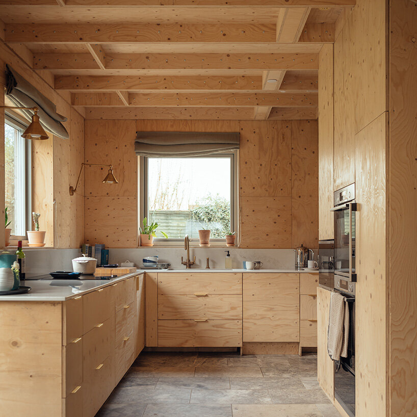
    The interior palette contrasts preserved Victorian features with natural materials that emphasize texture and tactility. Architraves and timber floors have been restored, while exposed spruce plywood and natural cork cladding lend the new areas a quiet warmth. Throughout the house, reuse and craftsmanship are emphasized. Furniture has been reupholstered, joinery is bespoke, and the pantry has been designed around an inherited dresser. The children’s bedrooms, housed within the U-Build framework, create a playful offset in scale and material — what the family describes as ‘feeling like a treehouse.’

    meadow house studio bark
    the project is a retrofit and extension of a Victorian home in Tunbridge Wells

    Passive Strategies and Circular Construction

    Alongside its spatial character, Studio Bark defines its Meadow House by its environmental ambition. The retrofit includes a comprehensive thermal upgrade using low-carbon, breathable materials such as cork, wood fiber, and sheep wool insulation. These materials support moisture regulation while achieving airtightness targets that contribute to thermal stability. Energy use is significantly reduced by the integration of a mechanical ventilation heat recovery (MVHR) system, an air source heat pump, and underfloor heating. These measures eliminate fossil fuel reliance and, combined with improved daylighting and spatial zoning, bring the operational carbon down by 68%.

    Sustainability and Self-Build Process

    The rear extension is a built example of circular thinking in residential design. Constructed entirely from the U-Build system, it is intended for future disassembly and reuse. This strategy keeps embodied carbon low and aligns with the London Energy Transformation Initiative (LETI) targets for sustainable building. The self-build process also played a meaningful role in the project’s outcome. By taking part in the construction, the family gained a deeper sense of ownership while embedding adaptability into the home’s long-term lifecycle.

    meadow house studio bark
    cork cladding and spruce plywood bring warmth and texture to the extension

    Conclusion

    ‘The design was driven by the client’s desire to live in a functional, comfortable and uplifting home, while responding to the context and climate challenges of our moment,’ Studio Bark Director Tom Bennett says. ‘At Meadow Road, the generosity of the existing Victorian house is combined with modern construction techniques and technologies, breathing a new lease of life into this building.‘

    meadow house studio bark
    the family built the extension themselves using Studio Bark’s U-build system

    meadow house studio bark

  • JJ Acuna’s Manila Eatery

    JJ Acuna’s Manila Eatery

    Introduction to La Chinesca

    In the heart of Bonifacio Global City in Manila, the Philippines, La Chinesca’s newest outpost boldly redefines what a contemporary Mexican dining experience can be. Designed by JJ Acuna / Bespoke Studio for Chef Bruce Ricketts and restauranteur Jae Ricketts, the space reflects an urban, multicultural edge with deliberate nods to various visual culture elements.

    Concept and Inspiration

    The concept pays homage to corner shop culture and deli architecture, inspired by institutions like New York City’s Katz’s Delicatessen. This reference is layered with eclectic influences: taco truck culture, cha chaan teng diners of Hong Kong, industrial metal accordion gates, and expressive street signage reflecting the vibrant attitude of Mexican graffiti, all coalescing into a space that feels both rooted and forward-looking.

    all images courtesy of JJ Acuna / Bespoke Studio

    Reimagining the Modern Mexican Restaurant in Manila

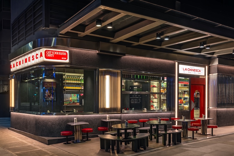
    La Chinesca BGC officially opened in 2025. The 92-square-meter footprint — comprising 40 square meters of front-of-house dining, a 22 square meter open kitchen, and a 30 square meter alfresco area — accommodates 55 seats, including 24 outdoors. While compact in scale, the space is dense with meaning, detail, and material richness.
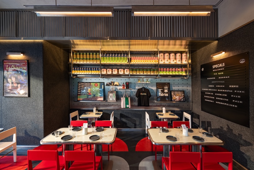
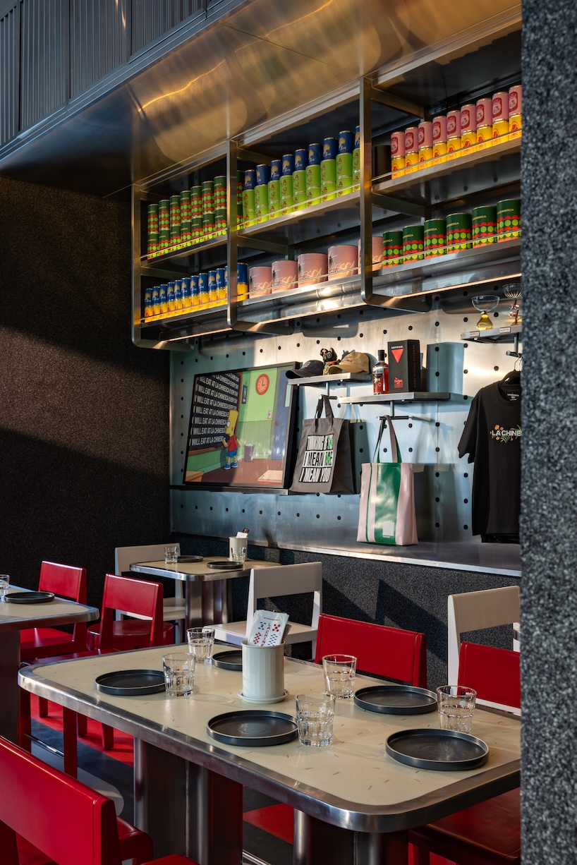
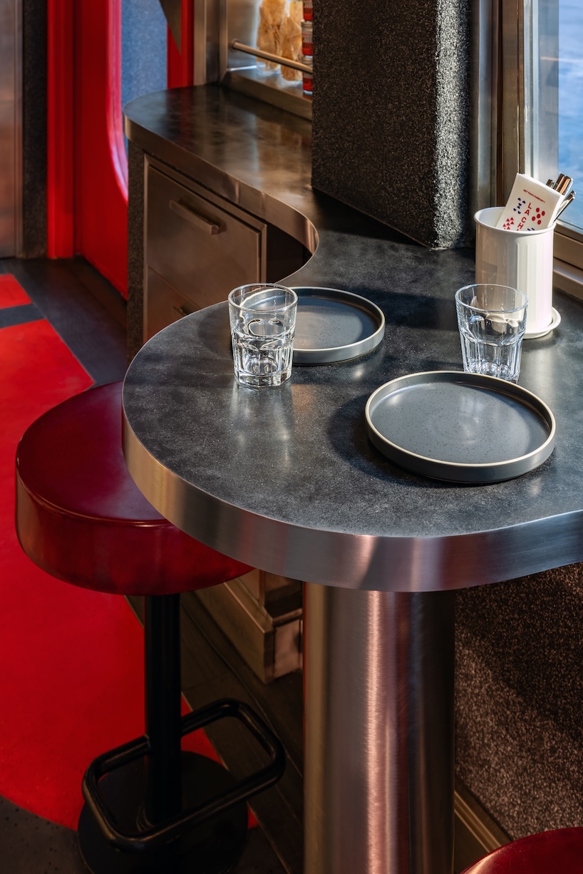
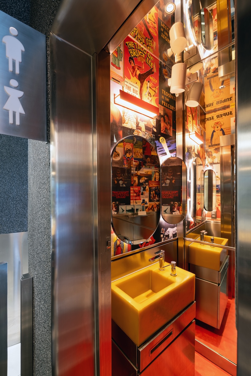
    JJ Acuna / Bespoke Studio defines the interiors by rich textures and unexpected juxtapositions. Walls and facades are finished with resin-infused stone aggregate from Japan, corrugated stainless steel panels, while the interior floor is made of bespoke Obrastone in the brand’s graphic print. A micro-cement window ledge adds a tactile contrast to surrounding elements. The custom furniture is locally fabricated and experimental in nature: dining tables composed of corn husk, resin, and concrete; stools and counters topped with resin forms; and bespoke stainless steel wall sconces and pendant lights that balance rawness with polish.
    jj acuna's restaurant in manila nods to new york corner shops and mexico’s vibrant streets
    JJ Acuna / Bespoke Studio designs La Chinesca’s newest outpost

    The Space Reflects an Urban, Multicultural Edge

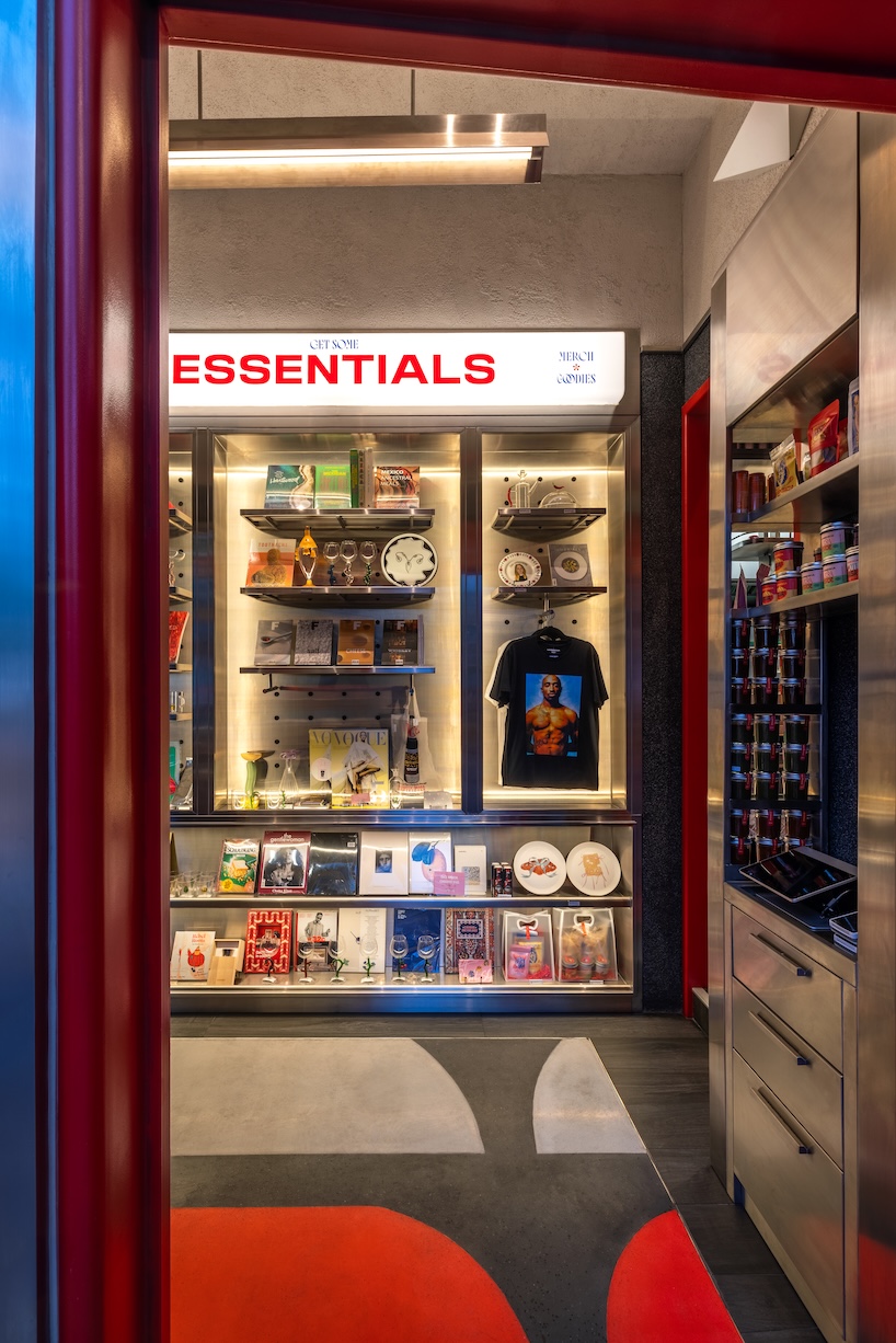
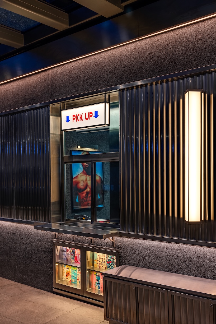
    In partnership with design studio Inksurge, the branding is integrated into the architecture with bold, urban gestures. A street-facing acrylic logo signage ensures visibility from passing cars, while a floating acrylic pickup window detail invites playful interaction. A custom acrylic box marked ‘Essentials’ crowns a retail corner shop-inspired wall, which houses curated merchandise — ranging from glassware and fashion to magazines and kitchen objects — extending the La Chinesca brand into lifestyle and culture.
    The layout also encourages a dynamic and open flow between kitchen, service, and guest zones. Seamless indoor-outdoor transitions connect the alfresco area with the lively street corner, ensuring the space feels porous, animated, and always in motion — mirroring the culinary ethos of Chef Bruce Ricketts, whose menu channels both personal heritage and global influence.
    jj acuna's restaurant in manila nods to new york corner shops and mexico’s vibrant streets
    located in the heart of Bonifacio Global City in Manila
    jj acuna's restaurant in manila nods to new york corner shops and mexico’s vibrant streets
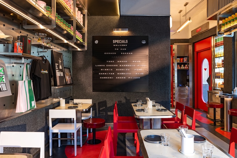
    the space reflects an urban, multicultural edge with deliberate nods to various visual culture elements
    jj acuna's restaurant in manila nods to new york corner shops and mexico’s vibrant streets
    the concept pays homage to corner shop culture and deli architecture, inspired by institutions in NYC
    jj acuna's restaurant in manila nods to new york corner shops and mexico’s vibrant streets
    the layout encourages a dynamic and open flow
    jj acuna's restaurant in manila nods to new york corner shops and mexico’s vibrant streets
    the custom furniture is locally fabricated and experimental in nature
    la chinesca curated corner shop culture celebrated 10
    layered with eclectic influences such as taco truck culture and cha chaan teng diners of Hong Kong
    la chinesca curated corner shop culture celebrated 9
    JJ Acuna / Bespoke Studio defines the interiors by rich textures and unexpected juxtapositions
    la chinesca curated corner shop culture celebrated 11
    while compact in scale, the space is dense with meaning, detail, and material

  • Modern Beach House

    Modern Beach House

    Introduction to Te Whare Tupu Kirikiri

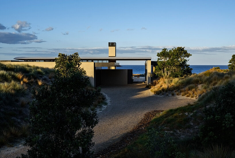
    Te Whare Tupu Kirikiri, a coastal residence by Olson Kundig, has been completed on New Zealand’s North Island. Sited among the dunes and Pohutukawa trees of Mangawhai, the project reinterprets the modest architectural language of the bach, a style of beach house typical to the area.

    Approached by a winding drive through shifting sands and native vegetation, the house gradually appears as a quiet extension of its landscape. Its low-slung form and concrete exterior echo the grain and tone of the surrounding terrain. A curving roof anchors the composition, casting controlled light and sheltering the structure from the high-exposure coastal environment.

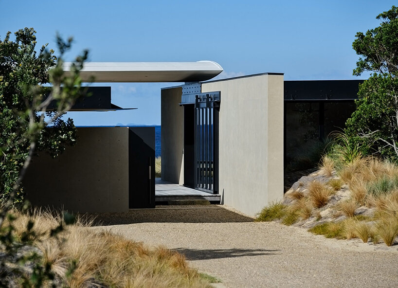
    ‘One of my favorite parts of this project is the roof design,’ says Tom Kundig, FAIA, RIBA, Design Principal. ‘We developed what we called ‘the surfboard’ — a roof structure that curves both above and below. This unique shape not only channels water efficiently but also shapes how light enters the space below.’

    images © Simon Devitt

    Olson Kundig’s Composition of Shelter and Exposure

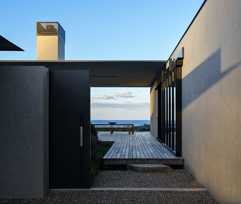
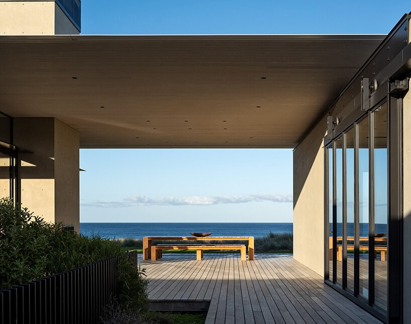
    The architects at Olson Kundig hide Te Whare Tupu Kirikiri among New Zealand’s coastal landscape so that it might unfold gradually upon approach. A steel gate leads to a central courtyard framed by three earthen wings and a floating roof plane, which blurs at its edges into the sky. The surface of the roof reflects light from the adjacent pool and ocean beyond, softening the threshold between structure and landscape. Guillotine glazing and sliding walls connect the courtyard to the open-plan living areas and exterior deck, creating continuity between interior and exterior zones.

    ‘One of the most compelling parts of this home is how the experience unfolds through the courtyard,’ Kundig elaborates. ‘As you enter, the architecture opens up, guiding you through the courtyard to the shoreline. The structure seems to dissolve into the horizon, blurring the line between interior and exterior.’

    The architect continues: ‘New Zealand has such a high-exposure, coastal environment. We created a refined shutter system that transforms the space with a simple gesture and responds dynamically to that environment. It opens and closes to protect the interior from harsh winds while allowing it to fully open to the shoreline in calm conditions.’
    olson kundig frames new zealand coastline with modern beach house 'te whare tupu kirikiri'
    Te Whare Tupu Kirikiri is a coastal home designed by Olson Kundig on New Zealand’s North Island

    Material Palette and Landscape Integration

    Inside the New Zealand beach house, Olson Kundig introduces a restrained material palette of concrete, teak, and stone, bringing together regional textures with careful detailing. Teak-paneled ceilings and custom cabinetry carry a weathered quality, resembling sun-bleached driftwood. Bedrooms are oriented for privacy and views, each with a path leading directly to the nearby wetlands and beach.

    ‘Architecture is experiential — it’s something that must be felt physically, not just seen,’ says Kundig. ‘As you move through Te Whare Tupu Kirikiri, it seems to float and open up, creating a connection to the landscape. The way the architecture engages with both the protected courtyard and the distant horizon is something you have to experience to fully understand.’

    olson kundig frames new zealand coastline with modern beach house 'te whare tupu kirikiri'
    a curving concrete roof with softened edges reflects light and channels water

    olson kundig frames new zealand coastline with modern beach house 'te whare tupu kirikiri'
    the structure is embedded in dunes and framed by native Pohutukawa trees

    olson kundig frames new zealand coastline with modern beach house 'te whare tupu kirikiri'
    a steel gate leads to a central courtyard framed

  • Fala Atelier’s Sculptural Home

    Fala Atelier’s Sculptural Home

    Introduction to Fala Atelier’s Playful Suburban Home

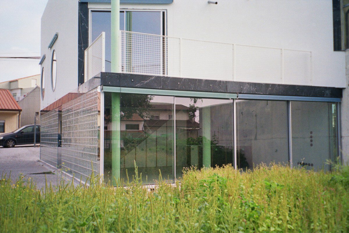
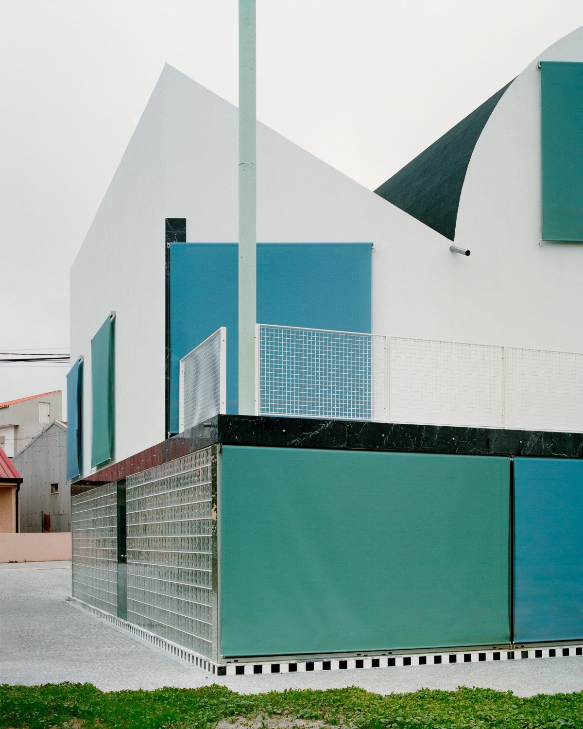
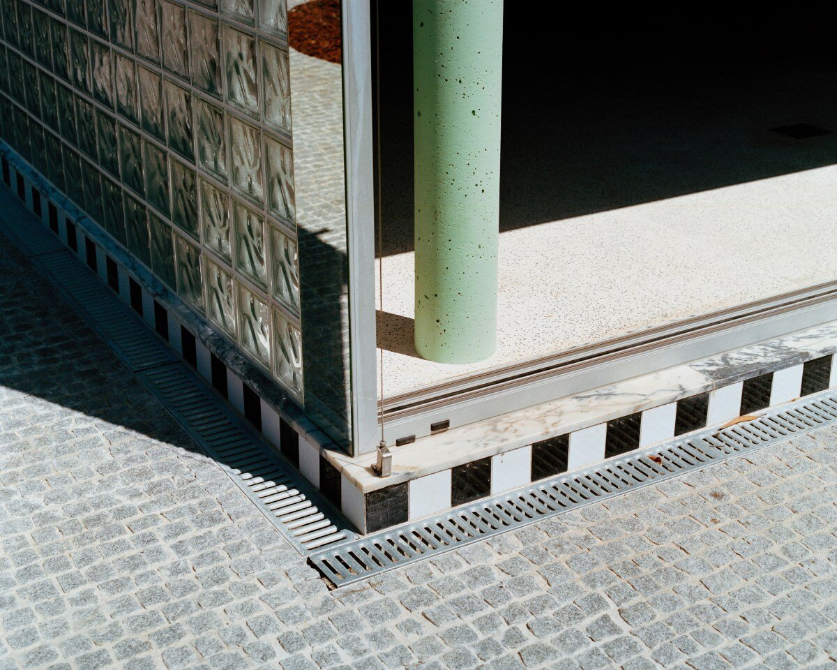
    Porto-based fala atelier turns the traditional pitched roof on its head, creating a house defined by a gently curved and sharply slanted silhouette that breaks from the uniformity of its residential surroundings. Titled 125, the home sits in a quiet suburb of Matosinhos, Portugal, perched atop a translucent plinth with an inverted sloped roof giving rise to an expressive, sculptural volume. Its elevations are punctuated by round and square windows, green and blue shutters, and a palette of crisp whites and muted hues that lend it the appearance of a paper collage rendered in three dimensions. Within, the studio carefully composes concrete, glass brick, and marble as layered surfaces that intersect and fold around each other.

    image by Lera Samovich

    Contrasting Geometries and Translucent Plinth

    The house takes a design approach that balances precision with idiosyncrasy in its forms, materiality, and programming. A rhythmic arrangement of round and square openings punctuates the white exterior walls, with colored shutters in blue and green animating the facade. Some elevations resemble abstract faces while others playfully evoke paper collages with scattered color fields.

    Throughout, fala atelier’s architecture reads like a child’s drawing rendered in marble, glass, and concrete — simultaneously rigorous and naive. Each surface, whether folded, tilted, or curved, has also been deliberately crafted and composed. Walls in green, blue, and black contrast with the muted palette, while the roof’s unique profile challenges the visual norms of its suburban context.

    fala atelier inverts the sloped roof with slants and curves for this sculptural home in portugal
    fala atelier turns the traditional pitched roof on its head | image by Lera Samovich

    Mint-Green Columns and Spatial Conventions

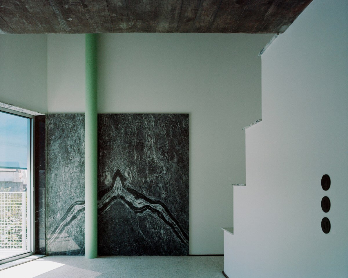
    Moving inside, the house continues to experiment with spatial conventions to infuse elements of architectural surprise. Five slender, mint-green concrete columns weave through rooms without following any clear, typical structural logic, with one even standing freely on the terrace, supporting nothing at all.

    Spaces shift as you move through them, as the living room opens to the garden and connects to an office above, while the master bedroom tucks itself into a curved corner beneath the roof. Double-height ceilings, angled walls, and additional unexpected moments in the layout give the interior a sense of balance that echoes the precision of the geometries while feeling improvised. As the team at fala atelier describes, ‘the figure of the house is simultaneously complete and broken.’

    fala atelier inverts the sloped roof with slants and curves for this sculptural home in portugal
    the house is defined by a gently curved and sharply slanted silhouette | image by Fransisco Ascensao

    fala atelier inverts the sloped roof with slants and curves for this sculptural home in portugal
    five mint-green concrete columns weave through | image by Fransisco Ascensao

    fala atelier inverts the sloped roof with slants and curves for this sculptural home in portugal
    located in a quiet suburb of Matosinhos, Portugal | image by Fransisco Ascensao

    fala atelier inverts the sloped roof with slants and curves for this sculptural home in portugal