Author: cozyspaces.haelthyh@gmail.com

  • Pāvilosta House Carved by Winds

    Pāvilosta House Carved by Winds

    Introduction to the Pāvilosta House

    The Pāvilosta House in Latvia, designed by MADE Arhitekti, serves as a large guest space that extends the client’s main residence located next door. Built as a place for family and guests, the house is sited along the coastline with the water’s edge and horizon beyond visible over the treetops.

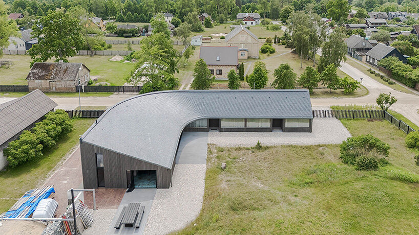
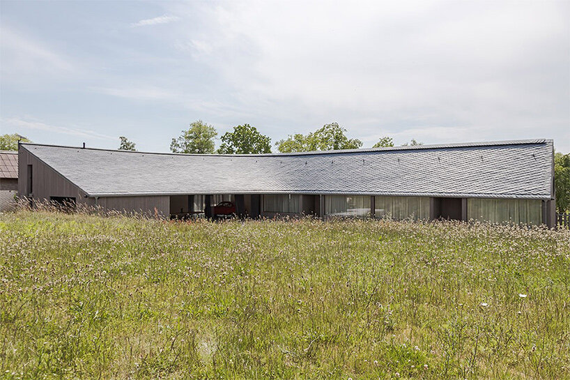
    The design team was informed both by the traditional architecture of the town and the natural forces that define its climate. The project aligns with the traditional gabled silhouettes found along the streets of Pāvilosta, while at the same time introducing a subtle geometric twist to its rooftop that seems to have been carved by the sweeping coastal winds.

    images © Jānis Vēveris

    MADE Arhitekti’s Approach to Rural Latvia

    MADE Arhitekti’s Pāvilosta House is located within an area of transition, between rural homes and the endless Baltic coast. The town of Pāvilosta is known as a settlement where life is shaped by close contact with nature, particularly the wind, waves, and shifting dunes. The architects acknowledge this relationship by turning a traditional roofline into a twisting vector, a movement that is intended to echo the surrounding landscape.

    Conversations with the client emphasized the importance of atmosphere as much as program. The building responds to this through a material and structural approach that pays tribute to natural forces, with timber construction and a slate roof shaped as if molded by water and wind. The impression is of a structure that seems to gradually rise out of the rolling terrain.
    made arhitekti pāvilosta house
    the Pāvilosta House by MADE Arhitekti is as an extension of the client’s main residence

    The L-Shaped Guest House

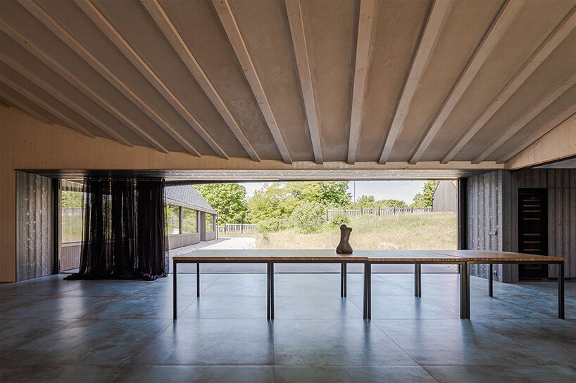
    At the heart of the Pāvilosta House is a large open living space designed by MADE Arhitekti for communal activity. This central volume connects to a kitchen on the northern end and expands toward the exterior with a west-facing facade. A ten-meter (33-foot)-wide opening allows the space to open broadly onto the courtyard, emphasizing the fluid relationship between inside and out.

    Along the street-facing edge, the program shifts toward privacy. Four bedrooms are grouped in pairs, organized around two entrances that link back to the courtyard. With this layout, the architecture balances openness and enclosure, and creates areas for quiet retreat away from the main gathering space.
    made arhitekti pāvilosta house
    the design balances the local vernacular of gabled forms with a twisting geometry
    made arhitekti pāvilosta house
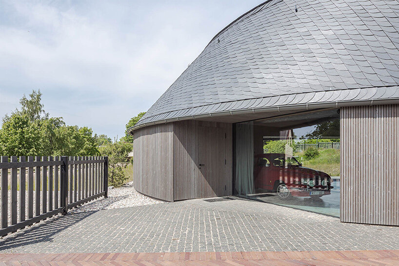
    a durable slate roof ties the house to regional traditions
    made arhitekti pāvilosta house
    a large communal living space extends toward the courtyard

    Conclusion

    The Pāvilosta House, designed by MADE Arhitekti, is a unique and captivating residence that seamlessly blends traditional and modern elements. The house’s design, which incorporates a twisting geometric rooftop and a durable slate roof, pays tribute to the natural forces that shape the surrounding landscape. The large open living space, connected to a kitchen and expanding toward the exterior, creates a fluid relationship between inside and out, making it an ideal space for communal activity. The balance of openness and enclosure, achieved through the layout of the bedrooms and entrances, adds to the house’s charm, creating areas for quiet retreat away from the main gathering space. Overall, the Pāvilosta House is a remarkable example of how architecture can respond to and interact with its environment, creating a truly special and memorable space.

  • BURR’s ‘benito’ renovation

    BURR’s ‘benito’ renovation

    Introduction to Benito Residential Renovation

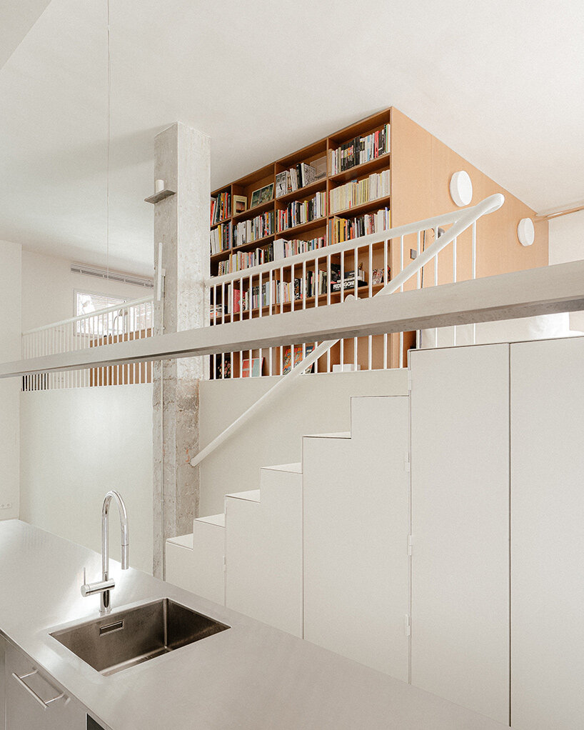
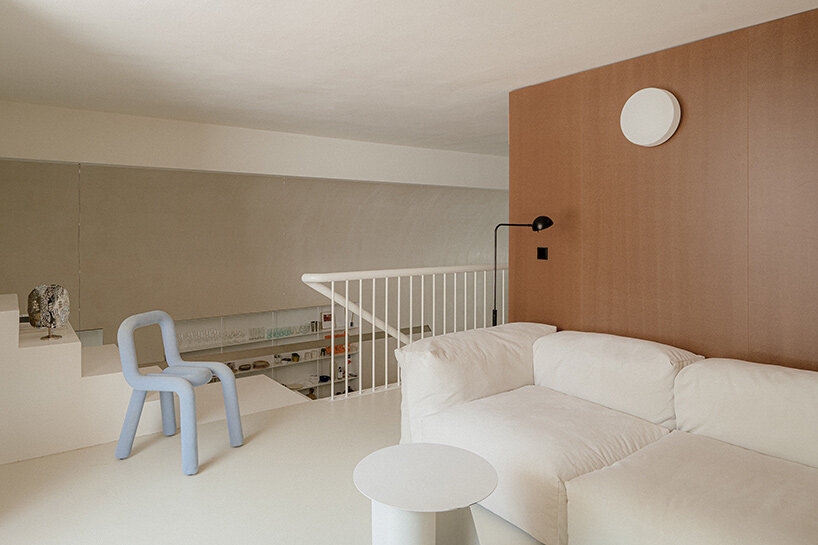
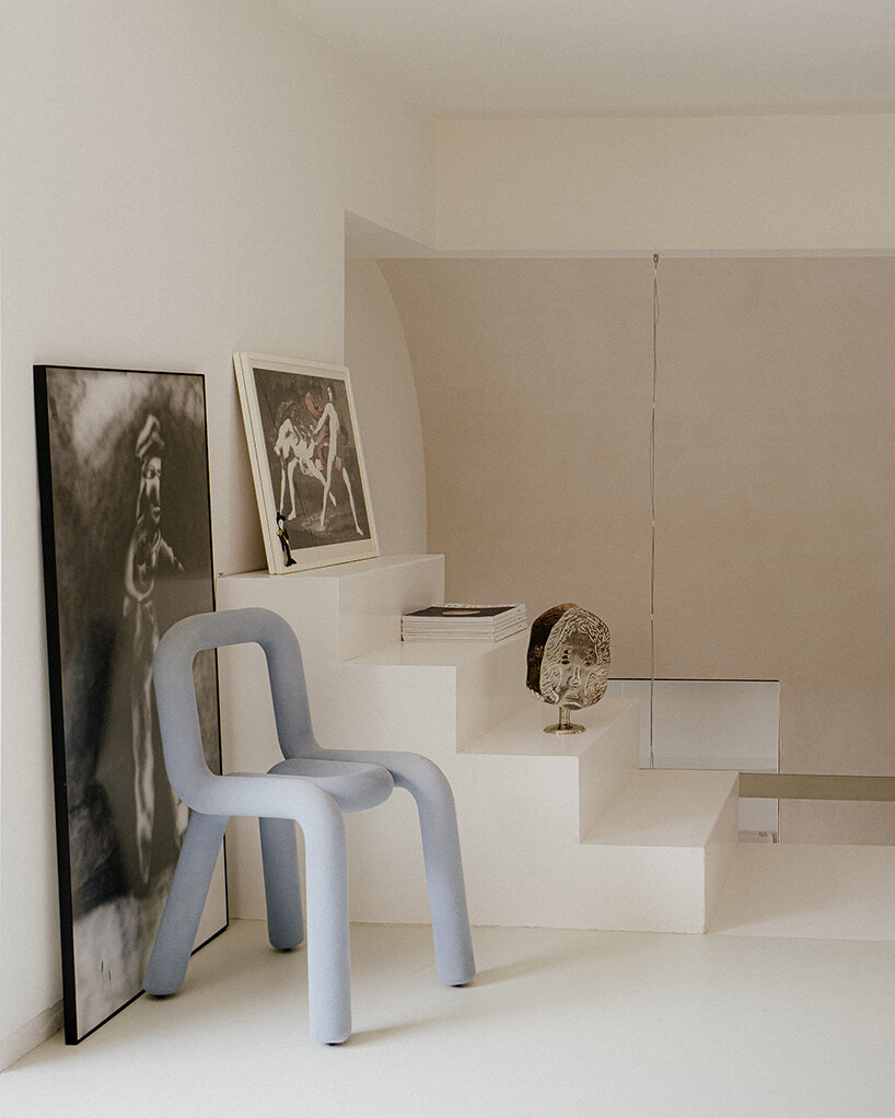
    Benito is a residential renovation by Madrid-based architecture studio BURR, reworking a disused furrier’s shop into a compact dwelling. The project is located in the city’s southern districts, where the architects adapted the limitations of a split-level floor plan into the defining character of the home. The plan is divided into two narrow bands: a street-level strip with a generous four-meter (thirteen-foot) ceiling height and a mezzanine raised 180 centimeters (six feet) above, originally designed to permit cars to pass beneath toward a basement garage. This uneven section results in an L-shaped volume, where the connection between levels becomes central to the spatial experience.

    images © Maru Serrano

    Circulation and Spatial Gradient

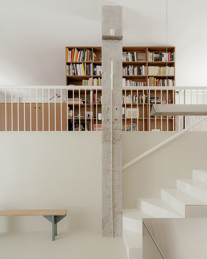
    The team at BURR thoughtfully designs the staircase of its Benito residence to play a dual role as both circulation and infrastructure. Beneath its treads, stepped doors conceal appliances, storage, and even a compact water-closet. The precision of this integration, reminiscent of transport interiors, allows the architects to maximize usable space without visual clutter. Movement through the home follows a U-shaped loop. Entry begins from the street at the lower band and gradually shifts upward through the stair to the upper level, which returns to the main facade. This sequence introduces a gradient of public and private use, distinguishing the shared lower zone from the more intimate upper floor.

    benito burr madrid
    Benito transforms a former shop into a compact Madrid residence

    Courtyards and Ventilation

    Both levels of Benito open outward, reinforcing a connection to air and light. The ground floor links to a communal patio, while the mezzanine opens to a private terrace directly attached to the dwelling. With facades at both ends of the unit, cross ventilation is established naturally, further supported by the open layout. Only the bathroom and water-closet are enclosed, maintaining a sense of openness elsewhere. This spatial clarity is part of BURR’s careful response to a constrained footprint. Instead of subdividing, the architects relied on voids, courtyards, and circulation to structure the home.

    benito burr madrid
    the stair serves as both circulation and concealed storage

    A Vaulted Ceiling Intervention

    The context of the building introduced further challenges. Shared residential services run across the ceiling at different heights, cutting into the space in uneven ways. BURR’s solution was to introduce a half-barrel vault across the public-facing portion of the dwelling. This intervention provides acoustic and visual insulation while lending a surprising sense of volume to the compact interior. The vault stands in deliberate contrast to the project’s otherwise modest scale, balancing practicality with a subtle architectural gesture. In this, the renovation elevates a small domestic corner of Madrid into something distinctive without excess.

    benito burr madrid
    BURR organizes the dwelling through a split level floor plan

    benito burr madrid
    a half barrel vault conceals building services overhead

    Conclusion

    The Benito residential renovation by BURR is a prime example of how creative architectural solutions can transform a compact, irregular space into a functional and aesthetically pleasing home. By incorporating clever design elements such as the half-barrel vault, concealed storage, and a U-shaped circulation loop, the architects have managed to create a sense of openness and airflow, while also providing a clear distinction between public and private areas. This project showcases the potential for innovative design to elevate small, domestic spaces into unique and captivating environments, and serves as a testament to the ingenuity and skill of the architects at BURR.

  • Le Corbusier’s Designs For Sale

    Le Corbusier’s Designs For Sale

    Introduction to Le Corbusier’s Vision

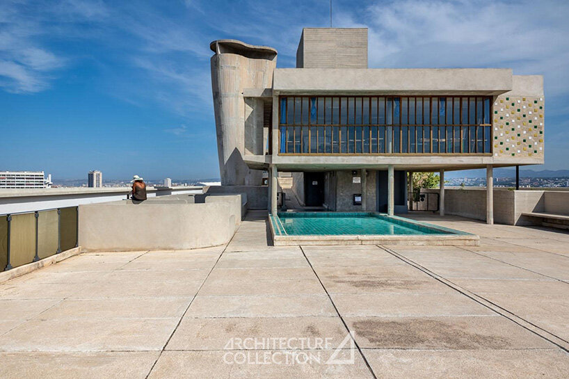
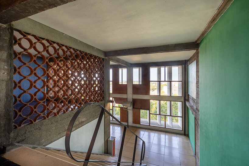
    Le Corbusier’s iconic residential buildings, originally conceived as experiments in how people can live together, are still welcoming residents more than seventy years later. Recent property listings in Marseille, Paris, and Geneva show that these apartments are opportunities to live inside some of the most influential works of modern architecture. From the massive Cité Radieuse on the Marseille waterfront to the glass-fronted Molitor building in Boulogne-Billancourt, each space reflects Le Corbusier’s ideas about design, proportion, and community.

    These buildings were meant to be lived in, adapted, and tested over time, housing real homes with terraces, kitchens, and fireplaces, where everyday life continues inside structures that once redefined modern living.

    originally conceived as experiments in how people can live together | image © Valérie Ruperti photographe

    Duplex Apartment in Cité Radieuse

    In Marseille, the Cité Radieuse, completed in 1952, remains the most emblematic of Le Corbusier’s ‘unité d’habitation’ models. To purchase an apartment here is to become part of a UNESCO World Heritage Site, but also part of an active community that still echoes with the optimism of postwar reconstruction.

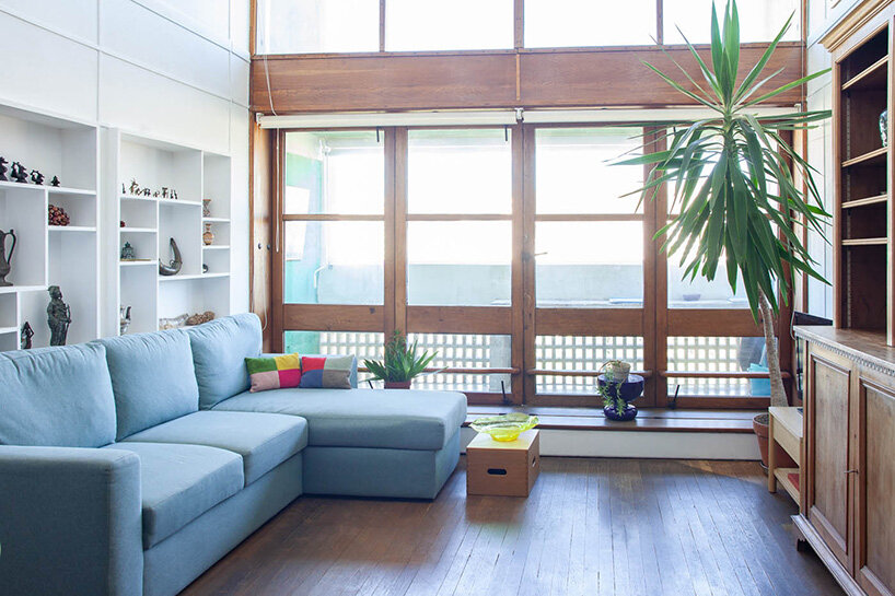
    One of the apartments currently on the market is an ascending Type G duplex occupying a high floor, offering 127 square meters of living space over two levels. The lower level features an entrance with storage that opens into a living space under a double-height ceiling. The open kitchen, designed by Charlotte Perriand, integrates with the dining and lounge areas, which extend toward a terrace framed by the glass facade and sea views.

    A Jean Prouvé staircase leads to the upper level, a cross-through space dedicated to the night area. This includes a master suite with a bathroom and terrace overlooking the sea, two children’s bedrooms with balconies, a shower room, a fourth bedroom with its own bathroom, and generous storage. The children’s bedrooms are arranged in elongated layouts divided into three zones: a toilet and wash area, a rest area, and a play area connected to the neighboring room through a sliding partition.

    step inside le corbusier's icons: apartments in marseille, paris, and geneva listed for sale
    the Cité Radieuse was completed in 1952 | image © Valérie Ruperti photographe

    Modernist Living in Paris: 5th-Floor Apartment in Molitor

    In Paris, the Molitor building (1931–34), designed in collaboration with Pierre Jeanneret and classified as a Historic Monument in 2017, stands as the city’s first residential block with a fully glazed facade, a precursor to the glass-and-steel towers of international modernism. Anchoring Boulogne-Billancourt, a neighborhood that in the interwar years attracted avant-garde artists, filmmakers, and designers, the building once housed Le Corbusier’s own apartment and studio on its upper floors.

    The 112-square-meter renovated apartment listed occupies the 5th floor and opens onto a 9-square-meter continuous balcony with unobstructed views of the Jean Bouin Stadium and the sculptural Parc des Princes. Its living space includes a living room and dining area with an open kitchen, allowing light to pour in through the large glass roof and glass-brick balcony railing. The sleeping quarters include a master suite with balcony access, a secondary bedroom, a shower room, and separate toilets, while a cellar and parking space complete the offering.

    The apartment’s volume is articulated by the structural pillars of the building, while the renovation embraces a restrained palette and high-quality finishes that enhance the geometric clarity and spatial logic of Le Corbusier’s design.

    step inside le corbusier's icons: apartments in marseille, paris, and geneva listed for sale
    an ascending Type G duplex | image © FLC/ADAGP 2025 © Magali Joannon

    Through-Flat Apartment with Terraces in Geneva’s Clarté

    Further north in Geneva, the 1932 Clarté building distills yet another vision. Known as the Maison de Verre (House of Glass), it was created for an affluent clientele who sought the advantages of modern construction without abandoning comfort. With its modular concrete frame and prefabricated components, Clarté exemplified industrial rationalization while still offering flexible layouts. Its glazed facades incorporate wooden sun-shading galleries and stairwells illuminated through glass-block floors. After threats of demolition, the building was saved, restored by Pascal Häusermann and Bruno Camoletti in the 1970s, and inscribed as a UNESCO World Heritage Site in 2016.

    The 169-square-meter through-flat currently for sale occupies a prime position within the building. Meticulously renovated, the apartment preserves the Corbusian character of Clarté through generous volumes, high ceilings, and quality materials that complement the building’s original architectural features. Residents also benefit from the building’s celebrated communal design, featuring transparent landings and glass-block staircases that diffuse light throughout the core. A cellar completes the offering, rounding out one of the most desirable properties in this emblematic house of glass.

    Another apartment in the building for sale, designed with an ascending logic, spans 277 square-meters over two levels. The lower floor includes an entrance hall, a versatile smoking room that can function as a bedroom or office, and a double-height living room illuminated by a striking facade of armored and clear glass, opening onto a running balcony.

    step inside le corbusier's icons: apartments in marseille, paris, and geneva listed for sale

  • Centralbadet Swimming Hub

    Centralbadet Swimming Hub

    Introduction to Centralbadet

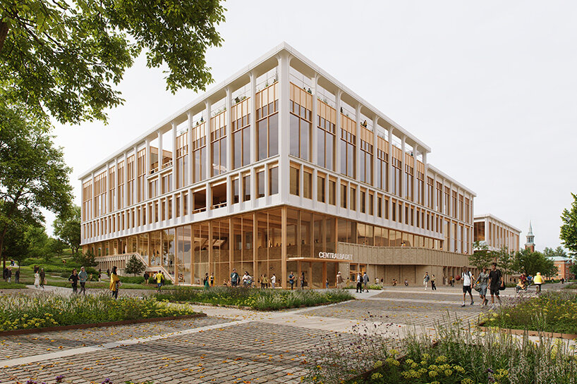
    Henning Larsen has been selected to design Centralbadet, a new public swimming and sports center in Gothenburg, Sweden. The winning timber proposal — developed in collaboration with Winell & Jern Architects, Ramboll, and sports science lecturer John Dohlsten — is expected to open in 2031.

    The upcoming Centralbadet represents a major investment in the city’s cultural infrastructure and continues Gothenburg’s legacy of public swimming spaces in a way that is sustainable and contemporary.

    The jury praised the winning entry as ‘an elegant and vibrant facility where citizens can come together — whether to swim, play basketball, or simply sit on the sun-facing steps by the river.’

    Henning Larsen wins a competition for Gothenburg’s new Centralbadet | visualizations © Plankton Group

    Centralbadet: A House for Health and Community

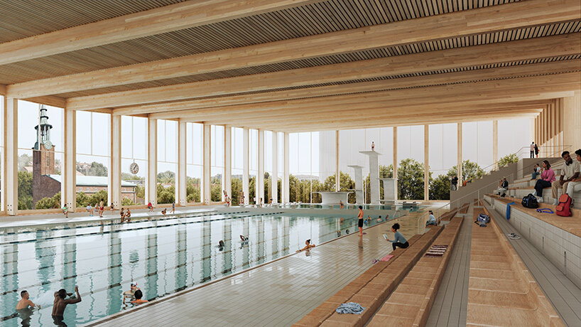
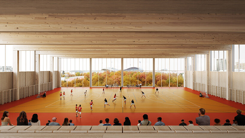
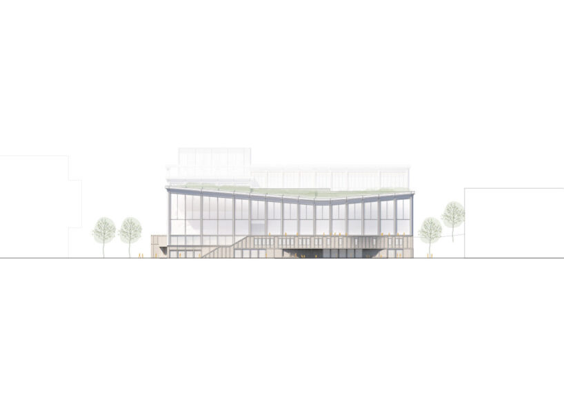
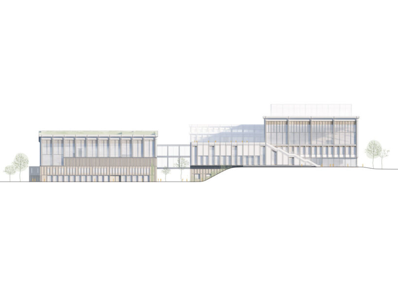
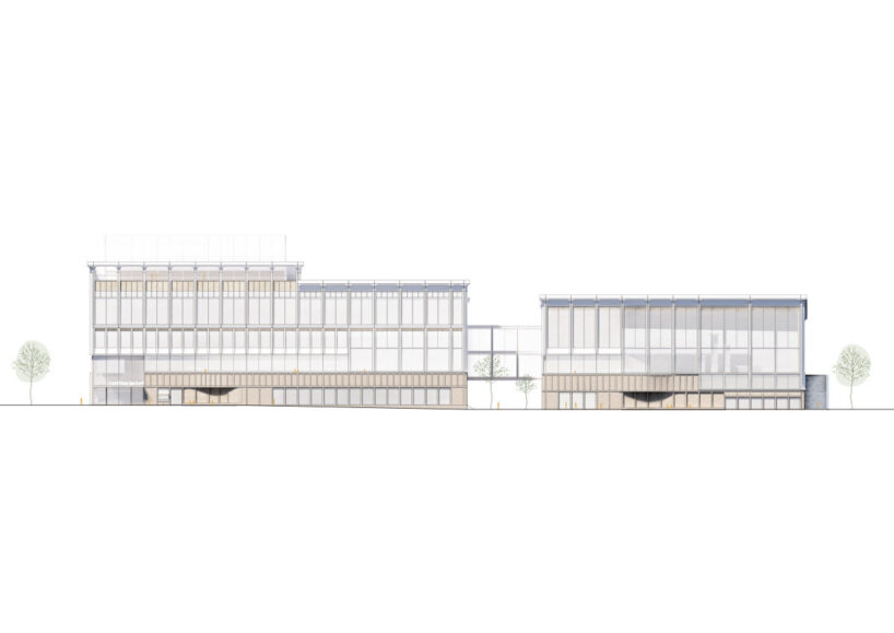
    The team at Henning Larsen plans the 51,850-square-meter Centralbadet complex for both elite athletes and everyday visitors in Gothenburg. Olympic-standard pools and diving facilities will stand alongside family pools and learning spaces.

    The program also includes four sports halls, a basketball court, a gym, outdoor pools, saunas, and a café. To support everyday life, the design incorporates flexible gathering areas, stroller parking, and — in the true Scandinavian style — a dedicated bicycle garage.

    ‘The intention behind Centralbadet is to prioritize social and health benefits as much as athletic performance,’ says Martin Stenberg Ringnér, Design Director at Henning Larsen. ‘From quiet nooks to sunlit rooftops, we wanted every visit to feel accessible, connected, and integrated with the rhythms of the city.’

    henning larsen centralbadet gothenburg
    the project will open in 2031 as a landmark for public health and recreation

    Extending the Forested Park into the Architecture

    Henning Larsen’s Centralbadet proposal honors Valhallabadet, Gothenburg’s historic swimming hall, by carrying forward traditions of public bathing and community health. References to the city’s cultural heritage appear in the landscape and artistic details, including pathways inspired by the cubist murals of 20th century Swedish artist Nils Wedel.

    Situated in Katrinelund, long associated with recreation and respite, the new Centralbadet is planned to strengthen connections to the Mölndal River and the nearby Burgårdsparken — a forested park which is home to a well-known skatepark. Visitors will be able to circulate throughout the building and onto its rooftop, which hosts running tracks, outdoor gyms, terraces, and planted areas that extend the experience of the parkland into the architecture.

    henning larsen centralbadet gothenburg
    Centralbadet will include Olympic-standard pools as well as pools for everyday recreation

    Henning Larsen’s Circular Strategy

    Centralbadet’s construction strategy balances durability with environmental performance. Concrete provides structural stability for the pool basins, while long-span glulam beams and other timber elements reduce embodied carbon and perform well in humid conditions. Timber is also used for interior partitions and ceilings, and elements are designed for disassembly and future reuse.

    The facade incorporates recycled brick, linking the project to its context and celebrating the sustainability of circular construction. Extensive green roofs support biodiversity, manage stormwater, and increase the building’s resilience over time. Together, these strategies establish Centralbadet as a long-lasting civic resource designed to evolve with the city.

    henning larsen centralbadet gothenburg
    concrete pool basins pair with glulam timber spans to reduce embodied carbon

    1/13

  • MoMA celebrates old NY messiness

    MoMA celebrates old NY messiness

    Peterson Rich Office Renovates MoMA Design Store

    The MoMA Design Store in Soho, New York, has reopened following a renovation by Brooklyn-based Peterson Rich Office. Built in 1884, the cast iron and masonry building has been carefully restored to its original footprint, a move that re-centers circulation and opens views into the interior from Spring Street. The updated store creates a contemporary new framework which celebrates the 19th-century ‘messiness’ of its historic home at 81 Spring Street.

    designboom attended a preview ahead of the public opening on September 27th, 2025, where lead architects Miriam Peterson and Nathan Rich spoke about the design process and goals for the project.

    ‘We got a wonderful brief from MoMA,’ says Nathan Rich. ‘The first goal was to create a meaningful dialogue between the Design Store and this historic building. The second was to connect with the public, literally bringing the street in. And the third was to showcase the products themselves in special ways.‘

    windows reopened to Spring Street create a stronger dialogue with Soho | images © Eric Petschek

    Historic Details Revealed

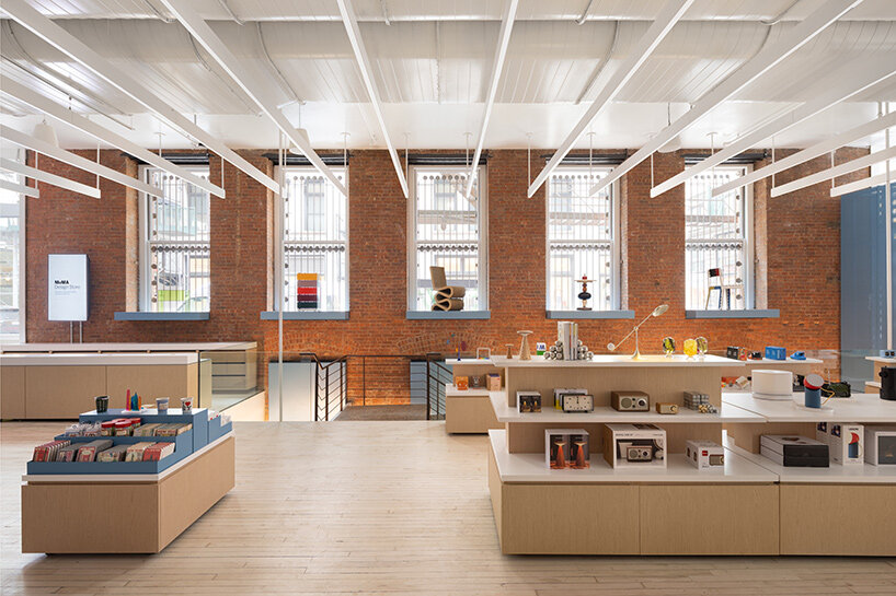
    The MoMA Design Store renovation emphasizes the building’s authentic details, exposing cast iron columns, brickwork, and even portions of the original tin ceiling. Layers of later alterations were stripped back to allow the historic textures to read clearly against new interventions.

    ‘What we love about working in older buildings is peeling back the layers,’ explains Miriam Peterson. ‘The ceiling had been dropped, columns were covered, and the facade was blocked off. One of the first things we did was reveal the brick and arches and look at archival drawings to relocate the entrance to its original center position.’

    The facade, once painted a muddy brown color called Afternoon Tea, has been restored to black with approval from the Landmarks Commission. ‘That subtle change reframed the interior from the street,’ Peterson adds. ‘It creates a stronger frame through which to view the store, while resonating with the masonry context of the neighborhood.‘

    MoMA Design Store renovation
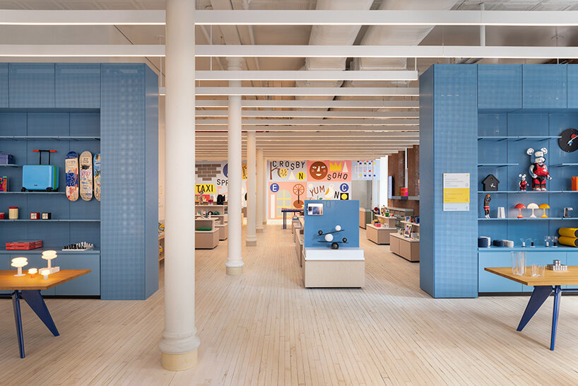
    perforated steel shelving in MoMA’s signature blue brings a flexible backdrop for products

    A Contemporary Framework

    Inside the MoMA Design Store, the 6,600-square-foot space is organized through a system of flexible casework and display structures. Perforated steel shelving finished in MoMA’s signature blue, vitrines, and movable islands establish rhythm and variety, while casters allow the lower level to be cleared for talks and gatherings. A new perimeter shelving system by Rareraw, a Korean family business making its U.S. debut, integrates lighting into a versatile framework.

    The architects emphasized adaptability and narrative potential. Nathan Rich describes the approach: ‘Everything here was made by brilliant creators. The store itself should help tell those stories — signage, displays, and layout all work to feature the products in meaningful ways.‘

    MoMA Design Store renovation
    historic cast iron and masonry details are revealed throughout the space

    Connecting Store, Street, and Museum

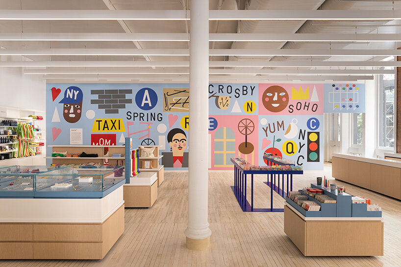
    The reopened windows and re-centered entry reinforce the link between the store and the streetscape, creating transparency and drawing the public in. This connection extends to the north wall, now home to a rotating Modern Mural program. The opening installation, LOVE NYC by Nina Chanel Abney, echoes Soho’s urban fabric while referencing MoMA’s collection, turning the wall into both an interior focal point and a street-facing canvas.

    ‘The mural announces from the moment you walk in that this is MoMA,’ Peterson says. ‘It frames the threshold between street and store, reinforcing the connection between the Design Store and the museum.’

    The renovation balances a reverence for the building’s industrial heritage with the precision required of a retail environment. Exposed tin ceilings and rough masonry contrast with crisp steel shelving and controlled lighting. Peterson notes: ‘We embraced the messiness of the old building and saw it as part of the palette that directly engages with the new products.‘

    MoMA design store renovation celebrates messiness of 19th-century new york
    the north wall features Nina Chanel Abney’s Love NYC mural

    Project Information

    name: MoMA Design Store | @momadesignstore

    renovation architect: Peterson Rich Office | @peterson_rich_office

    location: 81 Spring Street, New York, NY

    client: Museum of Modern Art (MoMA) | @themuseumofmodernart

    mural artist: Nina Chanel Abney | @ninachanel

    completion: September 27th, 2025

    photography: © Eric Petschek | @cb

    Conclusion

    The renovation of the MoMA Design Store by Peterson Rich Office is a thoughtful and nuanced approach to preserving the building’s historic character while creating a contemporary retail environment. The emphasis on exposing authentic details, balancing old and new, and connecting the store to the streetscape and museum has resulted in a unique and engaging space that celebrates the intersection of art, design, and commerce. As the store continues to evolve and showcase new products and exhibitions, it will remain a vital part of the Soho neighborhood and a must-visit destination for design enthusiasts and shoppers alike.

  • ISMO Architects sculpts Jakarta flats

    ISMO Architects sculpts Jakarta flats

    Compact Co-Housing for Jakarta

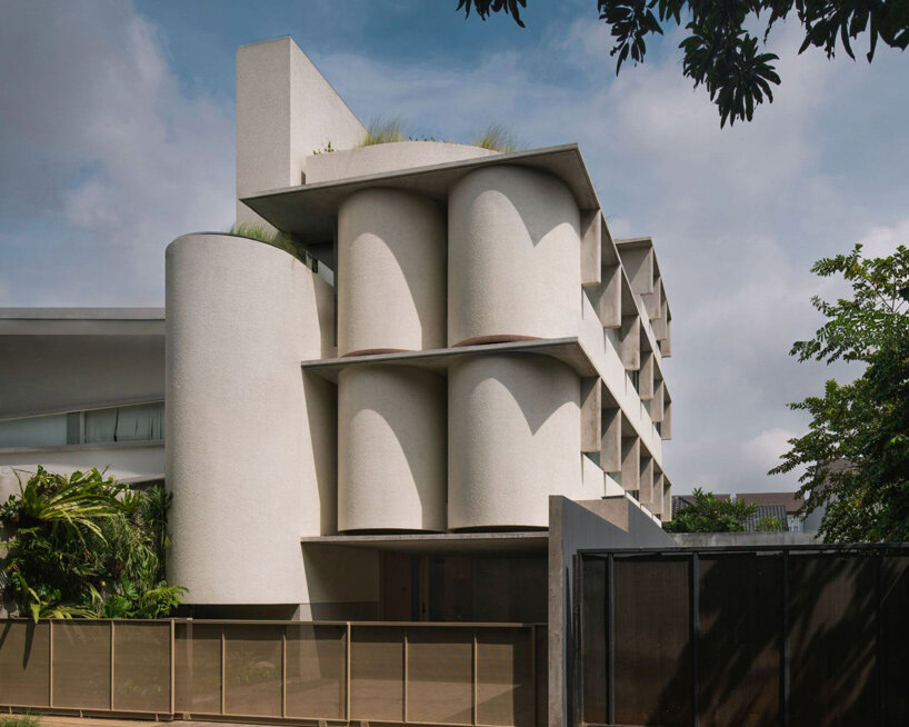
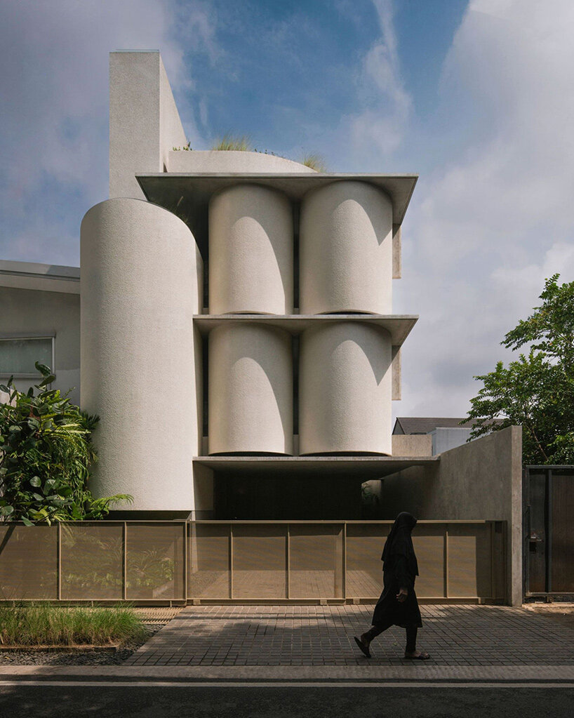
    ABC Flats stands in the dense Cilandak neighborhood of South Jakarta, Indonesia as a compact co-housing development by Isso Architects. Built on a 175 square-meter (1,884 square-foot) site, the three-story concrete structure encompasses a total area of 423 square meters and accommodates eleven ensuite rooms arranged across three distinct room types. A rooftop pantry and communal terrace extend the shared living concept upward, offering residents a modest yet inviting outdoor space.
    images © Ernest Theofilus

    Isso Architects’ Stack of Concrete Cylinders

    From the street, the Isso Architects-designed ABC Flats building distinguishes itself through an interplay of soft curves and heavy geometries. The design team uses cylindrical forms as repeating elements, creating a rhythm that softens the presence of raw concrete while lending a sense of movement to the facade. This subtle fluidity contrasts with the more conventional neighboring houses and establishes ABC Flats as both a visual landmark and a considered response to its tight urban plot.

    Entry to the building unfolds across a wooden floor beneath a triple-height staircase. Above, a skylight introduces natural light that shifts throughout the day, casting patterns along the stairwell walls. A reflective pond at the base amplifies these effects, bringing air and water into dialogue and giving residents and visitors a tranquil moment within the dense surroundings.

    isso architects abc flats
    ABC Flats brings co-housing to South Jakarta, Indonesia

    Inside the ABC Flats

    Inside, the layout follows three longitudinal bands — stairs, aisles, and rooms — arranged with clarity and efficiency. Mechanical and electrical systems are consolidated within a central shaft, simplifying maintenance and preserving a sense of openness. Curved interior walls and partially detached railing sections echo the fluid facade, allowing light and movement to animate the compact circulation spaces.

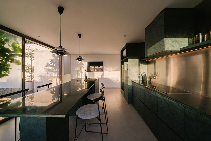
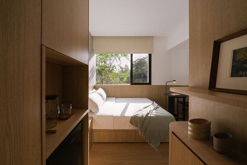
    The interiors balance the texture of exposed concrete with clean lines, wood finishes, and a restrained color palette. These choices enhance a feeling of warmth and stability while encouraging residents to inhabit shared areas. The rooftop pantry and communal terrace continue this theme, offering a quiet gathering point above the lively streets of South Jakarta.

    isso architects abc flats
    cylindrical elements give the facade a soft, rhythmic character

    isso architects abc flats
    a communal kitchen pantry is designed to bring residents together

    isso architects abc flats
    wood finishes and a neutral palette balance the raw concrete

    Conclusion

    ABC Flats, designed by Isso Architects, is a compact co-housing development that brings a unique and innovative approach to urban living in South Jakarta, Indonesia. The building’s use of cylindrical forms, curved interior walls, and a restrained color palette creates a sense of warmth and stability, while the rooftop pantry and communal terrace provide a quiet gathering point for residents. The project’s emphasis on shared living spaces and community areas makes it an attractive option for those looking for a more collaborative and social living experience. Overall, ABC Flats is a successful example of how compact co-housing can be achieved in a dense urban environment, and it sets a precedent for future developments in the region.

  • ABRA Frames Pastries Against Colors

    ABRA Frames Pastries Against Colors

    Introduction to ABRA Patisserie

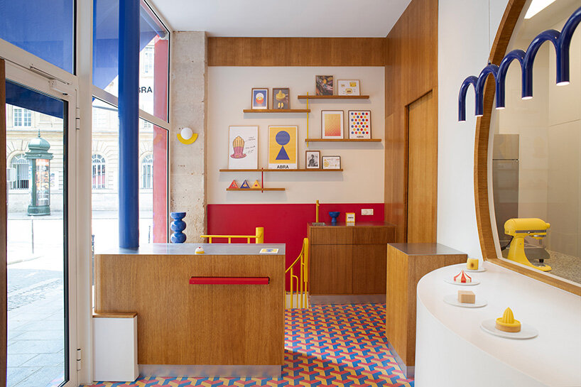
    ABRA is a Parisian patisserie, conceived by chef Tal Spiegel, with a vibrant interior designed by Ron From with architect Nicolas Frances. The material and color palette draw on Bauhaus and modernist precedents. Ron From clads surfaces in wood and combines it with strong accents in primary blue, red, and yellow, creating a contrast between warmth and graphic clarity. The patterned tile floor introduces repetition and depth, while shelves along the wall display prints and geometric objects that align the project with ideas of modularity and composition.

    The Conceptual Framework

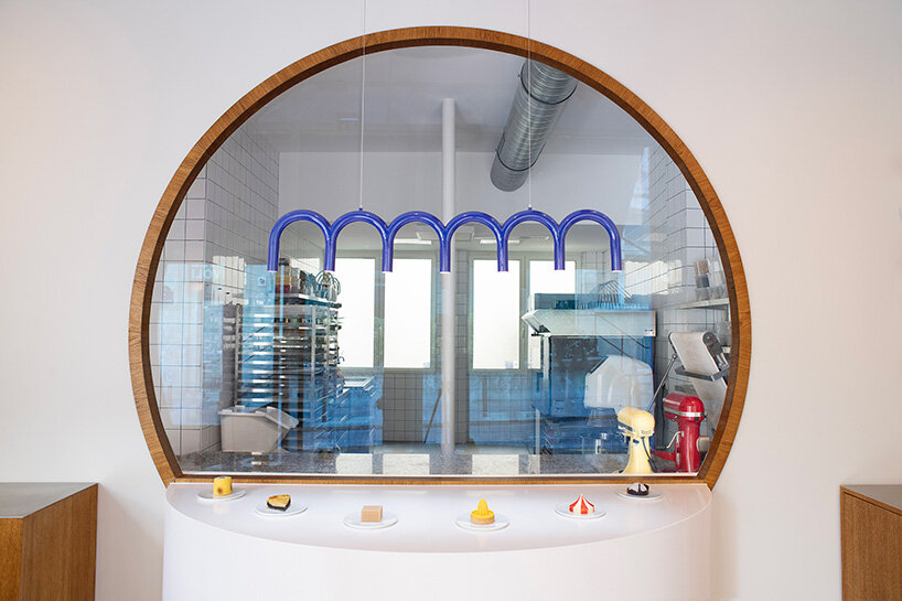
    The project establishes this conceptual framework through a deliberate division of space and shifts away from the conventions of display, where windows are usually filled with rows of ornate cakes, and instead reduces the focus to a series of singular objects. Each pastry is positioned to be read almost as a prototype, inviting comparison with design processes rather than with culinary excess.

    images by François Fonty, unless stated otherwise

    The Shop’s Layout

    Located on Rue des Mauvais Garçons in Paris, ABRA pastry shop is organized in two clear zones, divided into a compact retail space at the street front and a working kitchen behind the partition. Ron From and Nicolas Frances install a semicircular aperture between the two spaces that acts as both window and frame, allowing the pastries to remain visible, while the display surface directly beneath acts as a threshold between making and consuming.
    parisian patisserie ABRA frames pastries against geometric floors and bold primary colors

    Color, Material, and Process

    Bauhaus and modernist references are legible in the restricted palette of primary blue, red, and yellow, which is layered against a white backdrop, warm wood cabinetry, and metal details. Geometric repetition in the patterned tiles underfoot and the framed graphics on the wall lends the room a rhythm and creates a space that feels warm and inviting but that also sparks curiosity.
    parisian patisserie ABRA frames pastries against geometric floors and bold primary colors

    Conclusion

    The street view roots the project in the city, while the open lab window invites visitors to peek behind the scenes. It’s a place where one can enjoy pastries but also explore how they’re made and what they mean. ABRA is a Parisian patisserie that combines food and design, creating a unique experience for its visitors. The careful structure of the shop, the openness of the glazed facade, and the framed view of the kitchen all contribute to a space that feels warm and inviting, yet sparks curiosity. The use of primary colors, geometric repetition, and warm wood cabinetry creates a rhythm and lends the room a sense of modularity and composition. Overall, ABRA is a must-visit destination for those who appreciate the intersection of food, design, and architecture.

  • Bjarke Ingels Completes Science Center

    Bjarke Ingels Completes Science Center

    Introduction to the Robert Day Sciences Center

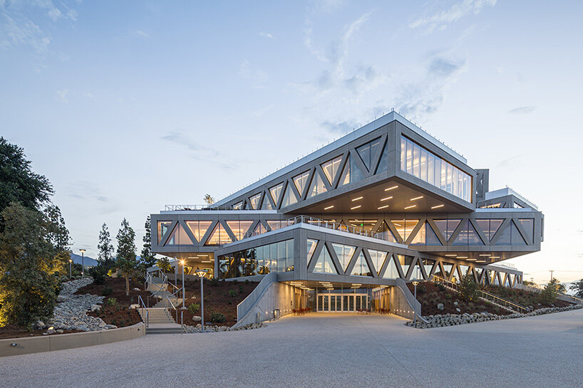
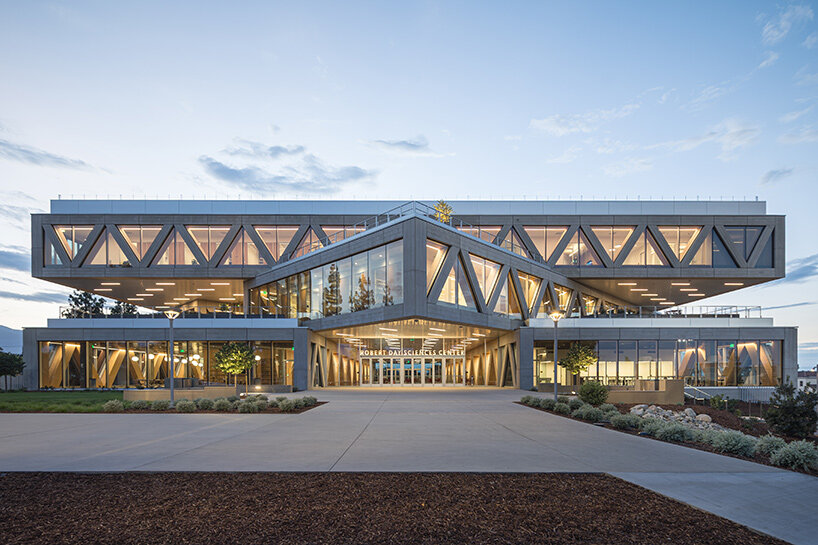
    The Robert Day Sciences Center has opened at Claremont McKenna College in Southern California, designed by Bjarke Ingels Group (BIG) as the first built project of the school’s Roberts Campus masterplan. At 135,000 square feet, the new building extends the campus’s north mall toward Ninth Street and Claremont Boulevard, forming a major gateway to the college and supporting a multidisciplinary approach to science and technology.

    The project was first commissioned in 2020 and now welcomes students and faculty. It serves as a platform for computational gene, brain, and climate research, and creates a place for computer science, data science, and the life sciences all together.

    images © Laurian Ghinițoiu

    Design Concept

    Lead architect Bjarke Ingels describes the concept for Claremont McKenna College as ‘a series of parallel building volumes side by side — with a public space in between — that are rotated in all the same directions as the mall.’ Each stacked volume is rotated 45 degrees from the one below, creating an atrium at the core of the structure.

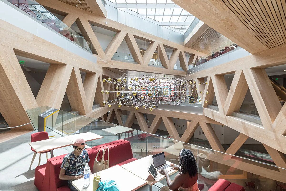
    ‘Even though each of the individual building volumes are rational, flexible, and capable of being computer labs or wet labs, the open atrium in between becomes a Piranesian social space,’ the Danish architect explains. ‘It’s a crucible where all of the different kinds of knowledge and all of the different kinds of students and teachers come together in one complex, three-dimensional learning environment.‘

    bjarke ingels claremont mckenna
    Bjarke Ingels Group’s Robert Day Sciences Center opens at Claremont McKenna College

    Building Features

    Bjarke Ingels Group wraps its Claremont McKenna College building with a facade of board-formed glass fiber reinforced concrete, which brings a wood-like texture with the durability required for a modern laboratory. Inside, triangular steel trusses clad in Douglas fir continue the rhythm of the structure, carrying a tactile warmth through the atrium and into the classrooms. The roof’s 11,000 square feet of solar panels produce about 342 megawatt hours of electricity annually, supporting the building’s LEED Gold sustainability target.

    The atrium itself is a vertical commons. It includes a full-height space that offers direct views into classrooms and laboratories, with a broad social stair connecting the first two levels and a café tucked below. Damien Ortega’s Magnetic Field, an intricate sculpture of Earth’s magnetosphere, is suspended thirty feet above the ground floor, and is composed of eighteen metal rings and nearly 1,500 glass spheres.

    bjarke ingels claremont mckenna
    the 135,000 square-foot building occupies the new Roberts Campus masterplan

    Amenities and Sustainability

    Ground-level amenities include the McElwee Forum and imaging suites, while upper floors house classrooms, research areas, wet and dry labs, the Quantum Library, and a maker’s space. Perimeter classrooms capture mountain views and remain distinct from the central social core, ensuring both focus and openness.
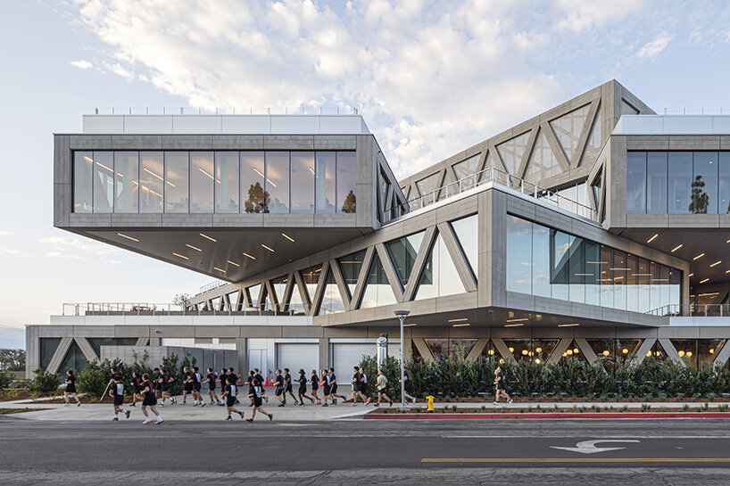
    Eight landscaped rooftop terraces extend the building’s program outdoors, offering panoramic views of Mount Baldy, the surrounding campus, and the adjacent sports bowl. These terraces function as outdoor classrooms and informal gathering spaces, reinforcing the building’s role as an active center for integrated learning and research at Claremont McKenna College.

    bjarke ingels claremont mckenna
    eight rooftop terraces provide 360 degree mountain and campus views

    Shaping a New Academic Culture

    President Hiram E. Chodosh highlights the building’s role in shaping a new academic culture: ‘This gorgeous architecture amplifies and elevates a revolutionary vision for higher learning at a critical moment in the well-being of our species, our brains, our planet.

    ‘Bjarke’s rotating stacks create opportunities to learn at the intersections. The wood fuels our social warmth. The glass cuts through the barriers.’

    bjarke ingels claremont mckenna

  • Custom Mudroom Cabinets Installation and Cost

    Custom Mudroom Cabinets Installation and Cost

    The big day arrived, and our custom mudroom built-ins were delivered and installed. The space is already taking shape, and in this post, we’re sharing how the install came together, the craftsmanship details, and the cost before moving on to paint, hardware, and styling.

    My dream mudroom is finally coming to life. After sharing the mudroom design plan and completing the demo last week, we now have cabinets. For years, I’ve had a picture in my head of what this space could be – tall cabinets, a built-in bench, and a well-organized spot for bags, coats, and sports gear that always seemed to end up scattered around our living room.

    The custom cabinets arriving was a big milestone in this project. It was exciting to watch everything come together, piece by piece. Let’s dive into what installation day looked like and how this wall quickly transformed.

    Install Day: Bringing the Cabinets Home

    After two weeks of building everything off-site, our carpenter and his two assistants pulled up with a truck full of cabinets, drawers, and panels. Each cabinet was built by hand and brought in separately to be assembled like a giant puzzle.

    Cabinet installation day 1 with tall lockers in place
    The space after day 1 of install

    The crew worked fast, securing each section to the wall, adding filler pieces, and making sure the tall cabinets stretched all the way to the ceiling. The crown molding at the top makes the cabinetry look truly built-in, like it was always part of our home’s design.

    mudroom built ins install day 2
    The space after day 2. Still a bit of a mess, but getting there!

    Choosing the Right Hardware for Our Mudroom

    Before the cabinets were installed, we had to order the hardware so our carpenter could pre-drill the holes. Here are some quick tips that guided us in choosing the right hardware for our mudroom:

    • Knobs vs. pulls: We usually put knobs on cabinet doors and pulls on drawers. For taller cabinets, though, a longer pull looks more proportional and functional.
    • Sizing your pulls: A good rule of thumb is to make your pull about one-third the width of the drawer. For extra-wide drawers (over 30″), consider two pulls.
    • Stick to one collection: Ordering all of your knobs and pulls from the same collection ensures the finish and style feel cohesive.
    • Order early: Hardware can take a while to arrive, and your carpenter may need it on Day One of install. Plan ahead so you’re not scrambling.
    • Mock it up: Use painter’s tape to test placement before committing. It’s the easiest way to visualize how the scale will look in your space.
    We went with golden champagne knobs and various sizes of pulls. If they look familiar, that’s because we have them in our kitchen. We think it’s smart to repeat elements throughout your home so things feel cohesive.

    Current Look (Before Paint & Finishing Touches)

    our mudroom before painting

    The mudroom is at that funny in-between stage. The cabinets are in place, but everything is still primed white, and it feels a little stark against the rest of our home. We know that once they’re painted green and the hardware is added, it will all flow beautifully.

    our technology cabinets are a mess
  • Plan C opens Milan store

    Plan C opens Milan store

    Introduction to Plan C Frame

    Carolina Castiglioni, founder of high-end women’s and accessories label Plan C, expands the presence of her brand in Milan with the opening of Plan C Frame, a retail-meets-culture concept. The project introduces a layered experience where visitors encounter Plan C’s signature womenswear and also jewelry, homeware, printed matter, and art exhibitions under one roof.

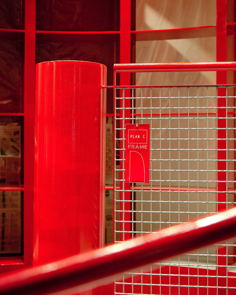
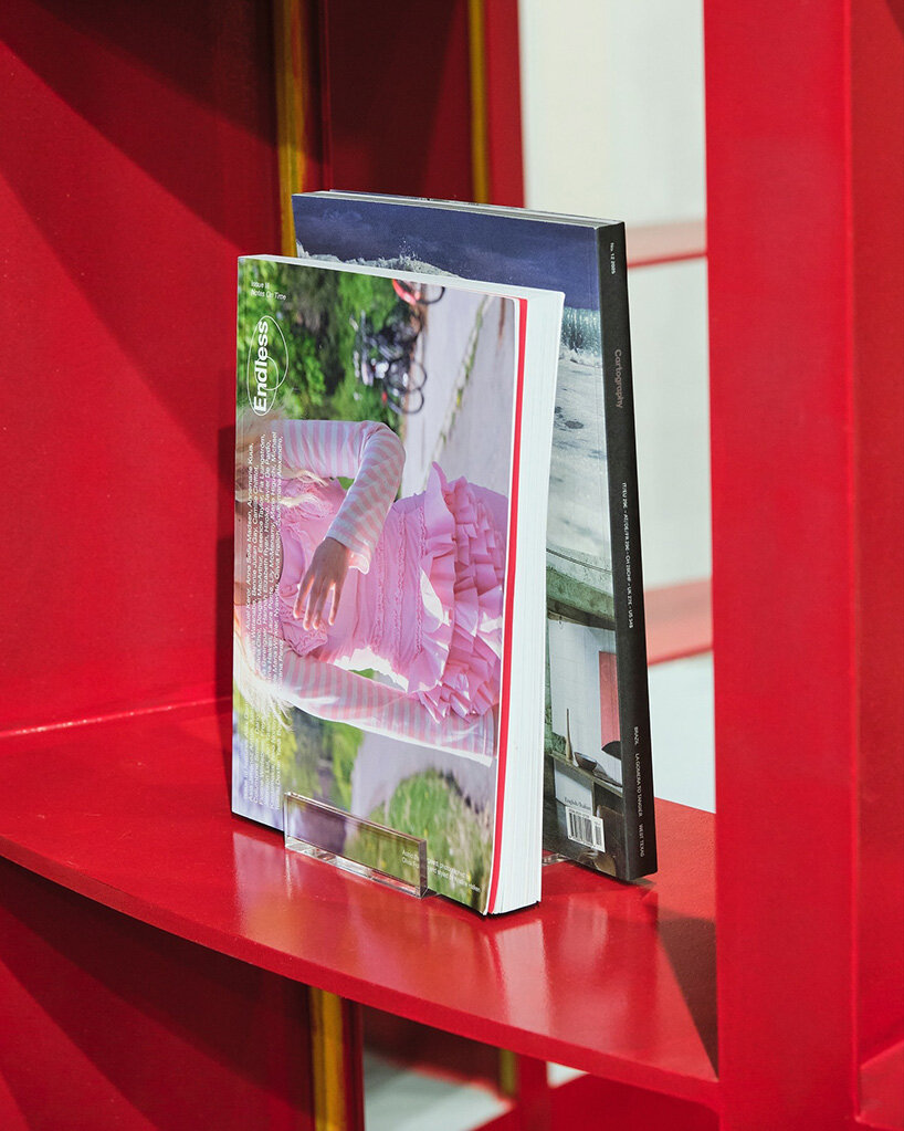
    At the heart of the space is a bold red spiral staircase that leads to the Reading Room, a curated corner that gathers contemporary magazines across fashion, design, art, and culture.

    all images via @plancframe

    Collaborations and Creativity Take Center Stage

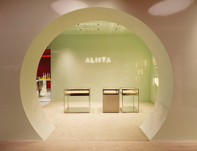
    The opening of Plan C Frame concept store also marks new collaborations. Jewelry brand Aliita, founded a decade ago, inaugurates its first dedicated retail space inside Frame, offering an intimate environment for its colorful and playful designs. Meanwhile, Plan C Silos, a homeware capsule developed with Belgian design company Serax, makes its debut exclusively at the Milan venue. The series of vases and candles draws inspiration from industrial storage structures, translating Plan C’s bold language into the domestic sphere.

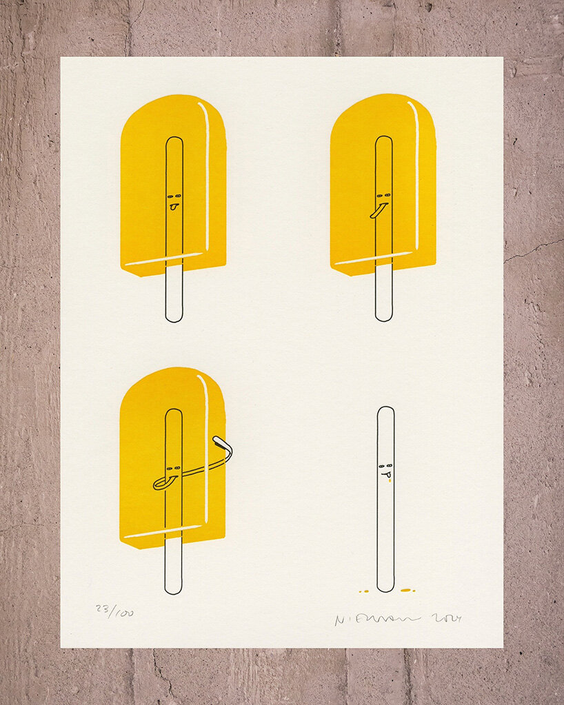
    Art anchors the launch as well, with the debut exhibition showcasing the work of illustrator and visual storyteller Christoph Niemann. Known for his witty ink drawings and covers for The New Yorker, Niemann features original works, prints, and editions that embody his unique way of turning everyday moments into reflections on perception and meaning.
    plan C opens 'frame' concept store in milan as hybrid venue for fashion, design and culture
    Jewelry brand Aliita inaugurates its first dedicated retail space inside Frame

    A New Chapter in Material and Color Experimentation

    Plan C, established in 2018 by Carolina Castiglioni after a decade of developing projects at her family’s house, Marni, is defined by its distinctive play of masculine and feminine codes, expressive color, and experimentation with materials. Headquartered in the historic site of her great-grandmother’s fur atelier, the brand creates long-lasting garments designed for women with a clear and independent sense of identity. With distribution across leading international stores and flagships in Tokyo, Plan C now establishes Frame in Milan as a platform that extends beyond clothing.
    plan C opens 'frame' concept store in milan as hybrid venue for fashion, design and culture
    at the heart of the space is a bold red spiral staircase
    plan C opens 'frame' concept store in milan as hybrid venue for fashion, design and culture
    the project introduces a layered experience
    plan C opens 'frame' concept store in milan as hybrid venue for fashion, design and culture
    this curated corner gathers contemporary magazines
    plan C opens 'frame' concept store in milan as hybrid venue for fashion, design and culture