Author: cozyspaces.haelthyh@gmail.com

  • Asif Khan Converts Soviet Cinema

    Asif Khan Converts Soviet Cinema

    A New Landmark Opens in Almaty, Kazakhstan

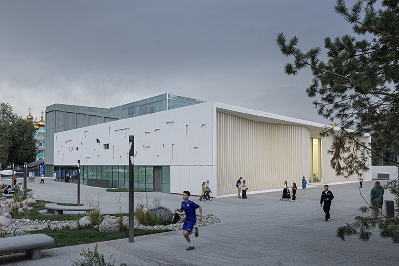
    The Tselinny Center of Contemporary Culture has officially opened in Almaty, Kazakhstan, marking the transformation of the city’s historic Tselinny cinema into a new cultural institution. Designed by London-based architect Asif Khan, the project extends across nearly 6,000 square meters of renovated interiors and a landscaped site of equal size, signaling a new era for the region’s artistic community.

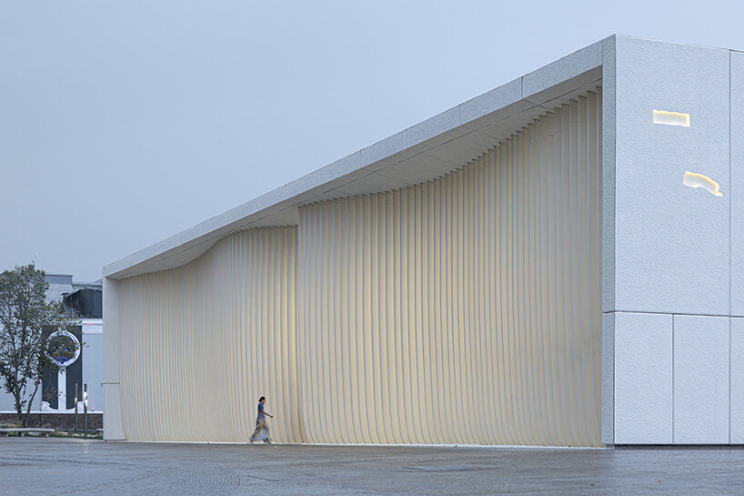
    With its undulating facade, the design integrates contemporary cultural programming with the building’s Soviet-era legacy, offering a space that connects Central Asia’s history and its evolving creative future. Khan’s approach balances structural renewal with symbolic gestures, creating a destination that responds to Almaty’s layered past while welcoming a diverse public.

    images © Laurian Ghinitoiu

    A Modernist Soviet Cinema Revived

    The Asif Kahn-converted Tselinny Center of Contemporary Culture occupies an historic site in Almaty, Kazakhstan. Built in 1964, the original cinema commemorated the Soviet ‘Virgin Lands’ campaign, a politically charged project that reshaped the region’s relationship to its steppe landscape. Over the decades, the building fell into disrepair, its monumental auditorium subdivided and its historic sgraffito — scratched or carved — artwork partially lost.

    Beginning in 2017, the Tselinny Center team initiated a careful reconstruction. Khan worked closely with local architect Zaure Aitayeva to stabilize the structure, strengthen it against seismic activity, and reintroduce its original spatial clarity. The rediscovered sgrafitto by Soviet artist Evgeny Sidorkin was restored with a restrained palette, allowing the work to coexist with contemporary art installations.
    tselinny center almaty kazakhstan
    the Tselinny Center opens in Almaty as a new cultural landmark

    The Tselinny Center Renovation by Asif Khan

    The renovation removes intrusive additions while revealing the auditorium’s impressive 18-meter (59-foot) height. Acoustic treatments and integrated systems now support a range of exhibitions and performances. A continuous ribbon of stainless steel and glass wraps the ground floor, introducing daylight and linking the interior to the surrounding landscape.

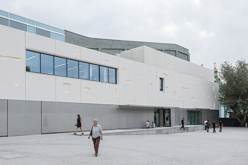
    A new ‘cloudscape’ of embossed symbols spans the north and south facades, drawing from Kazakh ornament and ancient petroglyphs. This abstract language appears in windows, lighting, and staircases, subtly embedding cultural memory into the architecture.
    tselinny center almaty kazakhstan
    Asif Khan restores a Soviet cinema into a contemporary art venue

    Design Features and Community Spaces

    Asif Khan retained the building’s exposed concrete, complemented by geological finishes that ground the project in Kazakhstan’s natural history. Fossil-rich limestone from the Mangystau region forms the reception desk, while earth-toned concrete floors and river stones from Almaty’s terrain extend the connection between interior and landscape.

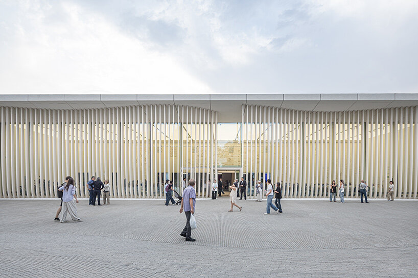
    At the entrance, a softly curving, cloud-like threshold introduces a sense of openness and movement, counterbalancing the building’s monumental frame. Inside, a lowered ground plane eliminates level changes, creating a seamless public space that flows outward to adjacent squares and parkland.
    tselinny center almaty kazakhstan
    a stainless steel ribbon brings daylight and 360 degree access

    Flexible Galleries and Community Hub

    The reconfigured interior accommodates a series of flexible galleries and gathering areas, including the vast Orta 3 auditorium, the white-box Capsule gallery, and a rooftop terrace with panoramic views of the Ile-Alatau mountains. A new café, learning atelier, and quiet rooms enhance the Center’s role as a community hub.

    This design prioritizes adaptable, multi-format spaces, allowing the Tselinny Center to host performances, exhibitions, and interdisciplinary events without fixed orientation. The inaugural program, BARSAKELMES, sets the tone with a live performance staged in the round, drawing on ancient Kazakh traditions.
    tselinny center almaty kazakhstan
    historic sgraf

  • B.L.U.E converts cinema into hotel

    B.L.U.E converts cinema into hotel

    Adaptive Reuse in Yangzhou’s Old Town

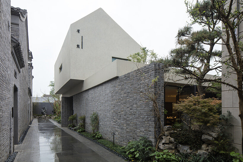
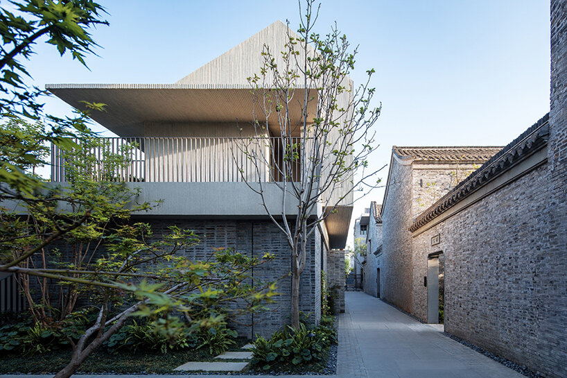
    Beijing-based B.L.U.E. Architecture Studio has designed the Jiangnan House hotel in the historic Guangling district of Yangzhou, China. The renovation project brings contemporary hospitality to a site that layers timber-frame architecture with twentieth-century brick-concrete structures. What was once a cinema is now a modern retreat that humbly preserves Yangzhou’s cultural heritage.
    The renovation forms part of the first phase of the Guangling Ancient City urban renewal program. Architecture and Engineering Co., Ltd. of Southeast University oversaw the overall planning, while B.L.U.E. Architecture Studio was responsible for key interior renovations, two new buildings, and facade updates.

    The design team worked alongside local groups, including Yangjian Group and Yangzhou Yijiangxuan Garden and Ancient Architecture Construction Co., Ltd., creating a collaborative platform that celebrates the neighborhood’s historic urban fabric.

    images © XIA ZHI Pictures

    A Sensitive Renovation by B.L.U.E. Architecture Studio

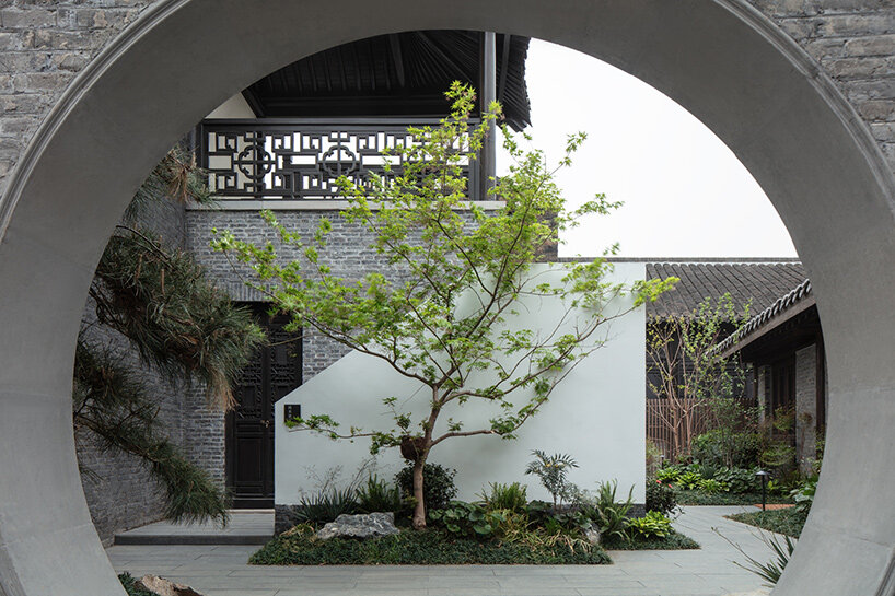
    B.L.U.E. Architecture Studio has sited the lobby of its Jiangnan House within the former auditorium of the former cinema. The building’s original timber roof structure has been preserved by the design team to maintain the lofty interiors. A new screen nods to the building’s cinematic past, while a central tree pond and corridor recall the courtyards of traditional Yangzhou gardens.

    Aged elm wood, natural stone flooring, and sawtooth wood veneer establish a tactile palette, complemented by terrazzo and vintage metal fittings inspired by historic cinemas. Local artists contributed woodcarving prints of classic film scenes, reinforcing the connection to the site’s earlier life.

    jiangnan house b.l.u.e architecture
    Jiangnan House stands within the historic fabric of Yangzhou’s Guangling district

    Inside the New Jiangnan House

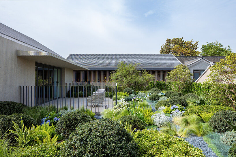
    The Jiangnan House offers forty guest rooms, many set within the preserved courtyard layout of the B.L.U.E. Architecture Studio-renovated heritage buildings. These rooms occupy two newly constructed volumes, whose design draws on the forms of pavilions and terraces found in classical Yangzhou gardens, using flowing corridors and layered roofs to create a sense of movement and varied perspective.

    Recycled bricks, bamboo-molded concrete, and hand-carved stone tiles pair contemporary techniques with the textures of the old courtyard walls and the small green tiles typical of local architecture.

    While the original timber structures and facades remain intact, each unit is fit with air-conditioning, heating, and ensuite baths. Natural materials like wood, stone, handmade bricks, and textured plaster lend a quiet authenticity. Details like hand-hewn wood panels, distressed copper surfaces, and woodblock prints reference Yangzhou’s craft traditions, while vertical greenery along the corridors softens the facades and enriches the guest experience.

    jiangnan house b.l.u.e architecture
    B.L.U.E. Architecture Studio leads the interior renovation and design of two new buildings

    jiangnan house b.l.u.e architecture
    a central tree pond and garden evoke the spirit of traditional Yangzhou courtyards

    jiangnan house b.l.u.e architecture
    vertical greenery and subtle facade updates lend a calm atmosphere for guests

    Conclusion

    The Jiangnan House hotel is a testament to the successful adaptive reuse of historic buildings in Yangzhou’s old town. B.L.U.E. Architecture Studio’s sensitive renovation has preserved the cultural heritage of the site while introducing contemporary hospitality. The hotel’s design, which combines traditional materials and techniques with modern amenities, provides a unique and authentic experience for guests. The project serves as a model for urban renewal and historic preservation, demonstrating the potential for adaptive reuse to revitalize and enrich the cultural fabric of old towns like Yangzhou.

  • 11 DIY Fall Centerpiece Ideas

    11 DIY Fall Centerpiece Ideas

    It’s finally fall, one of our favorite times of the year when it comes to seasonal home decor. The first thing on our list to decorate is the dining table, of course. Fall is all about cozy cider, apple pies, and warm meals with family, so it’s only natural that the dining table should be first on your list to decorate. To help you get inspired, we’ve put together a thorough list of DIY Fall centerpiece ideas. Get ready to fall in love with your dining table.

    collage of photos showing examples of DIY Fall centerpiece ideas

    Whether you’re in need of a gorgeous Thanksgiving dinner centerpiece for your table or just want your dining table looking extra spiffy for the season, you’re sure to find something to suit your style. We’ve got ideas from minimalist foliage to elaborate pumpkin tablescapes perfect to get your table looking festive for the season.

    Candles, Pumpkins and Mums:

    You may already know from our post on decorating with pumpkins and gourds that we’re big fans of a pumpkin centerpiece. Add some mums and candles for a little extra whimsical fall vibes and you’ve got a beautiful tablescape. This tray design by Azure Farm Life is a great example.

    fall centerpiece of candles, pumpkins and mums on a mirrored tray fall centerpiece of candles, pumpkins and mums on a mirrored tray

    Vintage Tool Box Fall Centerpiece Idea

    Whether you find a cute wooden, vintage toolbox at a thrift shop or make one yourself, this is a great base to try out your floral design skills. The combination of rustic, aged wood and fall foliage and fruits really adds the cozy fall vibes to your table. You can thank Dabbling and Decorating for this fun DIY centerpiece idea for Fall.

    A vintage wooden toolbox used as a fall centerpiece, filled with fall foliage and applesA vintage wooden toolbox used as a fall centerpiece, filled with fall foliage and apples

    Fall Table Decor using Natural Materials

    We believe fall decor is all about decorating with natural elements. This can mean pumpkins on

  • Artequitectos’ CL House in Portugal

    Artequitectos’ CL House in Portugal

    Introduction to CL House

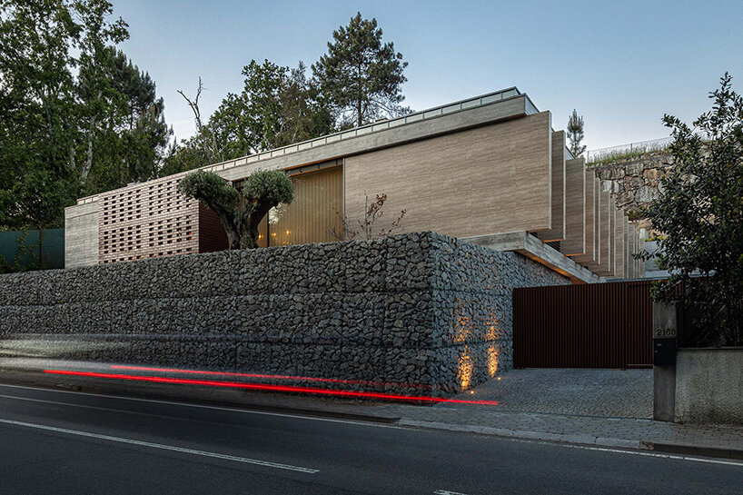
    Habitação CL, or CL House, is a private residence in Portugal designed by Artequitectos. Conceived as an interpretation of its sloping site, the house engages topography, material, and the act of inhabiting with intentional restraint. The project begins with the extension of an existing retaining wall along the western edge of the plot. This structural element defines the building’s elevation and establishes a raised platform where the home rests, aligning with the surrounding urban fabric. The placement allows the program to remain primarily at garden level and preserves the two-story profile that characterizes neighboring structures.

    images © Ivo Tavares Studio

    Interior Design and Layout

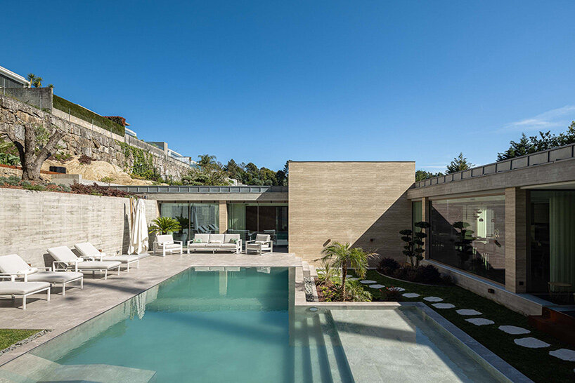
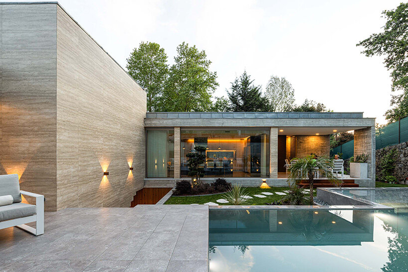
    Turning inward, the CL House is organized by Artequitectos around a sheltered central garden. A northern retaining wall reinforces the sense of enclosure and stabilizes the terrain to create a private and contemplative patio that the architects design to shape the interior experience. Programmatically, the house follows a clear hierarchy. The lower floor, partially embedded into the slope, accommodates service and support areas. Above, the main living spaces maintain a continuous relationship with the garden, with social areas opening directly to the outdoors. This layout lends an interior atmosphere that is breezy, sunlit, and private from neighbors.
    cl house artequitectos
    CL House rests on a raised platform shaped by a western retaining wall

    Material Palette and Design

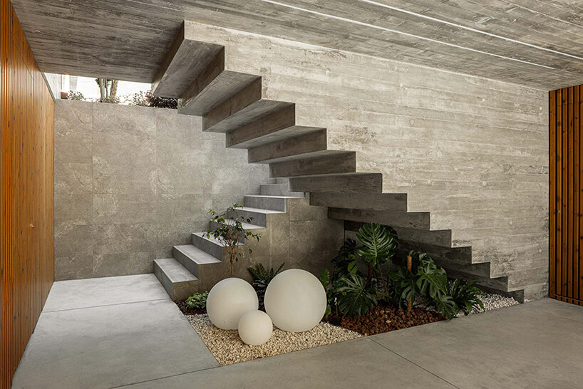
    With the design of its CL House, the team at Artequitectos curates an expressive material palette. The lower level is enclosed by textural gabion walls, or caged partitions filled with stone. Interiors of exposed concrete provide structural clarity and a sense of permanence. Thermally modified wood introduces texture and warmth, balancing the coolness of concrete, while travertine accents add subtle elegance and durability.
    cl house artequitectos
    a central garden defines the home’s inward-looking layout
    cl house artequitectos
    social zones open directly to the outdoors for fluid interior-exterior connections
    cl house artequitectos
    the lower floor is partially embedded into the slope for support spaces

    Conclusion

    Through these elements, Artequitectos achieves a measured synthesis of structure and atmosphere. The materials age gracefully, reinforcing the project’s intent to integrate architecture with the passage of time. More than just a functional response, the residence encourages a peaceful daily atmosphere. The design reflects the client’s desire for a contemporary home that favors a strong connection to the outdoors. Ultimately, CL House stands as a testament to the power of thoughtful design in creating serene and contemplative living spaces that not only respect their surroundings but also enrich the lives of their inhabitants.

  • Casa Tao in Mexico

    Casa Tao in Mexico

    Introduction to Casa Tao

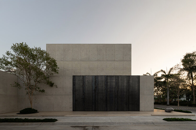
    Casa Tao by HW Studio stands in Puerto Vallarta, Mexico, as an architecture shaped by the coastal sun and shade. Rather than chase a postcard view, the concrete house faces a tree-lined courtyard, drawing in breezes and scents while filtering the intense Pacific sunlight. Its quiet stance responds to the climate as much as to the personal histories of its owners.

    ‘The project began with the silent memory of those who inhabit it,‘ the architects explain. Gustavo, who grew up in Puerto Vallarta, hoped for a house that promised coolness and retreat, recalling the modest home of his childhood where shade was essential. His wife, Cynthia, shared a fascination with Japanese design after a trip with their daughters.

    The clients told the design team: ‘We’d like to feel as if we were living inside a Japanese museum,’ describing a place where time slows and silence is tangible. These experiences shaped every decision, giving Casa Tao a language of restraint and depth.

    image © Hugo Tirso Domínguez

    Casa Tao: A Composition of Simple Geometries

    HW Studio organized the plan of its Casa Tao as a composition of stacked forms. Bedrooms, garage, and service areas create a grounded base, while a light, double-height volume floats above with the social spaces. By lifting the living areas, the architects surrounded them with air and treetop views, capturing the ocean breeze without exposing the interiors to direct sunlight.

    ‘We wanted the presence of the plaza to be sensed without being overwhelmed by heat,’ the architects note. Instead of large panes of glass, angled openings frame glimpses of trees and sky, allowing the house to observe the neighborhood at a measured diagonal.

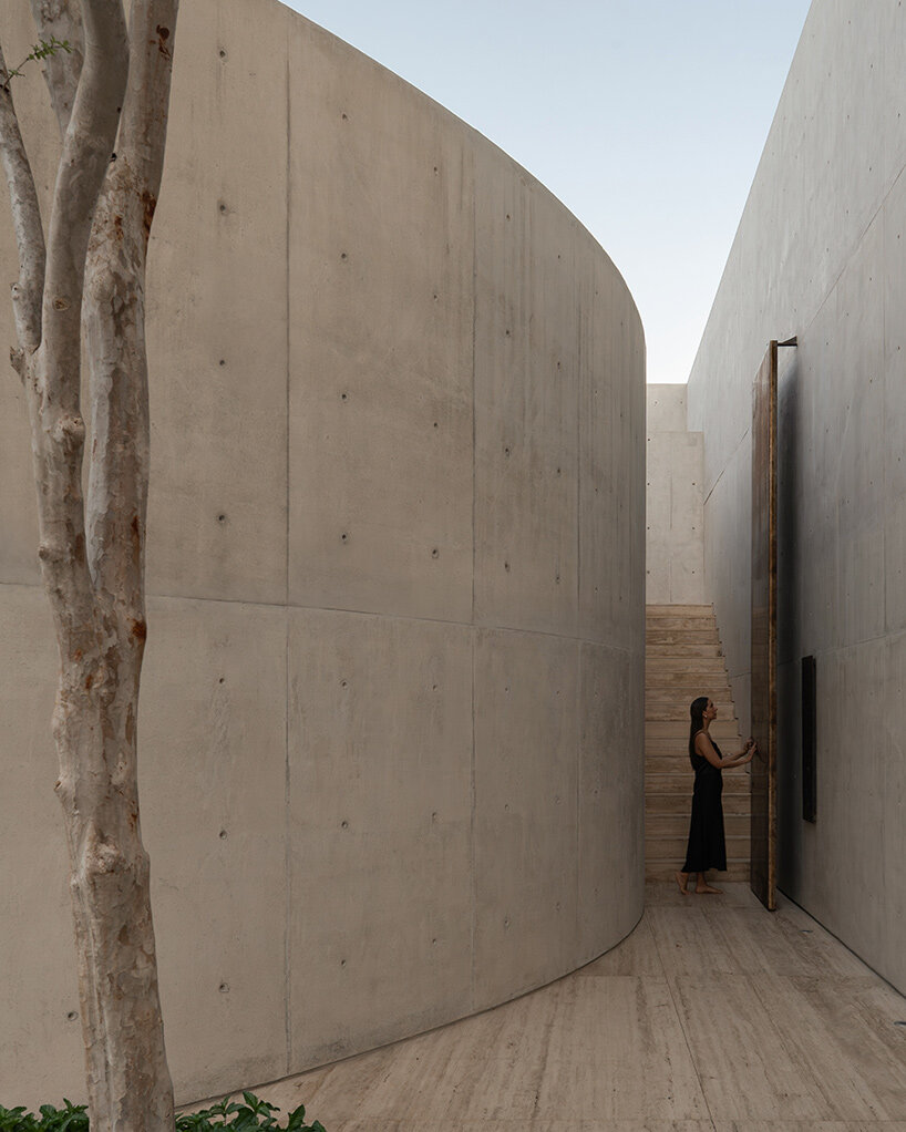
    Inside, the bedrooms gather around a secluded patio where a curved wall and a single tree create a soft threshold. This arrangement encourages movement that is slow and deliberate. ‘Shade here is an emotional condition,’ the team continues, ‘a promise of calm and silent protection.’ The house turns inward yet remains permeable as breezes carry the fragrance of the sea through subtle apertures, and shafts of daylight slip across the walls.

    hw studio casa tao
    image © Hugo Tirso Domínguez

    HW Studio Takes Cues from Japanese Design Logic

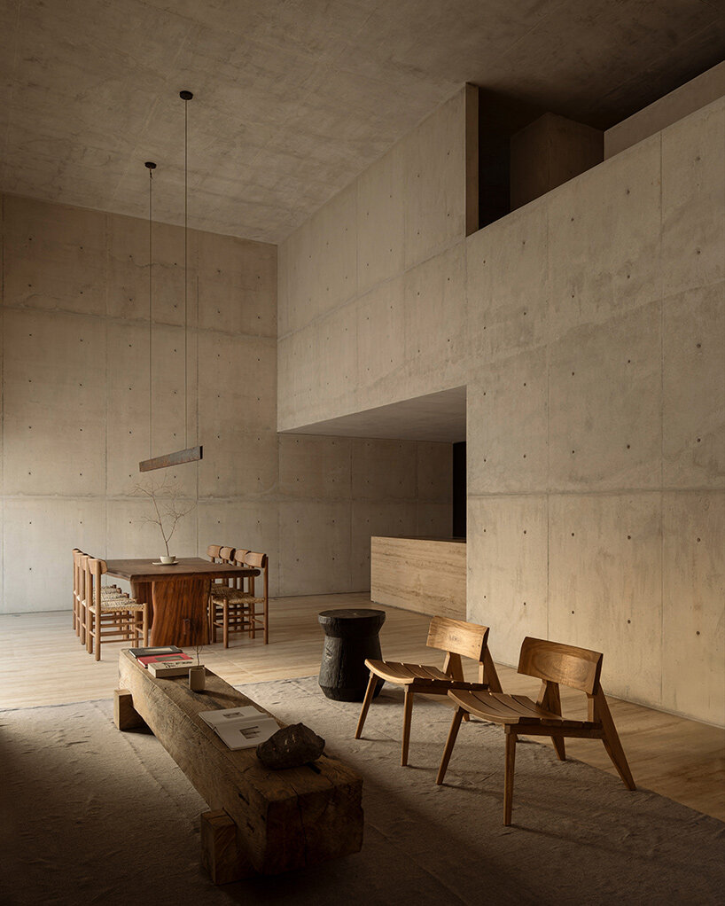
    Concrete forms Casa Tao’s structural core, chosen by HW Studio for its durability and tactile depth. Exposed surfaces absorb the coastal sun with a muted glow, while white finishes heighten the gentle contrast between shadow and light.

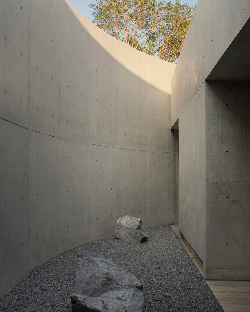
    ‘We wanted the material to settle light, not bounce it,’ HW Studio explains. Over time, the concrete will warm and soften to become a surface that records use and weather rather than resisting them. The combination of solid mass and delicate illumination gives the house a meditative stillness.

    The architects hope to invite lingering throughout the home. Elevated patios become terraces for contemplation, where the scent of flowers mixes with the sound of leaves in the wind. Each space is an atmosphere for quiet observation. The team seeks to echo the reflections of 20th century Japanese author, Junichirō Tanizaki in his essay, In Praise of Shadows, where subtle light reveals depth and texture. HW Studio captures that spirit, allowing light and shade to guide the senses and slow the day. In this way, dwelling becomes a study in presence.

    hw studio casa tao
    image © Hugo Tirso Domínguez

    hw studio casa tao
    image © César Belio

    hw studio casa tao
    image © César Belio

    Conclusion

    Casa Tao by HW Studio is a testament to the power of thoughtful design in creating a sense of calm and tranquility. By embracing the principles of Japanese design and incorporating natural materials, the architects have crafted a space that not only responds to its surroundings but also fosters a deep sense of connection with nature. As a result, Casa Tao stands as a serene oasis, inviting all who enter to slow down, observe, and appreciate the beauty of the present moment.

  • Electrical Plans

    Electrical Plans

    We’re officially kicking off our mudroom makeover, and the first step was anything but glamorous. From demoing a closet to adding new electrical and patching the floors, here’s a look at the messy (but necessary!) progress before the built-ins go in.

    Last week, I shared our mudroom built-in design plans, and I am so excited to see them come to life. This project is going to completely transform the feel and function of our entire living room. It will finally give us a proper drop zone for all the shoes, bags, and chaos that come with a busy family of four.

    This Escalated Quickly…
    Over the summer, I’d been tossing around the idea of adding built-ins to the front of our living room. When our contractor came by for another project, I casually asked what he thought about removing the coat closet and building a custom mudroom wall in that space. He looked around and said it would be a relatively simple job—demo, electrical, patchwork—and the demo could be done in just a few days. Oh, and he had an opening in his schedule coming up before he started on a huge project. You know I couldn’t let that pass.

    our front entryway where we will have our mudroom

    He also recommended a carpenter, who stopped by the same week and said he could build the custom lockers and cabinets, and he had availability right away. So just like that, we were locked in and ready to roll.

    Juggling Real Life With a Renovation
    With school starting and our schedules already packed, I definitely paused for a moment thinking, “Do I really want to live through a renovation right now?” But I also knew that with the timing aligning perfectly, it was worth going for it.

    To prep, we cleared out our entire coat closet—shoes, jackets, internet equipment, speaker system… all of it. Most of it went down to the basement temporarily.

    removing all of our internet cords during constructionremoving all of our internet cords during construction

    The trickiest part was relocating our internet setup. The wires had to be moved from the top of the wall down into the new cabinet zone, which meant we were without internet for a couple of days. Since both Finn and I work from home, we made alternative plans—he went into the office one day, and I worked from a coffee shop. We also used hotspots here and there, which worked well enough for emails and light tasks.

    Demo Day: Loud & Dusty
    Our contractor is great about keeping the mess contained. We’ve used him for all of our major home reno projects. He and his team put up plastic sheeting to help block the dust, which I highly recommend if you’re working in a lived-in space.

    Make sure your contractor puts up plastic sheeting to contain the dust
  • Snøhetta Completes Arched Addition

    Snøhetta Completes Arched Addition

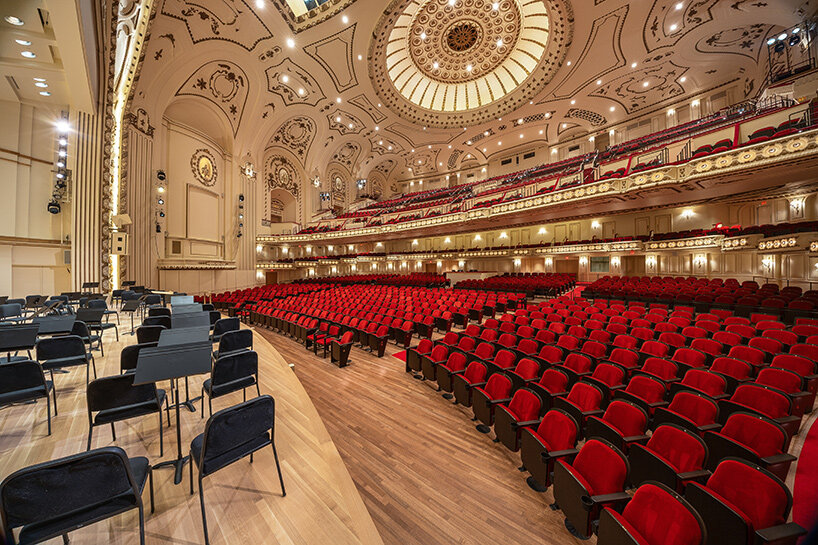
    Introduction to the St. Louis Symphony Orchestra’s Powell Hall Renovation

    The renovation of the St. Louis Symphony Orchestra’s Powell Hall by Snøhetta brings a balance of heritage and contemporary design to one of the American city’s most cherished landmarks. Located on St. Louis’ Grand Boulevard, the project expands and reimagines the 1925-built theater building while preserving its architectural character and acoustic qualities.

    Project Overview

    The global architecture firm worked alongside Christner Architects, Schuler Shook, BSI Constructors, and Kirkegaard to create a 64,000-square-foot addition in time to celebrate the hall’s centennial in 2025. The expansion improves accessibility and introduces new public spaces, educational spaces, and backstage areas to support the full scope of the Symphony’s programs and community events.

    images © Sam Fentress

    Snøhetta’s Arching Addition

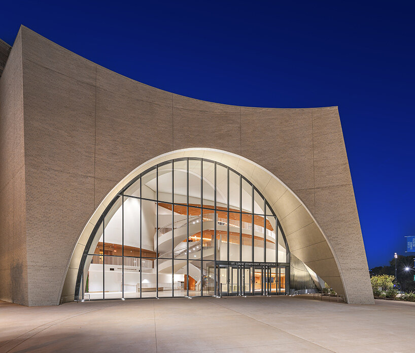
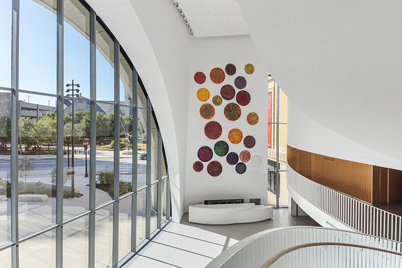
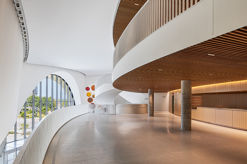
    Visitors to the St. Louis Symphony Orchestra now approach a series of canted masonry shells and arched openings, which the team at Snøhetta designs as the new front-of-house addition. These inclined surfaces and generous windows create a sense of openness, inviting passersby to glimpse the activity within. Inside, a triple-height lobby holds terraces and gathering areas that visually connect different levels, encouraging interaction before and after performances.
    Outside, Snøhetta has shaped a public plaza at Grand Boulevard and Samuel Shepard Drive to extend the vitality of the Symphony into the city. The sunlit square offers flexible space for gathering, integrates vehicle drop-off zones, and introduces lush planting beds that soften the urban setting while providing accessible routes from multiple directions.
    snøhetta st. louis symphony
    the expansion by Snøhetta adds 64,000 square feet to historic Powell Hall

    A Fluid Connection Between Old and New

    Snøhetta plans circulation paths to flow easily through the site, allowing visitors to the St. Louis Symphony Hall to move easily between indoor and outdoor spaces. Towering groves frame the entryways, and a network of pathways ensures that the plaza is welcoming and functional, whether for pre-concert mingling or quiet daytime use.
    Behind the scenes, the eastern expansion delivers state-of-the-art rehearsal rooms, recording suites, and storage areas. These upgrades provide musicians and staff with modern facilities for practice and collaboration, while community programming strengthens the project’s role as a creative hub.
    snøhetta st. louis symphony
    a new entry sequence features canted masonry shells and arched openings
    snøhetta completes arched addition to 100 year-old st. louis symphony hall
    a triple height lobby creates visual connections across terraces
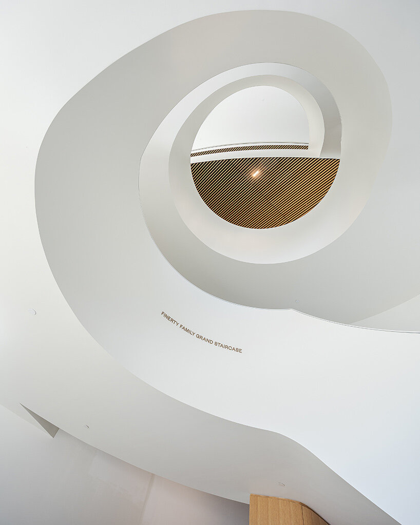
    snøhetta completes arched addition to 100 year-old st. louis symphony hall
    visitors ascend by way of a sculptural spiral stair
    snøhetta st. louis symphony
    the renovation infuses contemporary design and preserves architectural heritage

    Conclusion

    In conclusion, the renovation of the St. Louis Symphony Orchestra’s Powell Hall by Snøhetta is a successful blend of heritage and contemporary design, preserving the architectural character and acoustic qualities of the 1925-built theater while introducing new public spaces, educational spaces, and backstage areas. The expansion improves accessibility, supports the full scope of the Symphony’s programs and community events, and strengthens the project’s role as a creative hub. The new design creates a sense of openness and invites passersby to glimpse the activity within, while the public plaza extends the vitality of the Symphony into the city. The renovation is a testament to the power of thoughtful design and its ability to balance old and new, creating a vibrant and functional space that will serve the community for generations to come.

  • GGSV Transforms Parisian Apartment

    GGSV Transforms Parisian Apartment

    Introduction to The Salons of Imagination

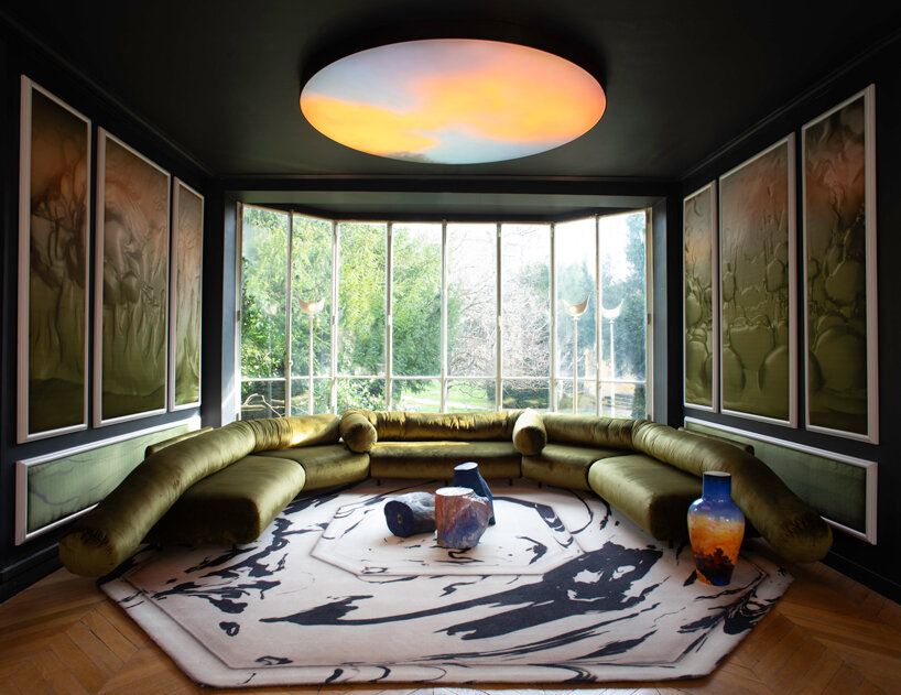
    The Salons of Imagination is an immersive installation by French design duo Studio GGSV, created for the newly established Manufactures Nationales as part of its inaugural PAVILLON program. Conceived for this first edition at the invitation of the institution, the project gives contemporary designers free rein to imagine the interiors of tomorrow while honoring the role of the interior designer. Housed inside the Pavillon d’Angiviller at the historic Manufacture des Gobelins in Paris, it transforms a 200-square-meter apartment into three interconnected interiors where art, architecture, and craftsmanship converge to offer profound sensory experiences. For this commission, Gaëlle Gabillet and Stéphane Villard, founders of Studio GGSV and known for their experimental use of illusion and trompe-l’œil, designed every piece of furniture and décor, presenting several never-before-seen works. The three environments — the Reception Salon, the Conversation Salon, and the Reading Salon — are conceived as spaces that stimulate the mind as much as they invite contemplation, encouraging visitors to imagine, exchange, and dream while celebrating French savoir-faire.

    Designboom visited the installation in person to explore the three rooms and speak directly with the Parisian design duo. ‘France has a long history of distinctive styles — every king had his own. Yet the concept of the ensemblier is unique: creating interiors as complete wholes, where architecture, fixed décor, movable décor, and furniture are in dialogue. This approach flourished through the Mobilier National until the 1920s, with Art Deco often seen as the last great French style to embrace it. Since then, focus shifted more narrowly to individual pieces of furniture, and the integrated vision was largely lost,’ Studio GGSV tells designboom. ‘For the centenary of Art Deco, rather than mounting another exhibition, the director of the Mobilier National posed a new question: what could an ensemble mean in 2025? The result is a reimagined apartment divided into three rooms, each exploring a different relationship between décor and furniture.’

    the Reception Salon | all images © Jean Allard

    Studio GGSV and Their Work

    Founded in 2011 by Gaëlle Gabillet and Stéphane Villard, Studio GGSV takes a multidisciplinary approach that spans design, installation, exhibition curation, and interior architecture. The duo, known for their experimental use of illusion and trompe-l’œil, were residents at the Villa Medici in 2018 for a research project exploring the application of painting to objects and architecture. Their works are part of the collections of the Centre Pompidou, the CNAP, and the Mobilier National, and they have been commissioned by institutions and brands including the Musée d’Art Moderne de Paris, Fondation Rothschild, Hermès, Chanel, and Galeries Lafayette. In 2023, they won the call for proposals Re-enchanting the Villa Medici with their project Camera Fantasia, and are currently presenting the monumental installation Grand Feu to mark the 200th anniversary of the Musée de la Céramique in Sèvres.

    The Three Salons

    In this commission, the Paris-based design duo blurs the boundaries between architecture, décor, and furniture. Patterns, materials, and forms echo and extend one another to create a unified yet unconventional whole. The result is three environments: the Reception Salon, the Conversation Salon, and the Reading Salon.
    studio GGSV transforms historic parisian apartment into salons for the imagination

    the Conversation Salon

    The Reception Salon

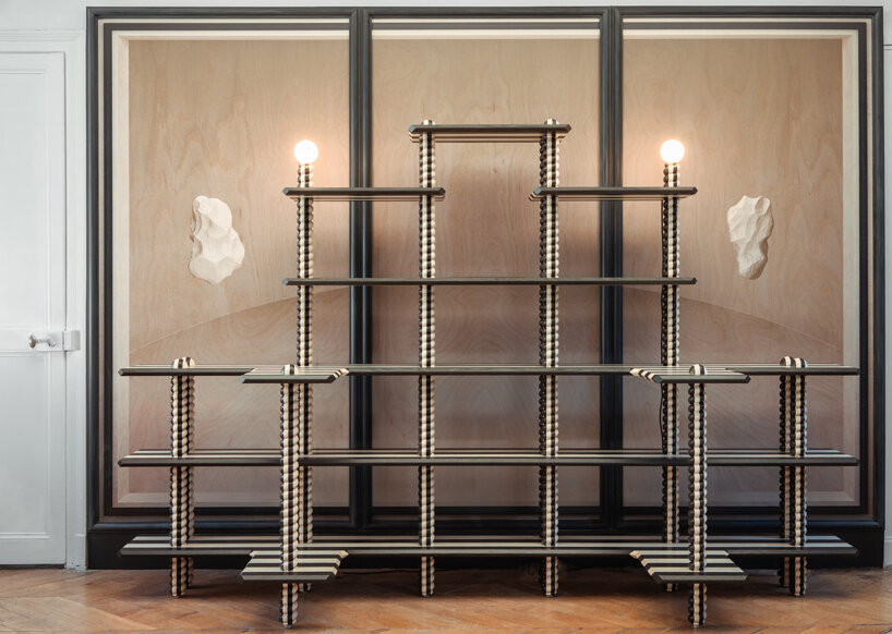
    The Reception Salon explores the dialogue between architectural structure and applied décor. At its center stands a monumental segmented-wood library, its hypnotic black-and-white rhythms recalling the twisted columns of Louis XIII style. These patterns extend across console tables, lamps, and molded wall panels printed directly onto wood, creating trompe-l’œil perspectives that multiply depth. Pilasters shift between illusion and reality, merging décor and structure into a unified whole. Classical and baroque references combine with art deco geometry, forming a layered composition where perception continuously oscillates between surface and volume.
    studio GGSV transforms historic parisian apartment into salons for the imagination

    hypnotic black-and-white rhythms recall the twisted columns of Louis XIII style

    The Conversation Salon

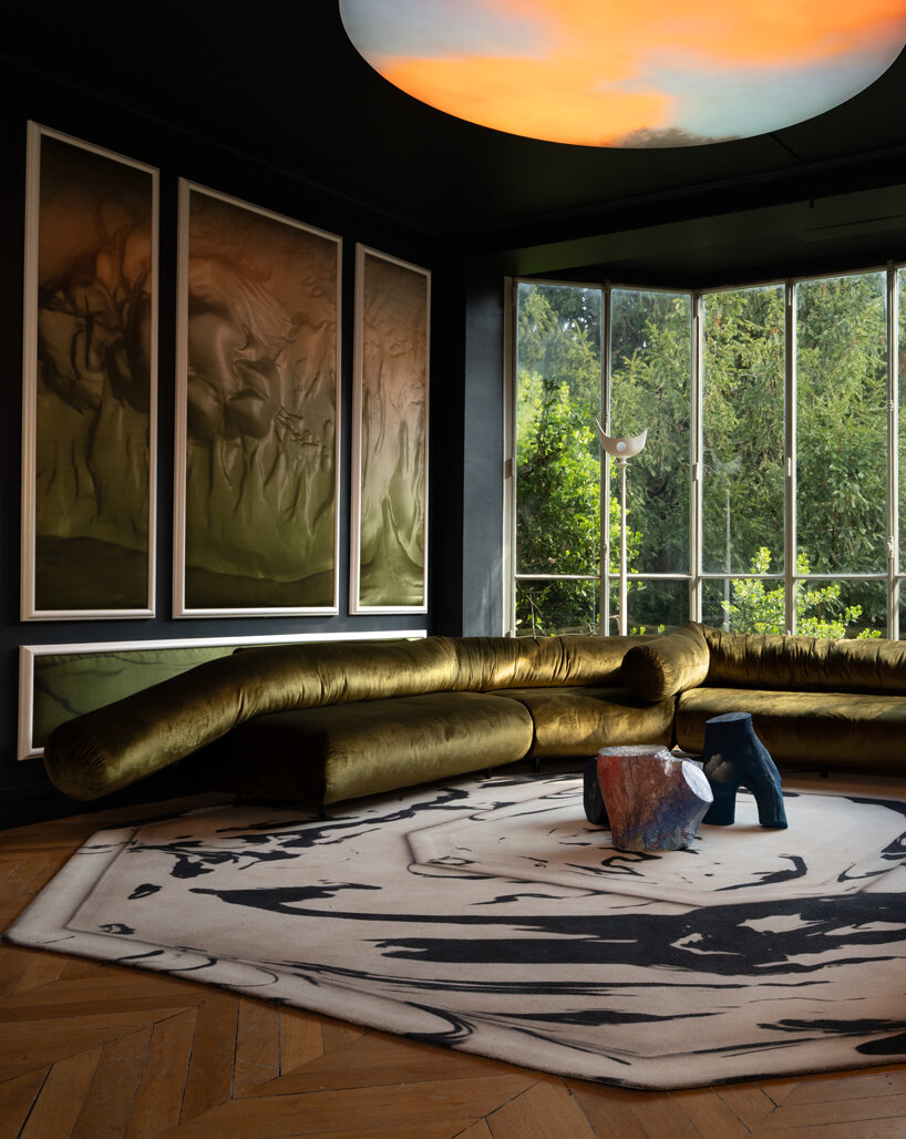
    Conceived as a space for sociability, the Conversation Salon is centered around a large sofa tailored to the room’s proportions. Its generous, organic forms reinterpret the conviviality of historic salons while echoing the art of topiary. ‘The second room takes inspiration from the garden, organized around a monumental hexagonal sofa designed for conversation — echoing both French traditions of salons and Middle Eastern majlis spaces,’ Gaëlle Gabillet and Stéphane Villard share.
    studio GGSV transforms historic parisian apartment into salons for the imagination

    the Conversation Salon is organized around a large hexagonal sofa

    The Reading Salon

    The Reading Salon envelops visitors in a total environment where architecture and painting dissolve into one. Romantic landscapes inspired by 19th-century art and Mobilier National tapestries cover the walls, floor, and ceiling, transforming the interior

  • ARKS Flagship Store

    ARKS Flagship Store

    Introduction to ARKS Flagship Store

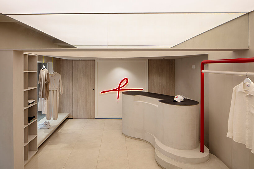
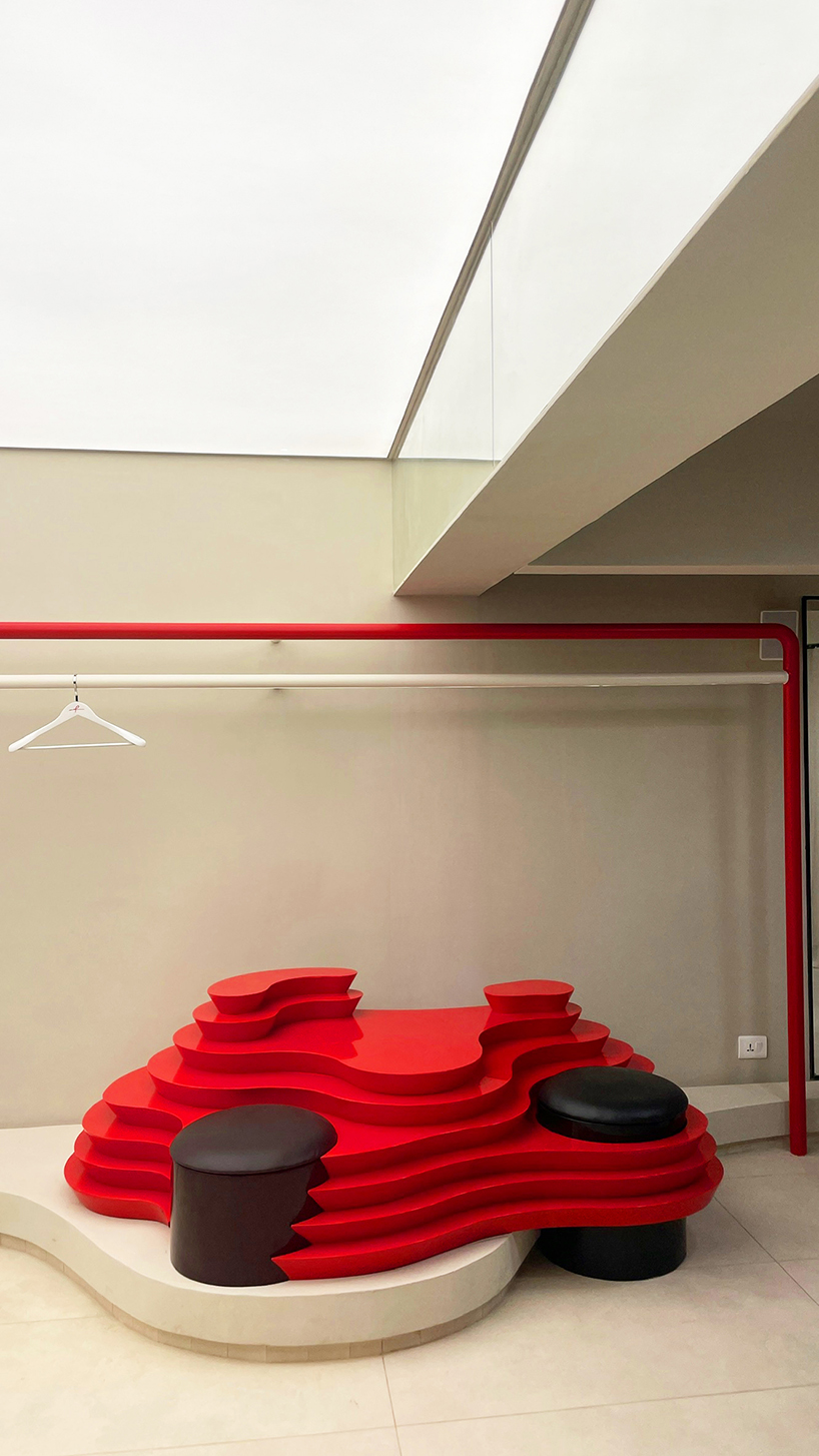
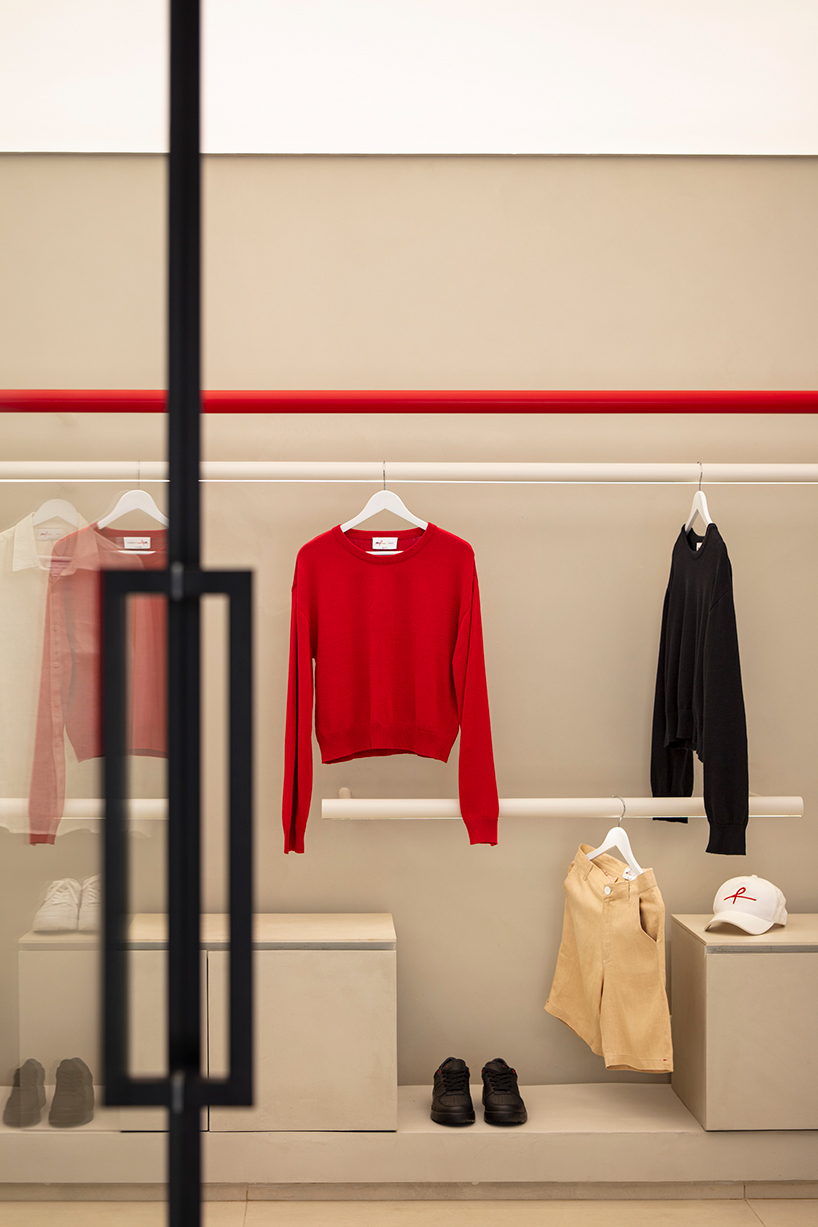
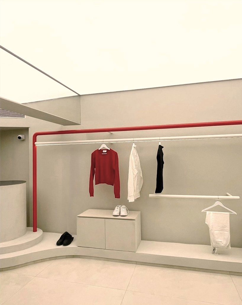
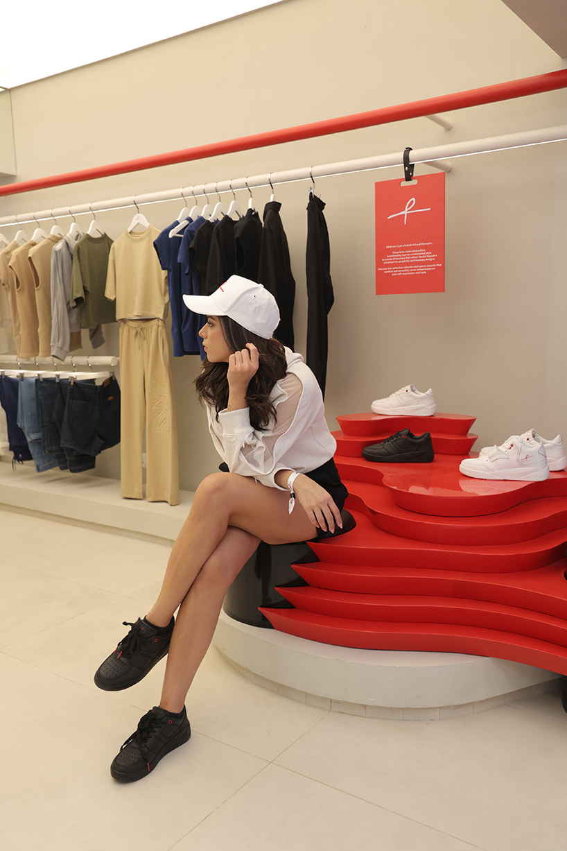
    Anagram Architects unveils 1200 square feet flagship store for ARKS, a lifestyle label based in Bandra West, Mumbai, translating its identity into a physical space. Conceived by Hindi cinema actor Ranbir Kapoor, the store features a restrained layout punctuated by bold red sculptural elements, including a sweeping display rod and a central bench that doubles as seating and focal point. Targeting a young, urban demographic, the space organizes circulation through a linear podium, concealed back-of-house zones, and a stage-like alcove for fitting rooms and a photo booth.

    all images courtesy of Anagram Architects

    Defined Thresholds Structure Movement Within the Store

    Set back from the street, the store, designed by Anagram Architects, is accessed through a metal gate and forecourt before ascending a short flight of steps to the entrance. Inside, the podium integrates the billing desk and product display, while the suspended red rod above anchors the visual rhythm of the interior. On one side, a veneer-paneled wall conceals service areas; on the other, the alcove for changing rooms is framed by drapery, a chandelier, and carpet, creating a contained zone within the open plan. The spatial sequencing reflects the India-based studio’s focus on guiding movement through subtle transitions rather than overt partitions.

    red sculptural elements define ARKS flagship store by anagram architects in mumbai
    the design translates the brand’s identity into a physical space

    Mirrored Details and Barrisol Ceiling Enhance Spatial Perception

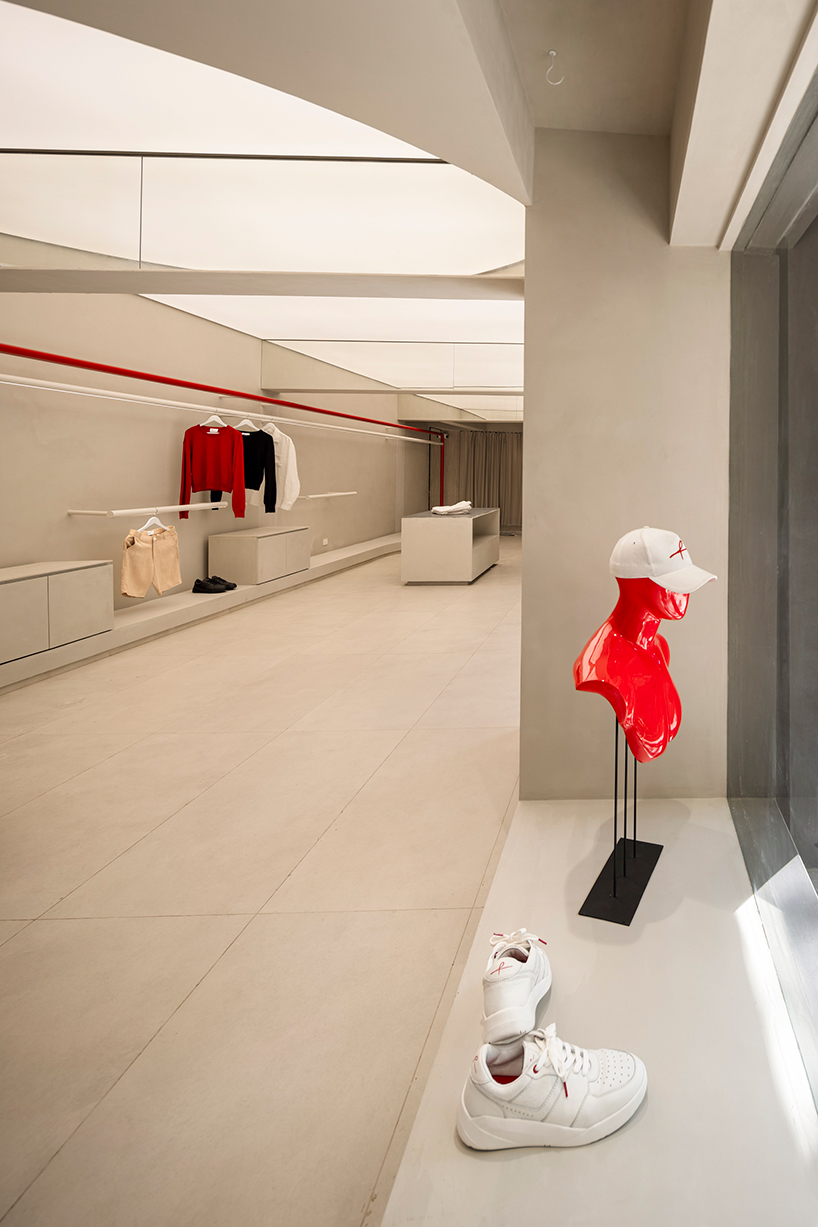
    The design adopts ARKS’ signature colors of red, black, and white. The exterior pairs a white bulkhead with black-tiled cladding and a red metal portal finished in ACP. Inside, neutral walls and flooring are punctuated by red accents on display elements, seating, and branding, while black hardware and tiles provide contrast. A Barrisol stretch ceiling conceals lighting to reduce visual clutter, with mirrored beam fascias used to counteract the low 7-foot height and extend the perception of space. The combination of these elements creates a structured retail environment that reflects the brand’s identity through material and form.

    arks flagship store 4
    mirrored beam fascias reflect the Barrisol ceiling to heighten spatial perception

    red sculptural elements define ARKS flagship store by anagram architects in mumbai
    strategic red accents energize the muted palette

    arks flagship store 7
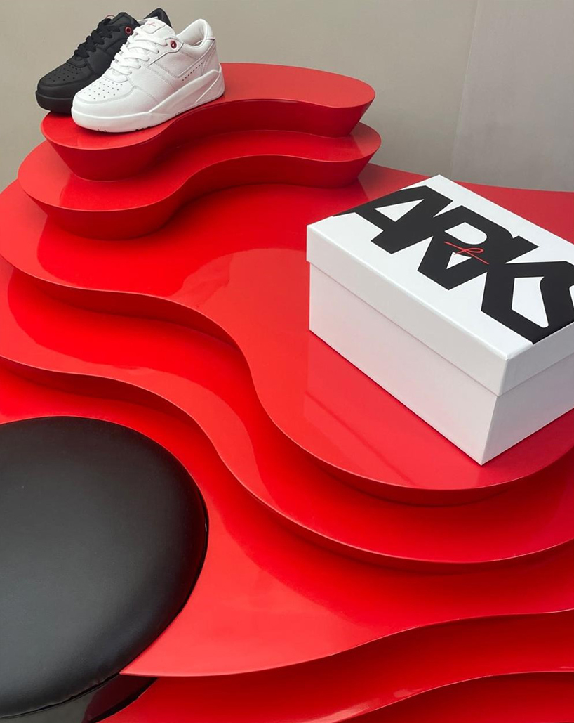
    a sculptural red bench serves as a bold visual anchor

    arks flagship store 6
    the sculptural red bench — designed for both seating and display

    arks flagship store 8
    the contours of the bench

    arks flagship store 2
    the material palette features ARKS’ signature colours: red, black, and white

    arks flagship store 3
    the billing desk extends into a continuous podium; above it, a sweeping red rod anchors the merchandise display

    arks flagship store 5
    the sweeping red display rod,

  • Refresh The Blue Guest Room

    Refresh The Blue Guest Room


    • Pin on Pinterest

    • Flip on Flipboard

    Introduction to the Blue Guest Room Refresh

    With the holiday season soon approaching and before my calendar starts to fill up with festivities, I wanted to give the blue guest room in my house a refresh for the family and friends who will be staying in the room over the holiday season.

    If you are new to my blog, then you know my husband Ed and I are empty-nesters so the two bedrooms on the second floor of the house we use as guest rooms. I call one the pretty room that has a more feminine vibe and the one I want to give a refresh, I call the more masculine blue guest room.

    The Current State of the Blue Guest Room

    On the bed in the blue guest room I still like the super-easy headboard that I made using a plaid flannel sheet and a curtain rod. I made it quite a few years ago and it has held up well and hasn’t faded.

    I also will keep the furniture and the thrift store lamp that I made over to resemble a high-end designer one.

    The blue quilt on the bed and the shams though have faded from the bright southern sun and repetitive washings. I also change that out in the winter with a navy blue velvet quilt for the bed, but it is a lint magnet and takes too much effort to keep it lint-free.

    Refreshing the Bedding With Quince

    I have used the Navy Blue color on the bed since we moved into the house. It looked nice with the lake view setting and the plaid headboard.

    But you know me. I like to see change and have been thinking of changing the color to a pine green that will coordinate with all the pine trees right outside the sliding glass door in the room. After searching online, I finally found just what I envisioned for the room from Quince.

    Getting to Know Quince

    Have you heard of the brand Quince yet? If not, Quince is a direct-to-consumer brand founded on a simple yet refreshing idea that luxury doesn’t have to be expensive.

    By streamlining their production and selling directly to customers, they’re able to offer incredibly well-made pieces at prices most of us can afford.

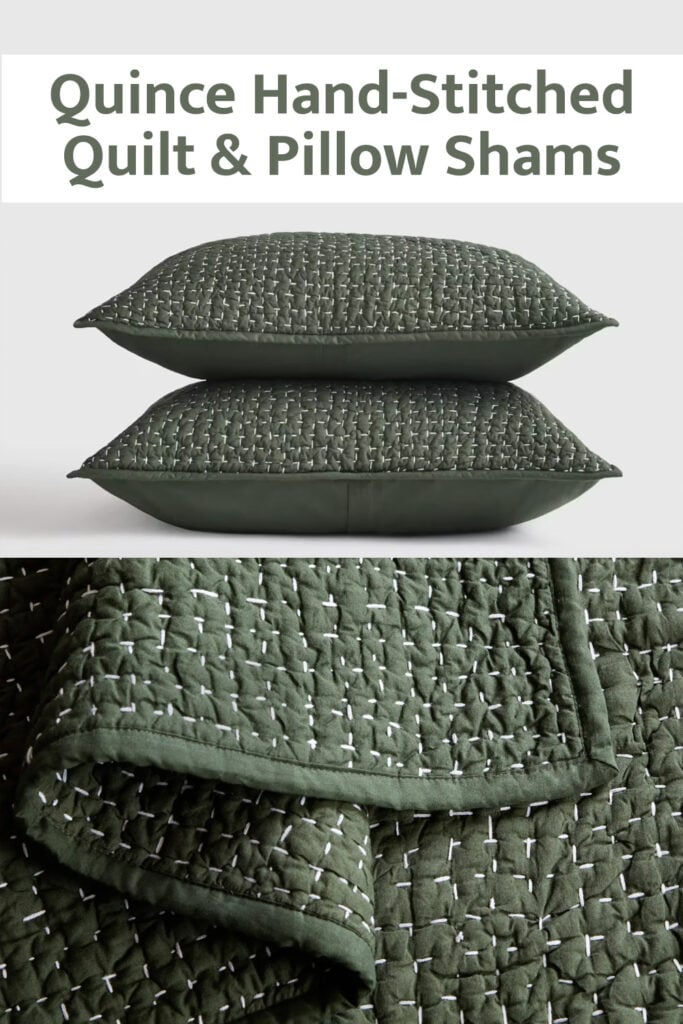
    I have seen the brand online and thought they just sold clothing, but I was surprised to find out they carry quite a nice selection of furniture and home goods like this Organic Cotton Hand-Stitched Quilt and matching pillow shams all sold at a fraction of what you’d expect to pay.

    New Additions to the Blue Guest Room

    With the color change for the bed to pine green, I also want to update the throw and found this Luxury Fur Throw for when guests want to take a cozy afternoon nap, but don’t want to get under the covers.

    I love the way fur throws feel against my body and use them now in every room, not just in my living room to cuddle with when binge watching TV or reading a book long into the night.

    To complete the bedding, I ordered a new duvet cover. I thought of getting it in a color, but like using white so it feels like a hotel. The one I have has yellowed with age so seeing a nice pristine one on the bed will make me smile big time.

    Quince Hand-stitched quilt and pillow shams in the color Pine

    I haven’t received the bedding yet, but as soon as it comes I will refresh the room and show you how it all comes together. I may even add a few more new details to the room to add to the new color vibe.

    I’d love to hear if you’ve bought anything from Quince and if so were they clothes or home goods?

    Conclusion

    In conclusion, I am excited to give my blue guest room a refresh with the new pine green bedding from Quince. The Organic Cotton Hand-Stitched Quilt and matching pillow shams will add a nice touch to the room, and the Luxury Fur Throw will provide a cozy element for my guests. I am looking forward to sharing the final result with you and hearing about your experiences with Quince.

    Disclaimer: This post may contain affiliate links, and I may earn a commission if you make a purchase through these links.


    • Pin on Pinterest

    • Flip on Flipboard

    Post navigation